Indie game storeFree gamesFun gamesHorror games
Game developmentAssetsComics
SalesBundles
Jobs
TagsGame Engines

Jdoe

21
Posts
1
Followers
6
Following
A member registered Sep 09, 2018

Recent community posts

Pressing shift to do things feels really uncomfortable. Usually it's ZXC not Shift ZX.

The different buttons for interacting and advancing dialogue is more confusing than helpful.

I think the setup you have at the moment would work pretty well on a controller and maybe it's just me, but definately make the keys rebindable.

Controls are pretty bad but the core concept is nice.

I really like the visuals and sound. Hope to see more of this.

Also:


;)

Nice to see you have this thought out. I really want to see your game in the next jam. Best of luck to you in all things.

(1 edit)

You could use PyxelEdit to create backrounds and tiles. I'm was horrible at art stuff but after learning some really basic truths about making tiles I can make them look a lot better. If you understand WHY you have to put a pixel in a certain place, it makes drawing a lot easier.

If you take some time out to learn the basics I'm certain you can make stuff look decent, even if you're crap at art, like me. With those basic rules you can approach the problems with a more 'mathematical' viewpoint rather than a creative one.

This video helped me understand some basic things

www.youtube.com/watch?v=9TlmBmMonIc

Yeah, he already had an item so Im guessing item switching has not been implemented yet. Wasn't sure if it was a bug or not so I mentioned it just in case. I right clicked on the item, yes.

Its my first time ever trying out the AGDG jam games and it has been a blast. Im very glad that people find my feedback helpful. Cant wait to play your game next jam!

Movement feels solid. Abilities are fun and  fluid to use. The animations that you have look cool. Try making the map more populated with those buildings and put some enemies at the top so I can run up the building and kick some nerds off. Awesome game. Definitely want to see more.

(1 edit)

I played the fixed version now. Really reminds me of my early games.

  • The jumping is atrocious. Definately make the character able to steer in the air. Its too hard to climb basic boxes.
  • The backround and ground dont tile well, leading to repeating patters and eye strain.

Not much else to criticize for a small demo. If you fix the jumping you should have a solid base to continue on the game. Keep learning and keepi devvin.

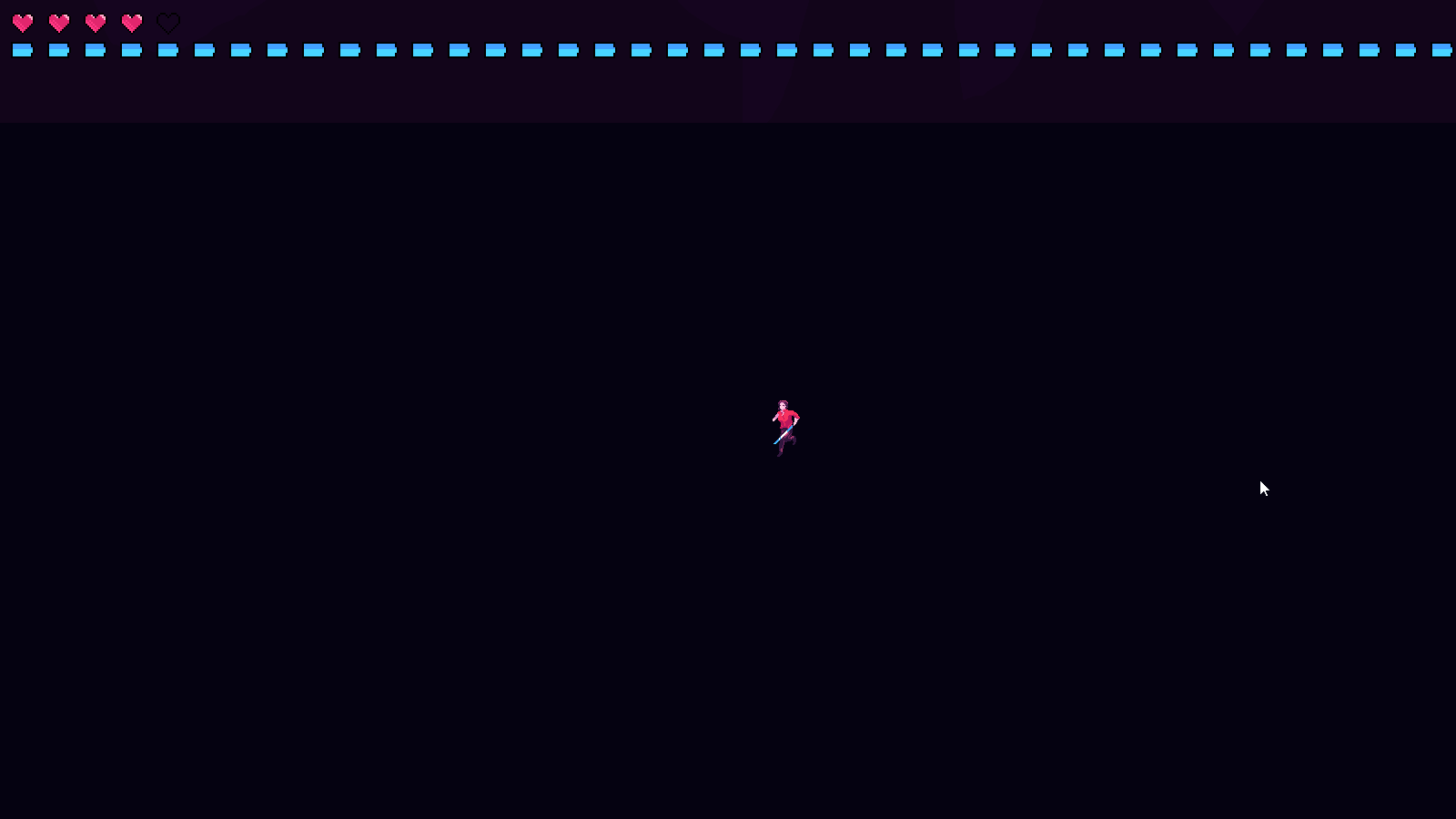
Making the enemies a tad brighter while making the shells a bit darker+alpha fade out would already help immensely. Try it out. Maybe try adding outlines to enemies? Might make it look worse though. Would need to see it in motion.

  • One of my skeletons didn't want to pick up a battle sword, even if commanded.
  • Make the command minion control image more easily understandable. Its just 2 lines at the moment which kinda looks like "
  • Please add a panning sensitivity slider in the options because the current one is frustratingly slow.
  • Being able to edit the options or atleast see the controlscheme during the actual game would be very helpful.
  • Kinda jarring and tone shifting how the character talks about her dead parents with this absolute B A N G E R of a track in the backround. Funnybone is pretty chill.

The idea and artstyle are neat. Love the music. Full steam ahead with devvin, dude.

The way forward was blocked 2 times in a row when I tried to progress.

Music quality is a bit low but I still like it

Movement and shooting are solid. Controls in general feels nice.

Art direction is simple yet effective.

Sounds are juicy.

Pretty fun except getting stuck.

(1 edit)

Using mousewheel for spell access is okay but you should be able to exit the menu with something other than mousewheel aswell like ESC.

I dont know if the game continues after you kill the first enemy but I couldn't talk to the NPC anymore. I tried twice so I assume that's how it is.

Definitely add on option to remove/reduce headbobbing because it bobs way too much for the amount you step forward.

I really enjoy the aesthetic of the painting cutouts and the voice of the NPC. Keep up the good work!


Cool style, amazing music, fun gameplay. 

Please keep making games.

The suitcase enemies have too many hitpoints for a first enemy.

Bomb launcher takes up a little too much of the screen.

Honestly cant think of anything else that was negative.

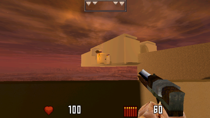
Solid movement and controls.I really enjoyed the atmosphere. Awesome skybox and cloud effect. Sick ambience. The low poly models are really nice. Vinyl gun is fucking cool. I didn't understand if the HEYWHERESYOURGAME does anything but still, noice.

PS: You can see the box where one of the eyebois is along with a torch box from the walkway to the vinyl gun.


I suggest removing this effect on the upgrade or gun buying screens


Maybe do a brief spazzing out effect when you "boot up" the menu.

The red interlocked circle effect when enemies are hit is a bit too much.

The amount of blood, shells and general mayhem sometimes make it hard to understand what's what and its difficult to understand when an enemy is dead or not so I keep shooting at them.

The camera moves too fast with the mouse.

Overall I really enjoyed the game. The silly premise and the apartment vibe is pretty cool. I also REALLY enjoy the music. Well done. Keep on trucking, dude.

Good to hear about the fixes.

As for the control scheme I would use WASD for movement, Mouse 1 for attack with knight, Mouse 2 to block, Mouse 2 to aim with witch and Mouse1 to fire. Space to interact. You could use the wheel to select items for example.

If you want to make it keyboard only I would go with. WASD for movement, Q for switching, F to disable/enable following, LShift for blocking, Space to attack/aim. E to interact.For the witches aiming I recommend removing the up and down arrow functionality and make it aim with only A and D. You could use the arrow keys to change items.

An alternative to that is Arrows for movement. Z to attack/aim, X to block, C to switch and F to disable/enable following and Space to interact.

Hope this was of some help. Keep on devvin. I'll be keeping an eye on this project for sure.

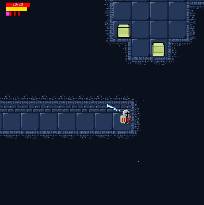
In the overworld some of the boxes are floating in the air and in the dungeon some of the tiles are clipping with other tiles.

The toggle AI button disables AI but does not reenable it.

The default control scheme is pretty bad. I dont know if the mouse is supposed to work or not but it does not and using F to attack,Q to switch and Z to toggle AI its really clunky.

I don't know if you have a block ability for the knight yet but the game needs one because of the BEES.

I really enjoy the art design. The bunnies, bees, mandrake(?) and the spider look really cool. Textures fit well together. The grass backround needs some work though.

Hope to see more of this game.

Some random feedback

  • First time I spawned I got stuck inside of a bat and couldn't move or kill it. The bat wasn't attacking me either.
  • I like the perspective but the combination of the perspective and how small things are sometimes fucks with my head and its hard to judge if I am lined up with an enemy/chest or not.
  • Camera movement when changing direction is too jarring. I suggest making it smoother.
  • No performance issues at all.
  • I really enjoy the camera spinning around when you die.
  • You probably already thought of this in the long term but having torches as an additional light source on the walls would look dope with your lighting engine. Maybe a small camp of enemies with a bonfire etc.
  • The combat feels nice. I can imagine it being really satisfying with some proper sounds and weapons. I don't really see the use of the lock on mechanic outside of bosses for example.
  • Make the stamina bar thicker.
  • The controls are bit unintuitive. Definately make them rebindable. Using items during during combat is a bit weird with the current keyboard layout as is the lock on. Also give the player an optinon to go fullscreen ingame instead of alt+enter.
  • Your UI elements feel to spaced apart.
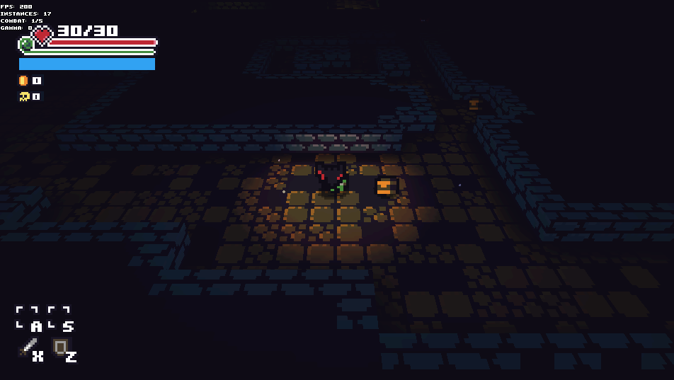
    I suggest putting the attack and defend boxes at the top right below the item use boxes at the bottom left to clean it up a bit. Also you should see if making the coin and kill counters smaller and putting them below the health and stamina makes the UI more compact.


  • Pic related to give you an idea of what I mean.
    The blue space can be for buffs or mana if you want to use a magic system. Also shows the bat bug.
  • The general look you are going for is pretty cool. I would gladly put in several hours if you juiced it up with items, shops, secrets and stuff like that.