Indie game storeFree gamesFun gamesHorror games
Game developmentAssetsComics
SalesBundles
Jobs
TagsGame Engines
A jam submission

Gloomy KeepView game page

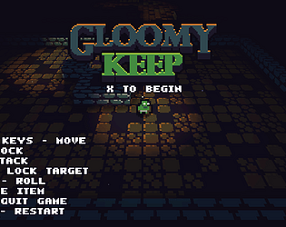
A little hack-n-slash dungeon adventure DEMO
Submitted by Oakleaff (@Oakleaff_) — 17 hours, 41 minutes before the deadline
Add to collection

Play game

Gloomy Keep's itch.io page

Leave a comment

Log in with itch.io to leave a comment.

Comments

(+1)

General:
-2MB.exe, well fuck me impressed

UI:
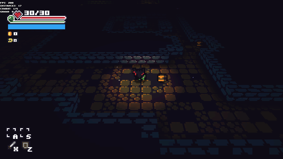
-the healthbar stuff looks out of place with the rest of the game 
-let me look up the controls while in game, who can remember all that shit
-alt+enter restarts the game, what

Graphics:
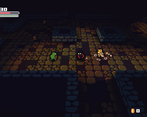
-I don't like the gradient lighting
-great choice of colors otherwise

Gameplay:
-level generation is trash
-let me use WASD, this isn't 2005
-mechanics are trash, no tactics
-camera feels odd, but maybe I'd get used to it

Experienced all the game had within 30 seconds. You figured out the graphics, but still need to do the same for the rest of the game. Don't @ me.

Developer

"Gameplay:
-level generation is trash

----
-mechanics are trash, no tactics"

Appreciate the feedback, but do you mind expanding these a little? I've developed both a little, but clearer feedback would be nice.

(+1)

Said don't @ me.

levelgen - what you have is clearly babby's first "combine rectangles randomly", they lead nowhere, serve no purpose and filled with shit arbitrarily  

mechanics - same shit, you just slapped in attack and defend and called it a day, there's no strategies to play around with, all enemies feel the same

I usually expand on something that can be improved in a way that might not be obvious. Literally any kind of improvement will drastically help the game because of how bad the mechanics and levelgen are. I'm shitting on these hard because I want the game improved -- even though the parts I mentioned are horrendous and make me drop the game 2 min in, the demo is well above what I expect from a DD demo.

(+1)

-I couldn't figure out how to play in full screen, so the block state was hardly visible in high resolution

-The game felt juicy, action feedback was nice

-It was hard to properly "feel" what cells I'm going to hit, so I let through some hits. Probably due to nature of camera.

-Rooms were slightly too big, but felt good nonetheless

-At some point I got lost and started backtracking and revisiting same spots

-Nice color palette and overall aesthetic

Interesting game, I wonder where it would take it further with dungeoning stuff. Keep it up!

(+1)

_
Developer(+1)

It's really neat seeing someone play your own game for the first time. You raise great points, and while most are things I have in consideration/under development, I also got a few new ideas. Some things to clarify:

  • The stamina system is of course unfinished. Currently running out of stamina causes 2 things: blocking an attack with 0 stamina results in the player getting stunned (as well as the enemy), and your attacks do about 1/2 of the normal damage.
  • The stamina system is there mostly to prevent spamming (as you guessed), but that's not  yet properly implemented.
  • Chests can actually be destroyed with a few hits, I just gotta make that more obvious. Also the chest placement is currently just random.
  • Attacking an enemy or blocking enemy attacks stuns the enemy (for about 3/4 of a second). If the enemy is already attacking (pleying the attack animation), the animation is not canceled.
  • The enemies don't have any level systems implemented, they just have (too much) RNG in their code, resulting in some 3- or 4-hit combos occasionally.
  • There is no win state (yet!), you can only lose

Thanks for the rewiew, it was really helpful!

You've set up a good base, but here's some issues I noticed:

  • Only diagonal roll that works is up-right
  • Skeletons occasionally teleport if they get blocked during movement
  • Chests still have colliders once opened, so they can potentially block passageways
  • Combat is a solved game (kite one enemy, block until they attack, then get a strike in) due to the lack of attack options for players and enemies
  • Stamina is basically infinite since you can roll even if the bar is depleted

Good work so far!

Developer

Thanks!

  • I think the rolling problem may be hardware-related. My laptop for example doesn't deal with multiple keys being pressed very well (I can roll diagonally up-left and down-right, but not the other diagonals). I'm yet to resolve this.
  • Characters sometimes snap around, this is a known issue with my collision checks/movement
  • Chests can be hacked to bits with a few hits, for this exact reason. I need to make the feedback more obvious.
  • I hope adding ranged enemies and modifying the enemy behavior solves this issue
  • Yeah, the only downside to having low stamina so far is reduced damage and getting stunned while blocking. I'll add a few more checks to prevent endless rolling.
Submitted

nice looks, snappy controls

if the camera followed more smoothly would make it much better imo

Submitted

Like it a lot.

Graphics is cute and nice. Wouldnt mind if hud was a bit bigger especially the stamina bar. Here are some of the adjustments that came up:

  •  I'm guessing it's a bit early so balance between spawning chest happens later, but some rooms had vast amount of chests keeping my hp topped off constantly.
  • I wouldnt a bit of line of sight on the enemies, sometimes they get triggered on the other side of the room with their back towards me
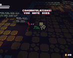
  • This might just be me but i couldnt restart after i died? 
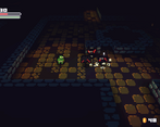
  • My biggest issue is that at times it was hard to figure out if my hits were going to hit because i couldnt see if we were lined up. Also if i was next to an enemy but angled upwards hits wouldnt connect until i backed down. 

Good job!

Developer

Thanks for the reply.

  • The hud will be refined
  • The chests are currently just spattered around the level randomly, so that needs to be reworked
  • I'll add a LOS check to the enemies, I think it'll make a nice addition (enables sneaking around)
Submitted

Pretty cool!  I think the health and stamina bars could easier to see.  I also agree with jdoe that it can be hard to tell if you are actually lined up with enemies due to the scale+perspective.  Really Jdoe gave great feedback that says pretty much anything I would say.

Some random feedback

  • First time I spawned I got stuck inside of a bat and couldn't move or kill it. The bat wasn't attacking me either.
  • I like the perspective but the combination of the perspective and how small things are sometimes fucks with my head and its hard to judge if I am lined up with an enemy/chest or not.
  • Camera movement when changing direction is too jarring. I suggest making it smoother.
  • No performance issues at all.
  • I really enjoy the camera spinning around when you die.
  • You probably already thought of this in the long term but having torches as an additional light source on the walls would look dope with your lighting engine. Maybe a small camp of enemies with a bonfire etc.
  • The combat feels nice. I can imagine it being really satisfying with some proper sounds and weapons. I don't really see the use of the lock on mechanic outside of bosses for example.
  • Make the stamina bar thicker.
  • The controls are bit unintuitive. Definately make them rebindable. Using items during during combat is a bit weird with the current keyboard layout as is the lock on. Also give the player an optinon to go fullscreen ingame instead of alt+enter.
  • Your UI elements feel to spaced apart.
    I suggest putting the attack and defend boxes at the top right below the item use boxes at the bottom left to clean it up a bit. Also you should see if making the coin and kill counters smaller and putting them below the health and stamina makes the UI more compact.


  • Pic related to give you an idea of what I mean.
    The blue space can be for buffs or mana if you want to use a magic system. Also shows the bat bug.
  • The general look you are going for is pretty cool. I would gladly put in several hours if you juiced it up with items, shops, secrets and stuff like that.


Developer(+1)

Thanks again for the input.

  • The spawn system doesn't take such things into account (yet),  so it was expected to happen at some point
  • I'll see what I can do about perspective problems, probably will make the shadows clearer to make it easier to judge depth
  • Camera direction doesn't currently take delta time into account correctly, thus the movement differs a lot between 60 - 200 fps.
  • Good to hear, my desktop has no performance issues either but my laptop does.
  • The lock on mechanic will be more useful when I add ranged weapons (bows, magic) I bet
  • Torches / bonfires are incoming, just didn't implement any (drawn) torches yet.
  • Controls will be rebindable, and I'm just making them up as I go
  • Thanks for the UI ideas, I'll take them into consideration!
(+1)

Nice to see you have this thought out. I really want to see your game in the next jam. Best of luck to you in all things.