Thanks for the feedback! :D We’ll give the patterns and balance a look after the jam!
Nicolás Jaramillo Ortiz
Creator of
Recent community posts
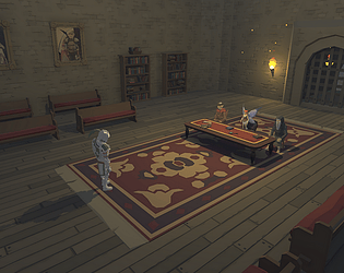
Thank you very much, I'm really glad both you and your brother enjoyed it! If you're interested in similar games (dialogue-wise), we're going to be releasing an english translation + content update for La Maldición del Cruce pretty soon (by the end of the month at the latest), and there's also You're Next which has the most writing I've done on a single game (and has an easter egg or two for people that played Blade of the Overlord).
Once again, thank you for playing! 😁
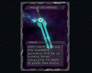
You're 100% right! I've been asking this question a lot and almost everyone keeps the card, despite (I believe) my bias for not keeping it showing in the text. I *did* try to balance the endings out as much as possible so that the one I don't like didn't feel like a "bad" ending, as a bit of an afterthought tbh, and in hindsight I'm really glad I did 😅
Thanks! We were reasonably satisfied with our ratings all things considered (I'm especially proud of the #4 in presentation), but it's still very rewarding to see how people that did actually play it had a good time and also saw the potential we have here - it's the main reason we decided to finish the game with a full version in the future instead of just fixing bugs and leaving it there.
Thanks so much for all the suggestions!
The idea for the tank controls were primarily to avoid any movement dissonance between camera angles - since there is a button that explicitly makes you move forward, you always know in what direction you're moving even if the camera angle changes. I do agree that it could do with refinement and maybe an alternate control method (I think point and click could work but it would also generate friction during chases so that would beed a bit of a rework), so it's something we're definitely going to think about in the future.
The keypad for Nick's room was a nod to his favorite game (Deus Ex) or more specifically the whole pantheon of immersive sims where the first lock is a variation of 451 / 0451, and where problems often have various possible solutions to them - in this case, finding an adequate window to smoke in the second floor could be solved either at Nick's bathroom window or through the balcony itself, and the other bathroom's door had two possible methods for opening it. The mention of Nick's favorite game was in passsing and we planned for someone else to refer to that again when spoken to so we'd also implement that in a further update, but regardless we made sure to keep it 100% optional and also "equivalent" content-wise to the rest of the second floor.
I also agree that the office area needs a rework - the trek through the corridors was supposed to feel super weird, as if you stepped into a place that's not quite an office for a bit, and hint you on how the Entity is starting to reach out and impact the "real world". We did rush it a bit so we're definitely going to give it another pass and think about how to empasize that mood further.
And yeah I'm still having a bit of trouble finding the character's unique voices when writing - I have a clear idea on how the characters are supposed to act and think but I still have trouble keeping it all in mind when actually writing the dialogue, but I'm going to keep your tips in mind! And also I do feel like the only way I can get better at it is by practicing so I guess this is just another step in the road. But I hope I can get there soon!
Once again, thanks so much for your time and all the suggestions! We're going to work on a "full" release in the future (probably at some point next year, maybe near spooky season) and I'd be stoked if you could give it another shot once it's done!
Thanks so much for the reply! I'm really glad to see that you engaged with the themes as much as you did, you picked up on all the important themes I wanted to convey. The concept, purpose and origin of the Entity shifted a lot during development because I was trying to make it fit in as best as I could with the actual ending. I'm pretty satisfied with the conclusion I reached with it (powered by fear, manifested physically by electricity) but there are some parts of the dialogue that could better reflect that direction so I'm definitely going to take your advice re: narrowing down the focus and setting up the actual ending a bit better thematically.
We're going to work on an updated version in the (relativaely near) future, taking all the great feedback we got into account, and it would be really cool if you could give it a spin whenever that happens! And again: thanks so much for taking the time to reply! If you have any other advice or feedback or anything else really then hit me up, I'd love to chat more as well!
Thank you SO MUCH for playing and for all the thoughtful feedback! I won't address all your observations because I agree with most of them, but some things that I'd like to add:
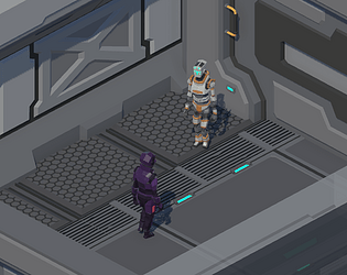
-We're still a small and new team so visually we're working with mostly pre-made assets modified to suit our purposes. Some examples: the model for Victoria didn't have a Freddy color pattern, the models for James and Sam didn't have blue and yellow colors, Nick didn't have a beard, etc. This also explains why Ollie looks more like an office worker than a college student, or why James looks older than the rest. Despite all this, I'm glad / relieved that the dissonance isn't larger and that it doesn't feel like an *blatant* asset flip.
-Design wise I really like the fixed camera angles for various reasons (mainly framing and blocking) but I do agree that the tank controls are janky and harder to parse than needed, and the camera system doesn't help a lot in that regard. Do you think that having cameras with fixed positions that follow you (like Silent Hill) would make navigation a bit easier? Ideally I'd like to figure out a way to keep the fixed angles in as many places as possible / where it makes sense, while adding and fixing the movement funcitonality in order to allow movement to be less frustrating.
-Also, do you think the mouse pointing would be an useful feature if it was better implemented? We kind of dropped that in the middle of development because it introduced a lot of extra jankiness and we preferred to use our time on content, but I made the prototype with that in mind so you could use your flashlight to point at specific things.
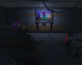
-A lot of things that might feel a bit extraneous to the plot are mostly references to our own previous work and/or other self referential stuff. For example: the al-juarisimi song in the jukebox is from a WIP game we're going to go back to at some point, which is also where the math drawings on the fridge are from. The beer actually exists irl, and it's homebrewed by some of my friends - I wanted to get them in there + poke fun on product placement in games (especially considering no one that doesn't live here can actually get their hands on a bottle). The arcade co-op game also exists, and is playable! We made it almost 10 years ago at a Global Game Jam with some of the team members, that was WAY before we started making games seriously so it's... not very good mechanically 😅 but we had a blast making it and playing it in front of the crowd back then. Also all the card game stuff is from another game I made this year in which I commissioned some of my pals, but we had such a great time working on it that we decided to just team up from here onwards, and here we are! There are some other references but I'm gonna be here all day if I point them all out haha
-The whole office area was a bit of a late implementation so it's a bit less content filled than the rest of the game but I've been thinking about how to make the whole eye fetch quest a bit more interesting - engaging. Do you think moving some diary entries there and / or adding more context about the fictional game company work (example: written notes from the employees) would be a good idea to make the exploring a bit more worthwhile? Also the long room with the single fixed camera was supposed to have something scary / funny at the end but again we prioritized other things above it. And yeah I definitely need to work on the AI following for Sam / James and the AI chasing for the killer.
As a final note I wanna say that I'm *really* into show-not-tell storytelling and I tried to apply that thought as much as possible (and I'm glad that the places where I did feel good!), but I'm still a bit new to writing dialogue and well, writing in general so again I'm very thankful for all your feedback. I'm very clear on where I want to get and how I'd like to tell stories, but I've got a lot to learn so I'm going to keep all this in mind for the future. I feel like I have a good idea on what things I want the player to know but how I get it across is the part where I need more practice in order to present it in an engaging way instead of just rambling on.
Once again: thanks so much for the detailed rundown, for playing so attentively and for taking time to leave all this feedback! Also I hope you'll stick around for when we eventually release an updated version 😁
I really liked the presentation! Audio in general (voice over in particular), the detail on all interactable items, the environments - it looks and feels very polished.
I seem to have encountered the same bug at the gears as other players - I couldn't interact with the second ladder, but I was able to exit the lighthouse, get on the boat and complete the game successfully. I also encountered a bug where, after being caught by the ghost with Estelle being exhausted / scared, her noises continued upon restarting and only stopped when I jumped. Apart from those small bugs, great work - congratulations to the team!
Thanks for playing, really glad you enjoyed it! We packed a ton of references and callbacks and little details and it's lovely to see that they manage to stand out :D
Also, no pressure but I would really appreciate thoughts about the writing and overall arc if you feel like sharing sometime!
I'm a novice writer and though I'm pretty confident about what I want to say and how I want to say it, I'm curious about how much of that I actually manage to get through, how it's interpreted, and what aspects of my writing could use more work. Only if you feel like it though, of course :)
Thanks for playing, glad you liked it!
Thanks for the feedback too - if you don't mind me asking, at what point did you feel the pacing started to slow down? We may put out another content update after the voting ends and it would be good to know what parts of the game we could focus on :D
I'm assuming around the office fetch quest but I might be wrong so I'd rather ask
Thanks for playing, glad you liked it! I tried to have fun and be as creative as possible within the single choice / action limit and I'm very satisfied with the result. However, I really appreciate the support - I think the game I just "finished" working on (You're Next) will be more satisfying for you :D
I'd suggest you wait until we update it first (we rushed a bit to meet the deadline and still need to fix some things), but it's still a complete experience from beginning to end as it is now.
Thanks for playing! I'm really glad you liked it, especially regarding the endings - one of them is (evidently imo) my preferred one and I was worried I wouldn't be able to make the other one compelling enough, so I'm relieved that it doesn't feel so one sided. And yeah animalese type voices are great 8)
Also, thanks for the info on the scene loading bug! I had been tinkering with a lot of things from the first release until now and at the last moment I made a VERY silly misclick that ended up not including the store scene in the web version - it's fixed now!


