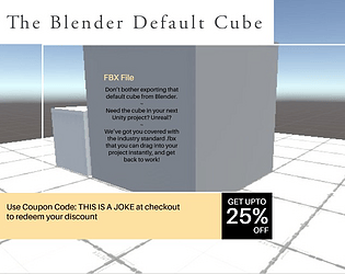
I'm not one of the moderators, so I might be wrong, but my understanding is that because they want us to upload our source files, we can't be uploading any files that we're not allowed to share with other people. So the things we get from Unreal free each month, we paid no money and got a license for, but we still can't share those assets with other devs, so they're not something we can upload in source files either.
Edit: You're right, they didn't say we have to upload the source files this year; that's great, it felt like an outdated step that probably made sense in the early days of game jams but always just added extra steps to an already stressful time period.
Noah Wizard
Creator of
Recent community posts
That's totally fair. The music is basically placeholder music because I knew I was going to spend a lot more time than I wanted to on bug-fixing. Even though this is a really simple game, there were some beginner-level problems in the UI that totally blocked me, and used up a lot of the time I had; no time to make the music better, and I'm with you: I firmly believe the player deserves better music than I have to offer in this build.
Definitely! Having some really simple animations on each continent was my original design. A friend of mine talked me into making a more simplified version for the jam, to make sure that I finish, Honestly, I might not have gotten done in time if I had tried the animations, but they would be the very next step if I were continuing with this project!
[Video Contains Spoilers. The Game is a very short exploration game searching for 5 objects. When you know where they are, the game takes only a few minutes to beat. But if you have no intention of playing the game, you might enjoy this 3 minute video. The music changes every time you pick up one of the items.]
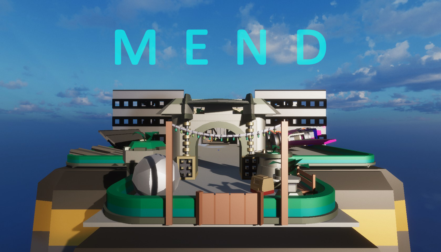
Game Dev Unlocked just had a 7 Day Game Launch Challenge, it was a course focused on getting your first game done and launched.
A lot of the curriculum was about thinking small, creating a space for someone to explore in a single sitting.
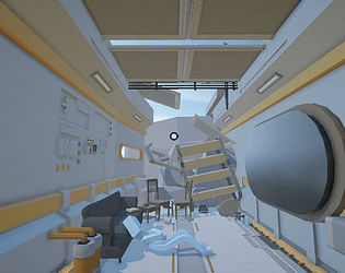
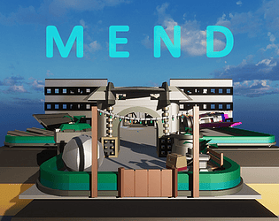
The plan was: use the Unity Asset Store to get free objects and set pieces and put them into your game, and just keep them all low-poly to make them work together. But I really felt like I wasn't able to express myself that way. Luckily a day or two into the challenge, I remembered that I had Asset Forge (which I bought on itch.io*) and I remembered that I loved the way my work looked in Asset Forge! The landing platform and the spaceship I already had made from last year, so that saved me some time; I just had to find ways to make them fit with the industrial corridor I built.
So much of the time was focused on technical difficulties, with one plugin not speaking to another, error here or there, etc. But there was never any problem with the Asset Forge stuff. It was the most fun part! Anytime I needed some new prop or something, I'd pop over to Asset Forge, smash a few things together, and export it back to Unity and I was able to keep working right away. It's everything I hoped it would be.
Heck, if I understood all the technical aspects of making a game, I'd have been using it in Unity last year when I bought Asset Forge! Though, really, I didn't appreciate the value of making short, exploration games until David at Game Dev Unlocked made the course focusing in on the validity of these short games. He kept talking about how you're offering someone a world to enter for a short time, one that didn't exist for them before; it's worth it.

If you want to play the game, it's on this itch page to download. I'm pretty sure it's windows/pc only.
Thanks for checking it out!
-Noah Wizard

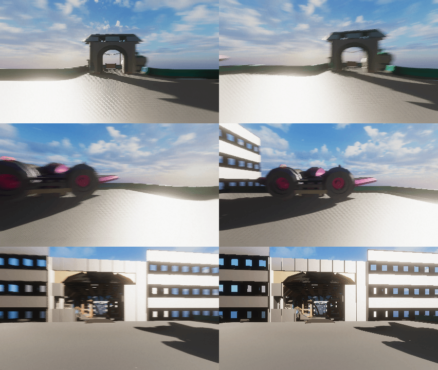
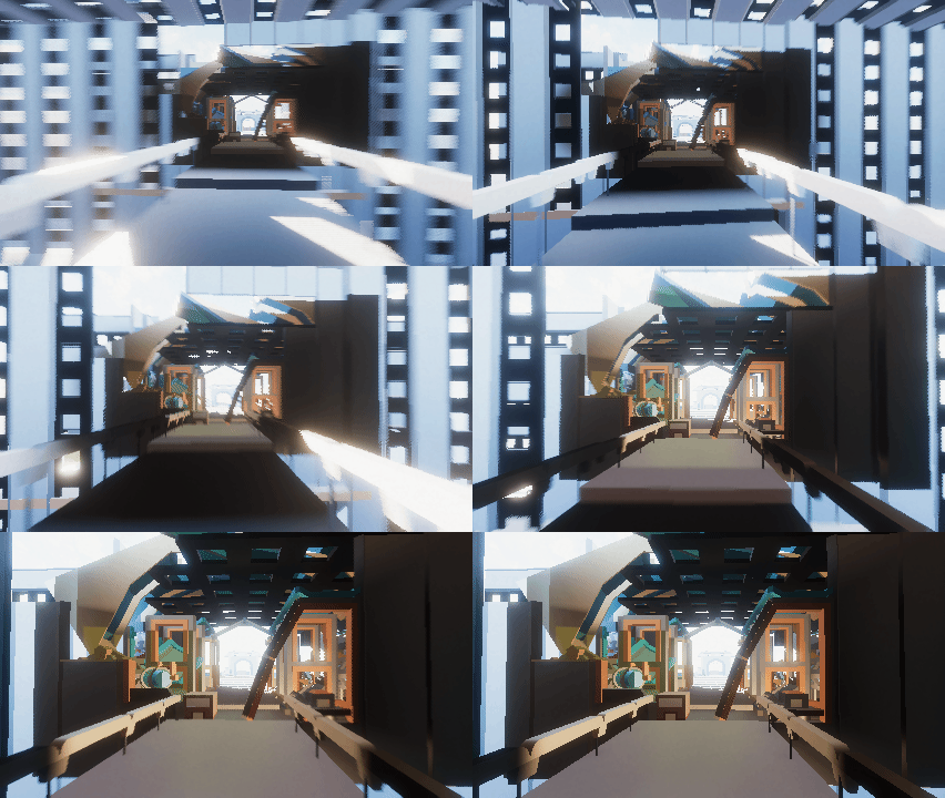
Game Dev Unlocked just had a 7 Day Game Launch Challenge, it was a course focused on getting your first game done and launched.
A lot of the curriculum was about thinking small, creating a space for someone to explore in a single sitting.
The plan was: use the Unity Asset Store to get free objects and set pieces and put them into your game, and just keep them all low-poly to make them work together. But I really felt like I wasn't able to express myself that way. Luckily a day or two into the challenge, I remembered that I had Asset Forge, and that I loved the way my work looked in Asset Forge! The landing platform and the spaceship I already had made from last year, so that saved me some time; I just had to find ways to make them fit with the industrial corridor I built.
So much of the time was focused on technical difficulties, with one plugin not speaking to another, error here or there, etc. But there was never any problem with the Asset Forge stuff. It was the most fun part! Anytime I needed some new prop or something, I'd pop over to Asset Forge, smash a few things together, and export it back to Unity and I was able to keep working right away. It's everything I hoped it would be.
Heck, if I understood all the technical aspects of making a game, I'd have been using it in Unity last year when I bought Asset Forge! Though, really, I didn't appreciate the value of making short, exploration games until David at Game Dev Unlocked made the course focusing in on the validity of these short games. He kept talking about how you're offering someone a world to enter for a short time, one that didn't exist for them before; it's worth it.
If you want to play the game, it's on this itch page to download. I'm pretty sure it's windows/pc only.
Thanks for checking it out!
-Noah Wizard
This is some of the tightest game design I have seen so far.
The fact that the entire game only requires 2 buttons was immediately interesting. I've never seen a side-scroller game that was about crafting, that's really cool, and I can see that solving some game design problems in the future with my own stuff.
The way you used the game's system for the credits/replay was so impressive. Instead of making something secondary, like a pop-up or a text scroll, you had us walk left or right, just as we had been doing. That's classy.
And the attention to detail in the animations was charming. The way the food items dance to the music, but more than that- the way the butter and the butter slice dance in opposite directions? I loved it. And the milk, the way it sloshes, with an economical two frame animation while you're walking, back and forth; it made me realize how valuable such a simple animation could be to the overall feeling of immersion.
The color palette was focused, something I find very difficult to do, and it created such a sense of unity within the game, gave it the feeling that this was a finished, whole product.
And I appreciate anybody who makes a happy character like this, especially now, the world as it is. This character is SO happy, and light hearted, and even for the 5 minutes I played this game, it was a welcome change of pace from the moods of the people I run into most of the time these days. The smile, the floppy hat, the way the character has this plucky walk, all of it combined to a memorable experience I will cherish.
This is the kind of game I want to show to people.
I have never seen embroidery used for a game before, that that is so cool. I've seen a few games use clay or paper, but using thread gave it a look all its own.
I originally clicked to see this game for the monster/character designs, but now this is probably the most memorable game I've seen all year. Cheers to ya
We don't know each other, so, I hope this doesn't come across overly personal.
I admire what you tried to accomplish. Plenty of people want to make a game and never start, but you at least attempted to bring your project into reality. And it got as far as physically printed cards, how cool is that?
You said this project is abandoned, and I get why you'd say it like that, but for a solo-developer, in a way, because a project is just a never-ending onslaught of problems to solve, to spend 4 years on it, is 4 years that your project undoubtedly made you smarter. Smarter at coming up with solutions, smarter at marshaling your resources, smarter at seeing problems coming so you can make corrections.
Project or no project, abandoned or not, you're an example for us all, to go out and try and see what we can do.
i'm literally procrastinating on my project right now to read this, because i'm paralyzed that the thing i make will not live up to the thing in my head and I can't face seeing what I do create. so thank you for writing this-- not as a distraction, but as a reminder that i'm not the only one facing this. it really does help. the emotional journey of making games is, for me at least, the harder part; the actual making-stuff is almost easy 😅
This is a great use of the Visual Novel format.
Often, visual novels are stressful because they are about making choices that you don't know what the outcome will be, but in this case, the stress was the point of the game, so it worked really well.
This is a great example of a game, that makes people feel something and makes people think, and it did it with these great little sets. Your other game, Long Gone Days, is visually amazing with these huge sets, and it's beautiful, so it's amazing to see that you are able to convey a game world with such smaller sets too. That's masterful.
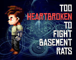
thank you yeah, I definitely had to cut the storytelling to make sure I published the game on time, and I've gotten that same comment from another one of my testers, that it creates this world but doesn't explain enough of the main character
Definitely moving forward, now that I've created this system where you are collecting your MP, in the future, the workload I would focus much more on setting the stage and creating other characters to interact with so that a full story emerges, instead of what I had which was a pretty vague hint of a story.
Also thank you for finding the dumpster; it was a late addition to the game, and I completely forgot to set it to have a collider, so that's something I can fix


