Pretty cool!
Here's my masterpiece:

There's a purpose for making the player run into the bear early, so that the player knew there was a strong enemy that they could defeat later after they were a bit stronger, but I should probably have added a warning that that room was dangerous so the player could at least have some agency on the matter.
Those are good points about the layout, will do.
Thanks for the feedback and thank you for playing my game!

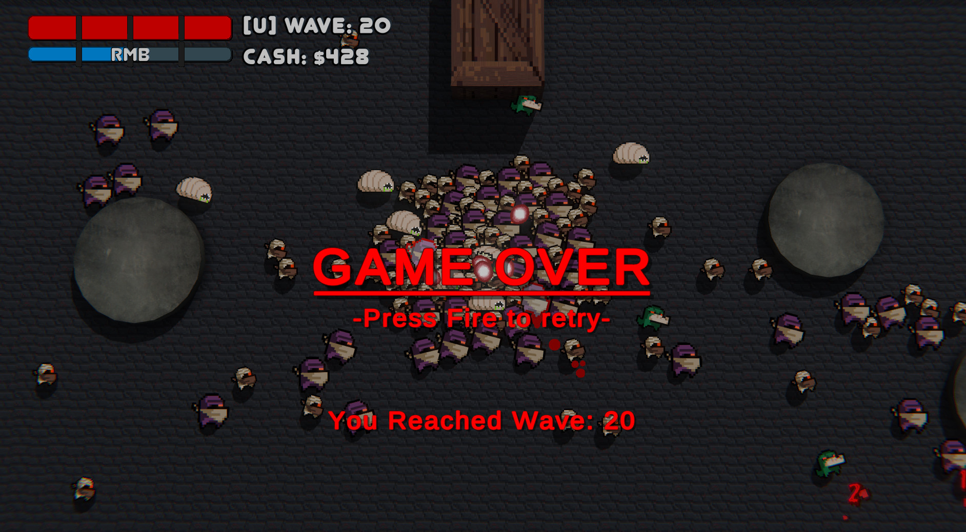
Playing on Ultra. Previously I was playing double waves and level 12 was as far as I got. Since you asked about the difficulty I did double waves until about wave 12 then did 1 by one and got to level 20 before I died to some dumb mistakes, Katana wielding Mini-Arker, 3 mortar turrets and 1 fireball
It plays as I'd expect, really hard but fair. Double waves are much more difficult than single ones the balls are the hardest enemy
It's fun I played for some hours, only the hardest mode with Katana.
My complaint which is more of a personal opinion rather than objective criticism is about the power up system.
You get forced to choose between a selection at the start but personally I only like some types of weapon so I ended up killing myself until I got one of the weapons I enjoyed playing. The increasing upgrade cost makes it a major disadvantage to switch to a different weapon after you've picked one.
My suggestions are towards allowing the player more freedom to choose a specific weapon or build. They are one of the following, from simple to ideas that could change how the game is played:
Other things I'd like to mention is that I found the repair +/-% a bit confusing. I'm not quite sure whether +repair (as in turret repairs more) is good or -repair is good (as in turret needs less repair)
And I don't understand why, on the first level: I get a free turret+turret upgrade is within budget but player upgrade is out of budget
As far as I can tell you're handicapping yourself by not picking the turret and it takes more skill so I'd allow the player on the first level to choose between a weapon and forgo the turret (or the upgrade) if they feel like going turret-less just for the fun of it.
Edit: Oh I almost forgot. Esc pauses/unpauses the game but it's also the shortcut in the browser to leave fullscreen.
That means that when you pause the game with Esc you exit fullscreen and it becomes impossible to get into fullscreen and unpause the game because the browser will exit fullscreen when you press esc to unpause. So you need to unpause the game and switch to fullcreen with the game unpaused, which can be a problem if you're in the heat of combat.
This can be fixed simply by providing a clickable button to unpause the game or changing the pause key from Esc.
Assuming it isn't being blocked by defender my guess is that some graphical requirement isn't being met.
I haven't set up a system to log errors to a file so it would be hard to diagnose the problem.
I will try to set a log system up the next time so I can find out what's wrong if the game fails to start.
This type of feedback is important too.
Thanks for trying to play my game!
Thanks for playing my game!
Don't want to sound too critical but it's hard to give feedback about something like this since I'm sure everything is a work in progress and liable to change completely, right? But I'll try.I completely understand
What is up with the weird f in the font in the menu? What's the DEAL with that? (locale issues probably)
I have yet to look into it and figure it out. I suspect it has to do with fi (f+i) ligatures not displaying correctly. I might be a problem on my code or on the code of the third-party GUI library I'm using (It is also a work in progress)
the actual flow of the combat in the interface is confusing. The fact that your team and the enemy team are in the same list of targets doesn't help.
Noted, I will work on a better interface
Thank you for playing my game!
Changes for DD51:
Note: During combat the battler models will spawn on the middle of the room and the camera will not follow them, if you want to see them you need to be looking towards the middle of the room before the combat starts—Later this will be changed and you will transported to a different scene during combat.
At the moment all battlers use the same model, please excuse.
If you download it from the website Windows Defender will probably warn about it being an unrecognized app, from there you can click in "More Info" then "Run Anyway" to run the game. I've been told this can be avoided by installing the game through the Itch.io app ( https://itch.io/app ), if you want.
Only a Windows version is provided this DD51.
Yes, you seem to have downloaded one of the previous demos. That's feedback too, I will make it clearer, maybe hide old demos.
Getting out of bounds is intentional for the prototype as long as you have clipped through the ceiling and not one of the walls. (I just thought it was funner to leave it in than having nothing to do, like an easter egg but since no one pointed it out before you might be the first to have found it) The actual game probably won't have jumping so this won't be a problem. If you clipped through a wall rather than the ceiling then it's in fact a bug.
Thanks for playing my game!
It linked ha ha ha!
This demo was intended to have a combat prototype and it was working on Linux but unfortunately when making the Windows build the mouse interaction with the UI elements didn't work, rendering the main menu and combat unusable. I will need to investigate why.
For this reason there's not much to do in this demo, it's just the classroom scene and you can walk in it
You can check can see the content of this entry in this video made by a crustacean:
The graphics are simple but I like the colored enemies mechanic, and having little bits of lore drop from enemies is always fun.
It's a bit annoying when enemies die near the bottom of the screen and you have no way to pick up the gems but maybe just gotta deal with it.
My best survival time was 8m45s
I have no experience with text adventures, so it was extra hard for me to play but at least I knew that they're usually played using commands in the "[action] [target]" form. I know you said there was no tutorial but I tried a "help" command nevertheless.
I found myself in a situation in which I knew very little about, and had no clear goal so I was lost. I didn't know where to direct my actions.
The first thing I tried to do was "say hi to locals" but they were pretty rude and didn't reply.
Then I tried "ask locals about [boat, hovercraft, destination, coup, cancellation, construction, aloana, helm, side], since there were two of them I tried to target them individually but I couldn't find a way to address them. Then I tried to "examine [jungle, river, fog]", "use [helm, propeller]", and finally I tried to find out what I was supposed to be doing by "examine self".
Then decide to look at the screenshots for clues and I found out I should have been moving using cardinal directions, which didn't occur to me since I was in a boat which isn't operated by me but now I could play and the game flowed from that point onward. A sudden wall of text unrelated to what I was doing had me thinking I had run into a bug before I realized what was going on.
It was nice, the way the story is presented is interesting and mysterious, and I like the setting. As far as I can tell with no text adventure experience, it works nicely mechanics wise.
I managed to win the game, but with 0 out of 3 points, although I don't know what that means.
I know you couldn't do it because of the time but some more directions at the start would have helped, maybe make those crewmen just a little more chatty or maybe just some hints in the descriptions letting me know I should be moving in directions rather than messing with the boat and crew.
Thank you for playing my game! Sorry for taking so long to reply.
Those are good points you bring up, I will fix them.
I'm hoping to have graphics by the next demo day, and if I can't do it, then at least an item system in the combat prototype, for health recovery items and the like.
Although the characters are not well defined since I don't have a defined story yet, I do have some ideas of what they're like and when more system implemented we may get to know the characters together.
By the way I love the treasure chest backpack the character has in your game.
Thanks for playing! That is good feedback, I've reuploaded the game with some changes based on it.
I've added an idle dancing (made using the MeMeMe dance frames).
I've also removed the key hints from hard mode because I don't want players looking at the title bar (sorry). They are still shown in easy mode.
My impressions:
Conclusion:
It's ok, think that with better balancing of the game pace/obstacles/firepower it could be a great game.

I didn't have much time to work on it but I tried to address the critique I've received the last time.
Changes for DD43:
Good feedback. I will keep all that in mind when making the next version. In special the point about giving instructions in-game since everyone had trouble with that.
The window closing is an oversight. There's actually a win/lose message but since the window closes, you never get the time to see it. Will fix.
Thanks for playing!