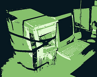
I shit and cum. I wish pizza were real.
Lars, The Dude
Creator of
Recent community posts
Ah no shame and hope no hard feelings, you understand. Maybe try to take a few style cues or talk with him about finding a way to make the styles a little more cohesive (not talking down, just two cents as a fellow dev and pixel artist.) The vibe was great and the puzzles fair but fun. Have you considered experimenting with Adventure Game Studio (AGS) for any future adventure game projects? It's very robust and I enjoy it quite a bit. Either way, cheers and keep up the good work, very excited to see what Chapter 3 has to offer.
I definitely can see the love of Disco Elysium, and as a huge fan and Raphael Ambrosius Costeau enjoyer, I had to give it a go.
Overall, fairly enjoyable for a bite size homage. Originally I felt it was gonna be a beat-for-beat thing (which is fine!) But I liked the little twist to it you brought along.
I was a bit unsatisfied with the ending, but as an aesthetic experience and lil' bite sized tribute to my actual favorite game ever, I had a good time.
I always appreciate nonstandard gameplay setup or mechanics for the expanding the vision of what you wanted to do. Although my wrist hurt by the end, I still liked the atmosphere. I understand this was a game jam but some thing I'd do differently or add:
1 - the computer terminal part was cool, if the game was longer it would be neat to see it used more.
2- "zombies" stop chasing after a certain distance
3 - an "easy" more with slower zombies and a bit more health
4- a "look" key one can hold down to look farther (think Hotline Miami)
however I'm gonna be honest: jumpscares are f-ing lazy nonsense and just ruin tenseness in horror games, for real. Took my enjoyment of the game down a few points.
Overall, for a game jam game it is very creative and quality and pretty spooky. However, it needs some quality of life improvements if it was a fuller game (and please ditch the jumpscares!)
This was such an awesome game. I went in very low low expectations, honestly. "Oh, a first person 'PS1' style horror game. Looks like a plain 'walking sim,' too." Also, obviously being inspired by the Loveland Frog cryptid, that didn't help (kind of the goofiest cryptid.)
However I was so impressed. The spooks and scares were very slow and immersive. Turning on stoves, TVs, sinks... they're little and don't add to "gameplay," but when they're in games they're a treat. But it got me more "into" the environment. I had a little "oh dang" moment when I could walk through the the swings and they rattled. Honestly you never see stuff like this in indie games of this style.
And that made the scares even more engaging. It wasn't the unraveling of the plot through "notes," but the creeping realization of what's happening. And the SOUND DESIGN. Again, you don't get great horror sound design in a lot of indie horror, and I find that for me is what elevates a horror game.
There never really any cheap jump scares. No "ARGH" scary JPEG. They felt earned and not really childish.
(SPOILERS FOR PUZZLES BELOW)
My main criticism is the puzzles and pacing. The puzzles themselves were simple, but the layout of the levels made it hard to figure out what to do. I was wandering for a good while a lot going "where the fuck is that key?" I starting getting into the equivalent of "rub all items on the puzzle" in point and click games. It did kill the pacing a bit which got in the way of the spooks. A solution to that would be more clear labeling of puzzle items. Not leaving them in the path, but better positioned so they're less easily missed. The key left on the broken windowsill was very annoying. Keep in mind where the player may be moving or looking. I think the game may be too dark, and the trailer park is a bit awkwardly laid out. For the full game, I suggest working with environmental lighting and layout for puzzles, not only to lessen frustration in puzzles but keep the pace to make it scarier.
Also, you could sometimes grab things through walls or tables, FYI.
So, in short, I was blown away. The use of sound design and earned spooks made the game very immersive and the story and spooks weren't spoon fed. The main issue is the awkward key-finding and darkness which added some frustration. But my heart was beating a good bit, and it wasn't my hypertension.
helpme helpme helpme helpme helpme helpme helpme helpme


