They are designed to work with 16x16 tiles.
Each character fits 16x16 in their idle state, with the exception of the orc and troll which are a bit taller.
During other animations they exceed 16x16 where necessary.
Pita
Creator of
Recent community posts
Going over the license once more has been on my to-do list, and I'm open to feedback. Feel free to let me know what aspects you find too restrictive, or would prevent you from doing what you want, by email: pita.madgwick@gmail.com
Apologies for a very delayed response. I've just opened up space for commissions for the next month or so. If you or any others have any requests please contact me at pita.madgwick@gmail.com
The mountains weren't built with rule tiles (in Unity?) in mind, and don't follow a typical construction pattern. It may very well be possible to set them up in rule tiles, but that's out of my expertise.
You can see how I go about constructing the mountains in the documentation. It may give some ideas on how to go about automating their construction.
I don't, sorry. I didn't restrict myself to a set palette when I created these resources, so the palette quickly expanded as I worked and it's not particularly organised or useful. If you wish to expand on these assets I recommend just reusing colours where possible.
I believe my starting point was DawnBringer's 32 colour palette, although I used this very loosely and added/changed colours when it suited my needs.
Hi Joe,
Thank you for kind words!
I haven't forgotten about this series, but I also don't want to make empty promises about future packs. I would recommend that you, or any other users needing extensions to the packs, treat these resources as-is and make any extensions you need by your own means.
Sorry for being vague! & best of luck with your dissertation!
Hello, I sell this asset on the Unity asset store here:
https://assetstore.unity.com/packages/2d/environments/overworld-tileset-123120
I believe they may support Alipay.
(unfortunately I don't have my other packages available on that storefront)
I don't have a specific palette, and I'm afraid I don't have a great method for selecting one. You might have better luck posting your work to a website like Pixel Joint or Pixelation.org for specific critique on what you're working on (or to just discuss pixel art in general).
I'm probably not the person to ask since I never had the patience to study colour at depth. My sense of colour has been slow to develop and what I know has just been slowly absorbed over many years (and I still have much to learn!)
I didn't use a standard autotile pattern as the framework to design these tiles, although I think it's possible to arrive at this solution coming from that angle.
The core of this tile pattern for me is the line of the peaks running north to south (or north west to south east) that separates the lit and in-shadow areas of the mountain, and then working out from there.
I didn't invent this, though. I had done some studies of the mountains used in the Fire Emblem series some years back, so I knew this structure worked quite well from that.
As for rendering, I forget my exact inspirations, but I was going for a soft look with these. Three reasons: so characters can be placed on top of them and be easily readable (for SRPGs), help sell the scale, and because I liked it at the time.
This comment section is already very cluttered, so forgive me if I don't go into details for rendering tips.
Hi BearNovels,
Thanks for your support and kind comments.
New packs are a low priority for me right now as I have my hands full on other things. That may change at any moment, but for now I have no plans for a new pack any time soon.
Similarly, as of writing this post, I'm not available for taking on commissions.
Hi Ryan,
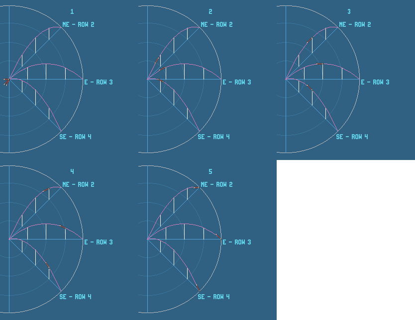
The arrow frames aren't really designed as an animation to be played start to finish, but are rather trying to cover as many angles the arrow could be facing during flight. I would select which frame to use depending on the direction of the arrow.
I failed to explain this in the package. Sorry about that.
Here is a demonstration of the angles each frames is roughly trying to cover:
You can pretty decently cover a variety of arcs with these frames, but for straight shots you probably only need frame 3.
I'm not a great programmer by any stretch of the imagination, so it's probably for the best if I didn't give any advice on how to implement this. One thing I can recommend trying is adjusting the anchor points of each frame to the arrow head.
Very cool, phoboz. I love to see people developing for old consoles and want to try my hand at it one day myself.
I don't want to rule out future monster packs, but it isn't a priority for me right now.
If/when I make more monster packs, they'll be at the same scale as this pack so that they can be used together in the same project.
Hi Aganierm. The 2-corner wang sets in this asset pack have been set up as terrains in the Tiled tileset file. Back when I created this tileset (2018! Yikes, time flies) I found it much easier to paint maps using Tiled's terrain feature over their wang set feature, and at the time it seemed to me like Tiled's wang set feature was mainly focused on flood filling maps with a variety of tiles, not what I was using them for.
It can be done, though. You might find some use in setting up the 2-edge sets, like the paths and rivers, since those don't fit into Tiled's terrain feature. Personally I still find it easier to hand place these tiles.
My documentation isn't specific to any program, so you won't find any help in there for setting it up. Here's a screenshot of how I just did it: https://imgur.com/a/UGoo7cH
Hope that helps.
Hi! Glad you're enjoying the assets.
Re: the missing animated tiles. It isn't a mistake that animations haven't been set up for those tiles, as they're simple rotations of the other tiles. Since the tile palette in unity supports rotations, I could reduce the amount of busy-work setting the tiles and animations up in Unity by omitting those. I can imagine changing the anchor points messed up the position of the rotated tiles. Best case: I think you should be able to fix it by just giving those particular tiles in the palette some position offsets?
If rotating is a no-go for your project for whatever reason, unfortunate answer is that you may have to set up the animations for each of them (which was very tedious, hopefully you'll be spared that). The tiles are all there in the spritesheets folder, but I believe I only 'sliced' what was necessary, so that would be the first step.
Disclaimer: I'm not a user of Unity myself, and I haven't kept up with any changes to Unity that may have happened since I created the package. There may be a better solution.
I'm not an expert with Unity by any means, and haven't used Unity for a long time. I'd recommend asking the Unity community about this.
There shouldn't be any offsets you need to make (the tiles are all aligned correctly), however there are issues with the 2D tile system in Unity and tearing, which might be what you're encountering. Again, I'm not an expert in Unity, so I'd recommend asking there about these problems.
I don't intend to make a unity package for this (or the Dungeon set). I don't know much about Unity so don't feel particularly comfortable giving specific advice about it. From memory, when I setting up the Overworld tileset for Unity I followed the instructions in the manual (here) and a blog post on the Unity blog (here). Things may have changed in Unity since that blog post and since I made that package. A quick search of 'unity tilemap' on youtube brings up more than a few more recent tutorials, so I'd probably start there.
Sorry I can't help more!
16 tiles.
Terrains cover the 16 tiles described here: 2-corner Wang Tiles
Walls, fences, hedges use these 16 tiles: 2-edge Wang Tiles
The water tiles from the overworld tileset won't be compatible straight away. However, with some small tweaks to the grass colour, they could fit fairly easily.
It wouldn't be perfect -- that tileset was a drawn to a different scale than these so there are some minor style differences -- but I think they could do the job.
There are three main issues from memory (I'm not well-versed in RPG Maker):
- These aren't in the format that RPG Maker VX Ace accepts, so you'll need to shift things around so they fit how VX Ace wants them.
- These are 16x16 pixel tiles. RPG Maker VX Ace uses 32x32 pixel tiles I think. You could double the size of the tiles to make them fit, but they'll have bigger pixels than everything else assuming they also haven't been doubled.
- I believe the auto-tiling that RPG Maker uses is not that same format that I've used here, so you will have to do some editing if you want to use the auto-tiling terrains in RPG Maker.