Why, what the point of hiding specific GDD?
You could at least do some pitch to show how well presented your "worlds".
Prudentibus
Creator of
Recent community posts
I can be Game Designer and semi programmer. I was been in one Game Jam as a Game Designer.
YES, I'M LOOKING FOR A TEAM WHEN THERE 15H LEFT.
Discord:
apokalipcic2012
Portfolio:
https://linktr.ee/prudentibus
Or straight up google play:
https://play.google.com/store/apps/developer?id=Prudentibus
Idea is interesting and very unique, but damn. There is only one way to use split screen is to share playable character with another person, or else it's creating visual destruction or worse sensory overload.
I think another way of doing so, is to change game modes, where you control the fly and the blackhole, or even funnier is to show them on one screen one overlapping another and showing some sort of a butterfly effect.
Bro, scale your UI.
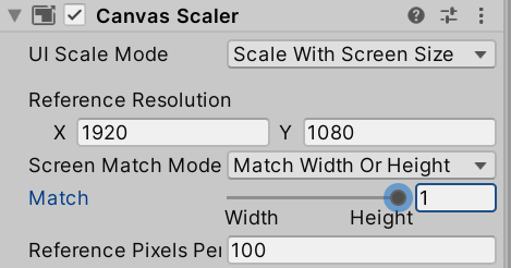
Also, IMO: the attack button should be SPACE - since it's the largest and attack is the most important action.
But the progress is going, keep it up.
Also, I think you used Rigidbody2D for arrows? You need only one rigidbody to register the collision, also you could use OnTrigger to avoid any "Pushing" and you could exclude layers to prevent from touching unintended content.
Idea is interesting, the art is amazing, the music is repetative.
BUT I didn't know what to do even after reading the tutorial, I was thinking I'm doing everything right, since the box is rotating.
I think, it would be nice, if you forbid to rotate when it's not on the plate, and you would HIGHLIGHT the plates in a way, so the PLAYER would like to press on it.
Also brother has more chance to loose, because his candies launches directly in his sister plate lol
I don't think it's really your problem, since you cannot really control every device sound volume, but in future keep track of the sound in your game on general level, so all your games would eventually have basic level of sound. At least for the start it would be nice.
Yes, dash might have 1 second CD, but it feel not intuitive when it performs dash because your pressed it 1sec before.
Just remove register event while it's CD. Or if you want to give a buffer opportunity, give it as last milliseconds.
Not a master designer, but I really don't like the font :)
Also why did you put back to Main Menu in the middle of the screen after loosing? Especially when you have the Shop in it. Put Restart button at the middle in the focus of the player.
And it's way too hard to control the boat at start. Could really progress pass 9$ lol
Dash has lag input, especially if you pressing it twice.
Music is nice.
Animation is okay, but great way of visually showing the change and action! You could decrease size or change the color of the damaged enemies to visually repesetn how many HP they have left.
Also Music Level is way too loud when I first turn it on, and there is no option for mutting it, sad.
I like the creative way of the game. As I understood you have little knowledge on how to work with Godot, so you came up with solution with your limitations, and it's great! You could change Godot Icon with pixeled cube with two black dots and get your character!
Then you could add randomly spawned white dots or apple icons to feed your same size characters, so it would unique behaviour.
Only thing that would be better at this stage is movement with the mouse instead of just WASD.
I'm sorry, is your game page color pallete broken? I literally cannot read anything on it.
About the game:
The style is nice and simple
- Idea is interesting, and goes well with the scale, but only from challenge perspective, not from character progression;
- I don't really like how the fist controller by, it's clunky and not intuitive. Try the mouse control.
I thought about, imagine creating snake like game using this principle?
So we already kinda could have basic mechanics : connections and following.
Only thing there would be need to add is restriction on map movement.
And we could add jump mechanics, where they jump one after another to avoid some obstacles?
What you think?


