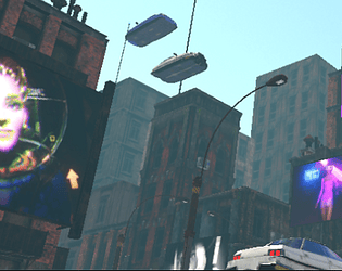
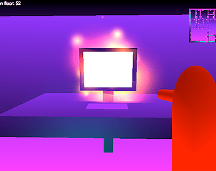
Yep, still working on it, but progress has been slow. I got gummed up in my action sequence so I'm skipping ahead to work on a separate story sequence that may end up coming first anyway. I also have been stressed out trying to find income so that I can pay my bills and continue developing. Got another interview this morning, wish me luck! :>
PushyPixels
Creator of
Recent community posts
Aww that's wonderful. I got real sidetracked but I really want to do a new recording session and get some more content in. I have all the pieces I need now to make chapter/phase 3 (Dactyl Nightmares) and I think I'm going to basically do that first before phase 2 (What an Exciting Time We Had). I may re-order things later but it might make more sense for it to come first anyway; the main reason I had pushed it out was it required some assets I didn't have at the time but I've since collected them so now it's just down to me actually building out the scenario, and making a couple creatures...
The reason I'm punting on phase 2 is because it involves a bit of movement tech and interface tech that I got a bit jammed up by; I figured it would be easier to make the action sequence as conceptually, it's quite simple. But even simple action in VR can be very difficult to get to feel right. Maybe especially when it's simple. Still learning a lot about the medium. I have several projects running at once always so that I can move between things and the lessons I learn on one project help on the others, and there's some jams that I've pressed through, but I think jumping "ahead" on the plan and cherry picking may help me with getting a proper content update done.
Making games is surprisingly hard work at times and I want to thank you for your interest and your patience. :>
I really hope it becomes apparent when you get one. It's strange. The grey space it takes you to specifically is the one you see when you hold the power button where it displays the Restart/Turn off menu, but no menus or information. It may also be the same background used for the permission request screens.
Hey, thank you so much for playing!
There's definitely audio in the game, and in fact all of the story content so far relies on it; what type of VR headset are you running?
The monitor is interactive, and some trash. Specifically cigarettes, cigarette boxes, forks (save for the ones on the food cart for now), and trash bags are all physically interactive. That monitor also was trying to talk to you the whole time, haha.
I love your ideas and I hope to take part of the game in that direction. I have some lofty goals regarding doing stuff that isn't really the norm in VR anymore, like jumping from car to car, so we'll see if I can figure a way to make it smooth and functional.
Finally got around to trying your new hand tracking. It's really wonderful. I found it rather striking how much freeing my hands from the controllers peeled one more layer of abstraction from the experience. Shooting and fighting were, of course, not as good as on controllers, and grabbing can be sticky, and the waist inventory may have to move for the purpose of camera angle. Still, I am probably going to be playing with hand tracking more often than not for now, as I typically play with passive enemies anyway, and button pushing feels particularly good.
Sorry couldn't resist. How is everyone doing? I'm getting my toolchain back up-to-snuff right now but my intent is to attempt to recreate a kind of visual style that I prototyped in this video a while back.
https://www.dropbox.com/s/dypltxtf9crlnik/NewStyleLogo.mp4?dl=0
Note that this is kind of a mix of a 70's filmic aesthetic and 80's CG, I'll be attempting to make something more wonderfully pixeley/arcady for this jam.


