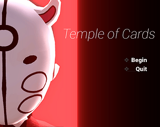
I beat the game yesterday and was hoping the comment section would be open here to talk about it, but I guess I'll post here instead (if you'd rather not have this type of discussion on your game page feel free to delete it).
I basically spent a little under 3 hours yesterday going through this, and if nothing else, I'd just like to leave my thoughts here, from someone that kinda grew up on RPG Maker.
As a first RPGM game, this is good, it's always fun seeing people customizing enough of the game to make it look original, and the art here really is fun. The worst thing I can think of, considering this is a first attempt, is certainly the guide book item in the inventory. It's quite confusing, and should honestly just have been a bit better explained, I forgot what every status ailment was in the exact moment I closed that window =P.
But the ideas are there and the drive to make something original as well, you clearly thought about the battle system, and how to make it distinctive, and all the form stuff is fun too (that changing animation is way too long though, lol).
The general narrative has a real "first RPGM game" vibe to it lol. It's hard to describe, but things like the first scene being a pretty shallow philosophical moment, one of the first NPCs breaking the forth wall by recognising the dialogue box, the odd dry humor, collecting the four two elemental crystals, etc. That might come off as a bit mean, but take it almost as a rite of passage, we've all been there. Also, being inspired by the first Dragon Quest, this feels almost intentional, like the quintessencial RPGM narrative told in its simplest forms. I would also disagree with your assessment of DQI not being super influential, and that DQII is the one that really inspired people, but I digress, let's go back to your game.
A couple of tips is that the sense of pacing in cutscenes is a bit off, and you close the dialogue box to wait for a few seconds before showing the next dialogue, which always makes it uncomfortable because I kept thinking it was over, only to have my character still stuck in place. There's a command you can type in the dialogue box to have it hang there for a couple of seconds without closing it, and that helps inform the player the cutscene is not over yet. But I really enjoy how you never have a text dump in the game, like every dialogue was thought out, and edited to be shorter, and it works really well. I don't think I was ever at a loss with the narrative either.
Battle animations look like you had fun making them (A+ on that healing animation), but some of them go on for too long (the "thousand little punches" or however it was called was pain everytime an enemy used it).
That being said, allow me to turn heel a bit, and say that, if I was to criticize this just as a game (instead of someone's first RPGM game), I would be way way harsher.
The graphics are not very legible, not only from the sprite work (collage work? idk what you'd call this technique) but from contrast as well. An NPC told me about a robot at the abandoned factory, and I crossed that entire place twice, and never saw something that looked like a robot there. If there wasn't a dialogue prompt telling me the little icon on the left of the first island was a crossbow, I would have never found it, etc etc. The world map is also really boring, its literally a bunch of rectangles connected by some lines.
The game is about 3 hours long and it still had me grinding, which is never fun. First NPC I talk to? Grind 3 hard to drop items from a common enemy or 3 common drop items from a rare enemy... Awesome. I think I was level 12 by the time I left the first island, just trying to grind out the 3 carrots. Second town, same thing, after all that grind I barely had enough money for the two cheapest items there.
Halfway through the game I bought the berserker item and the muscle ring, I equipped them on the strongman form and for the rest of the game the battles became just literally holding down the enter key, I couldn't even be creative if I wanted, since the berserker item locks my skills, it's like the game gave me an overpowered build at the expense of fun. No enemy could deal with this either. You clearly thought about the skills and equipment in the game, but then put an item that just undermines it all, it feels a little weird. Maybe if items played a bigger role in combat, the berseker would make more sense? idk.
The towns are really basic, with pretty much nothing interesting going on, and the level design on the towns and oveworld is really uninteresting. And still, they are a step above the dungeons, which are all completely flat, and are clearly just a few halways connecting rooms that will, sometimes, try something different, but never something interesting. It feels like you have in your mind a couple of things you think a dungeon shouldn't do (don't be a corridor, don't make every enemy walk the same, don't limit the dungeon to just fighting and opening chests, etc), but it never feels like you have a grasp on what a dungeon SHOULD do. You never "cooked" anything here, you just avoided the pitfalls. You should have spent more time designing things, questioning why something is the way it is... Hell, maybe you can find an idea to make a hallway dungeon be interesting, who knows? That would probably end up with you getting a game with memorable dungeons (even if they turn out bad) instead of the unremarkable ones you have here.
My last (and maybe harsher) comment is that it looked like you spent most of that 3 months making the game not look like standard RPGM project, instead of being a fun, well paced adventure, with fun level design and fun combat. IMO, that's fine, but I'd prefer a game that looks like standard RPGM and focuses on design over presentation.
Sorry for the heel turn and subsequent downer comments. If you take anything from them is that you have an ocean of possibility in front of you, and whatever comes next can be so much more inspired and creative. And hey, if you had fun making this, and would like to make another one just like it, go for it! At the end of the day, I'm just a guy who stumbled here and decided to spend way too long writing out his personal opinions on your work. More than making an amazing game, you should have fun making your game. Everything else comes with time! Cheers


