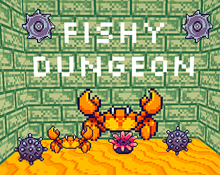
I think is funny idea. Very neat at the outset, but there was no downside to hiding and the mechanic wasn't pushed. I would have liked the games mechanics explored further, rather than adding story. Variation to enemy, a give and take. I think it would have been enough just to be a crab doing crabby things- the story text, lack of skip or speed was annoying.
Ruskul
Creator of
Recent community posts
I think there are some good ideas in here. Overall, I found it frustrating and trial and error was a major component of progressing, which imo, isn't fun. I think if you had more focused levels where you don't have to wait around, progress would be more fun.
I did like the visual design. I think it was super clear from start what was what, easy to see/understand
The game is way too zoomed in. I feel like I died simply because I had to just go for it because I can't see. I like the ideas and theme, though. I would argue that the assets don't communicate as clearly as they might, however, I did like that you kept the palette to 2 colors.
Thanks for making! I enjoyed my playthrough.
I left a comment on the game page so this is a TLDR version:
I think the visuals are fun, but its hard to see the dark character.
I think the controls could be better, easier to handle, if they were mirrored (wasd +jkil) as an example, instead of arrows.
The game felt like a puzzle game, but was annoying because you have to restart when you hit spikes. The puzzle competes with the platforming. You need to pick one. If the puzzle is important, then make the platforming safe. If the plaforming is important, then don't lock it behind a puzzle that you have to keep repeating.
Thanks for making, I had fun playing!
Cool game. I looked forward to playing this one as I saw you make progress on discord.
1. I really don't like the controls how you have them mapped. I think using something like wasd and ijkl would be a great pairing with mirrored jump and pickup buttons.
2. I like the puzzle aspect, its fun, but the platforming aspect is very meh. That is okay, since the focus is puzzles, but having to restart because you hit a spike is annoying. If platforming is important, make that aspect more fun and in depth, then it would seem fair to have to avoid spikes.
3. I like the art, but the black guy is hard to see. I would suggest a light colored outline our similar effect to make it easier to see.
Thanks for making the game! It is fun!


