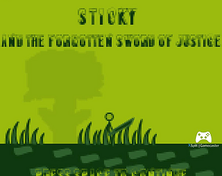
Thanks for giving it a try and appreciate the comment! I want to revisit the core concept at some point after a few other projects; it was a fun idea.
Seanzee25
Creator of
Recent community posts
yeah, the big guy is the "boss". I wanted to keep it short. I wanted people to be able to pick him up too, because it's funny to have that large of an enemy on your sword, but because of this, if you kill all enemies other than him, you can't win. I could fix this by making a spawner to spawn more enemies if the instance count gets below a threshold, but I didn't think of that during the jam and got too worried about getting a video done.
The glitch you encountered I believe happens when you die and the game restarts, the variables aren't being reinitialized correctly, and the game is trying to find an instance of an object that doesn't exist yet. So unfortunately you have to close the game and re run if you die.
Also, the wall jump mechanic was something I never tried before, and likely would have absorbed a lot of time to get working the way I wanted, so I just said good nuff and moved on. Gives me something to work on for next time!
It's actually turned off. If you're referring to the blurriness, it's because I used inkscape for the art, and since everything is a low resolution, the pixels get distorted when exported to png. Probably not the best call on my part, but I'm no artist, and for some reason thought low res would make life easier. I learned that low res actually made it more difficult for me for several things. The text is also something I wasn't happy with, buuuut, once again, trying to fit the text on the screen of a resolution of 160x144 ended up making things ugly. Learned a few things though that I can definitely apply to my future challenges!
Absolutely fantastic. This is definitely up there with my top favorites in this jam. Honestly, very close to the top. However, my biggest gripe is there is abolutely no forgiveness, which doesn't make the player want to keep playing. The music is awesome, and the art is amazing. I'd suggest instead of a game over, if the player doesn't get the timing right, let them continue but don't increase their score.
Honestly, it's pretty darn good for what it is. I like the simplistic art. It has a lot of character. The camera movement and everything was good. Battles would definitely need to be sped up. Pace is very slow. Really great beginning concept if you intend to move forward with it! Keep up the good work.


