This program is great 😲🤯
I hope you stick with it, I'll be excited to support the project!
I have three suggestions:
1 - Increase the distance between lines. Before, as the CSS was visible and editable, I had made a small modification:
#typeArea {
max-width: var(--typeAreaWidth);
text-align: justify;
line-height: 2em;
}
It's much better to write and read!
2 - This suggestion is more for the general improvement of other people. I suggest fonts for people with dyslexia. And also fonts that are better to read, such as “Merriweathe”, which was made for this!
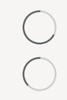
3 - My last suggestion is that the timer's “progress bar” be a circle in the corner of the screen. I love doing sprints, but I'm not always in the mood, so not having a second “bar” would be really nice.
Example:

I just wanted to show the concept of being round that “fills”. A common little circle would be great and discreet. If you didn't want to use a timer, it would be something that doesn't “disrupt” your vision.
These are my suggestions! Thanks again for the incredible program, I spent the rest of the night writing yesterday!
I just received the email with the update and rushed here.
I'm amazed 🎈🥳
The program is much better than I could have imagined.
The option to “hide” the text is great for someone, like me, who lives with roommates.
My suggestion is to make a post in the itch.io community and also in reedit and, of course, on Twitter. Your program has also just become a great space for outline and a lot of people need it.
I recommended it to some friends, but it's not something massive. I want to see everyone using and supporting this software.
You deserve much success after this impeccable work.
Kurtis, first I'd like to apologize for English not being my first language.
I'd like to congratulate you on your work. WriteRush has quickly become my favorite way to write my book. Your work is amazing and seeing your update, I'm looking forward to the change in word count.
I would like to make a suggestion: put the writing information in the visible part. I know some people don't like that, they like a cleaner environment, but seeing how much I've written gives me strength !!!
Example: (progress bar)
🟧🟧🟧⬜⬜⬜⬜⬜⬜⬜30% (percentage)
30/100 words (how much you've written)
-70 words (how many words are missing)
Final example of how it would look:
Maybe it's too much to ask and I understand if it is! But, it would be very nice to have this information for anyone who wants it on the screen.
Thanks again for the amazing work.
Looking forward to the update :DDD