I have three suggestions:
1 - Increase the distance between lines. Before, as the CSS was visible and editable, I had made a small modification:
#typeArea {
max-width: var(--typeAreaWidth);
text-align: justify;
line-height: 2em;
}
It's much better to write and read!
2 - This suggestion is more for the general improvement of other people. I suggest fonts for people with dyslexia. And also fonts that are better to read, such as “Merriweathe”, which was made for this!
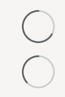
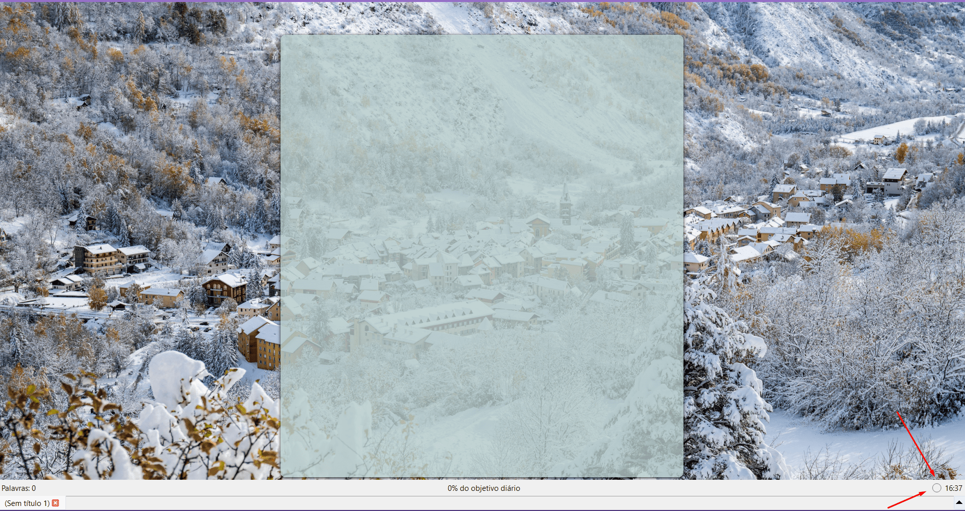
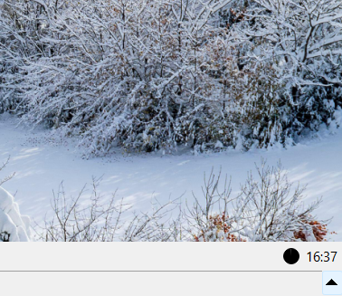
3 - My last suggestion is that the timer's “progress bar” be a circle in the corner of the screen. I love doing sprints, but I'm not always in the mood, so not having a second “bar” would be really nice.
Example:

I just wanted to show the concept of being round that “fills”. A common little circle would be great and discreet. If you didn't want to use a timer, it would be something that doesn't “disrupt” your vision.
These are my suggestions! Thanks again for the incredible program, I spent the rest of the night writing yesterday!


