It lets me fit everything on screen comfortably without having to use fullscreen mode, which is great. Thank you!
Brian Swetland
4
Posts
3
Following
A member registered Dec 03, 2017 · View creator page →
Recent community posts
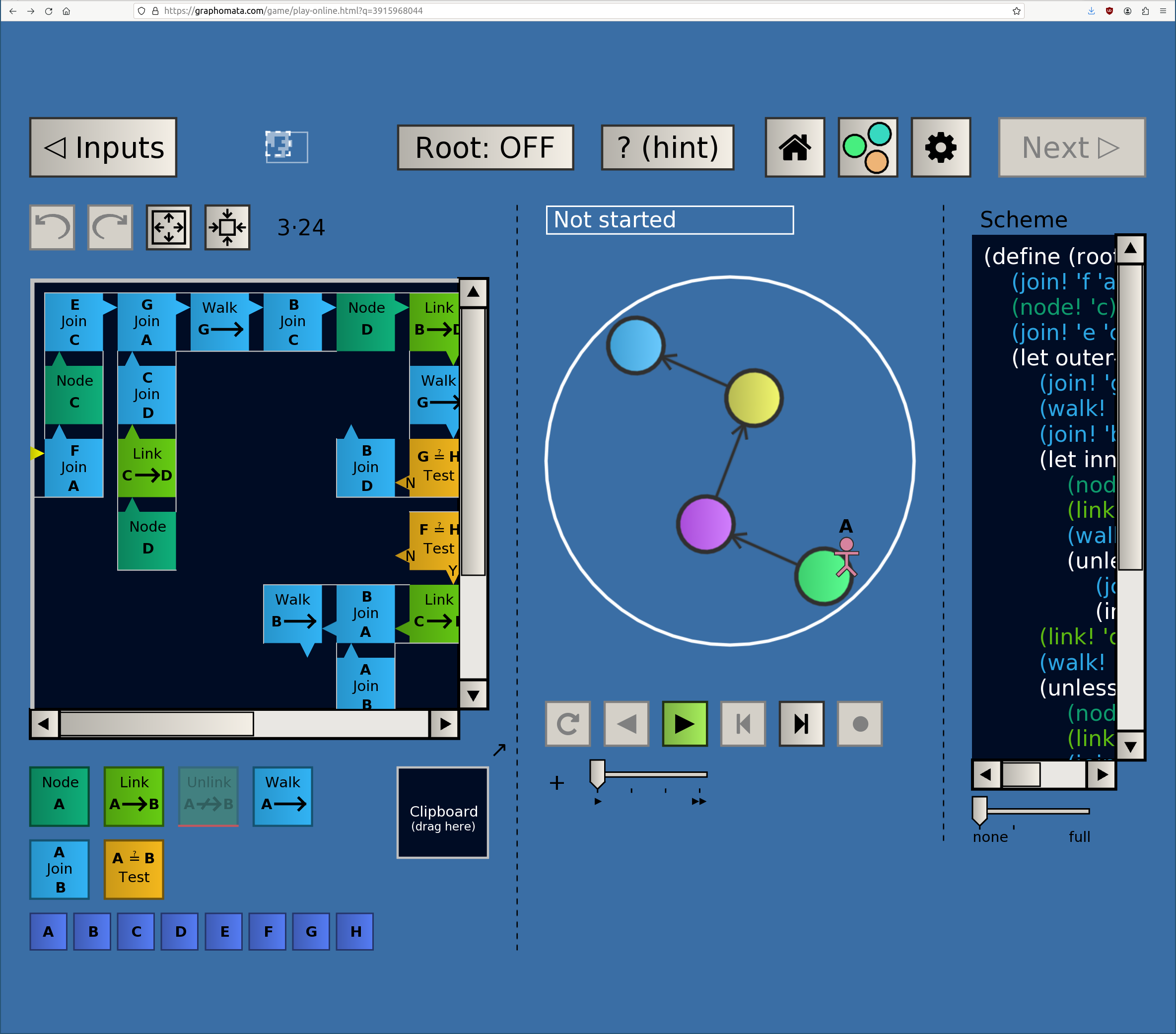
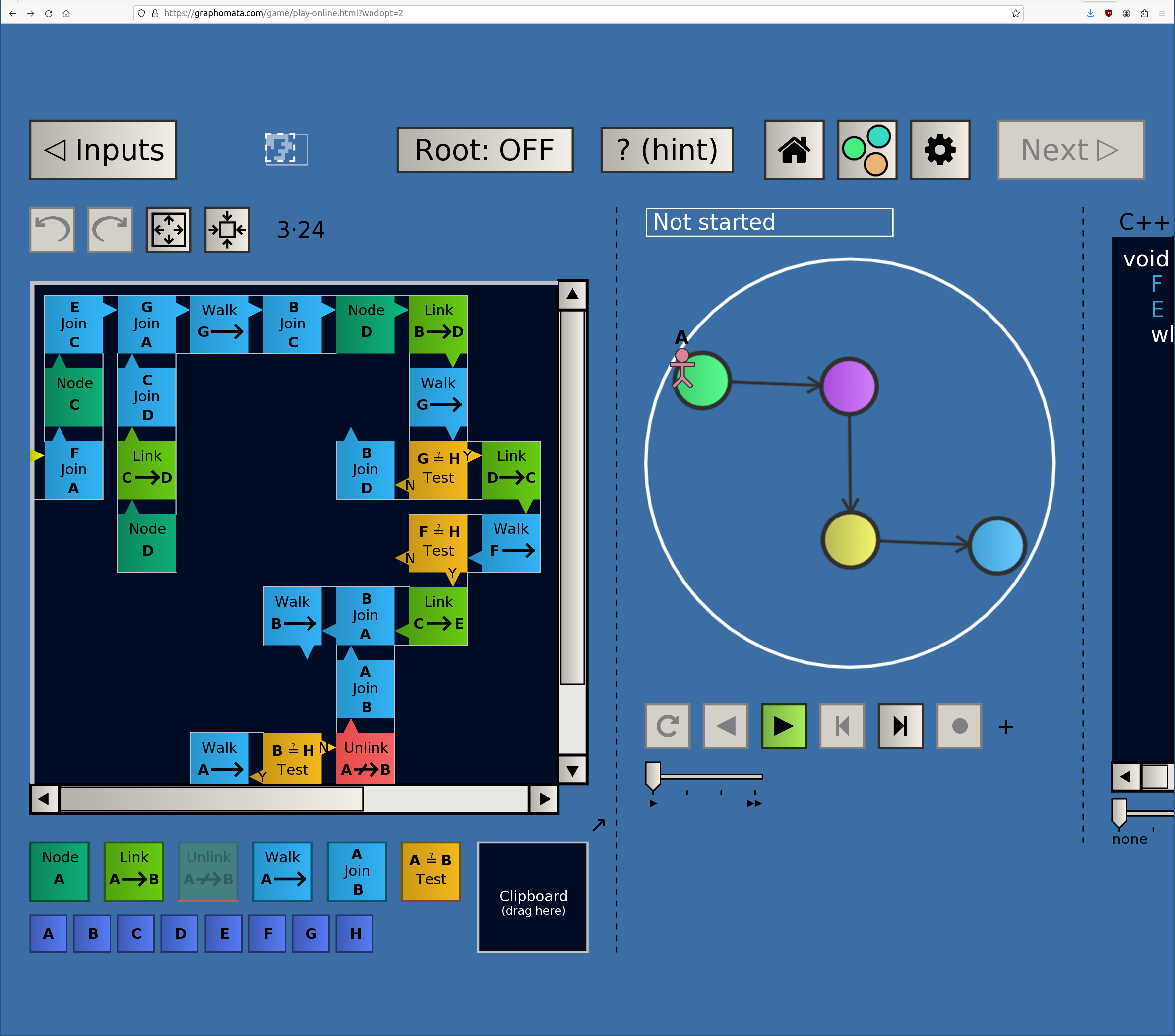
The difference is minimal – in the both opt 1 and 2 the code pane extends under the right side of the window rather than not in the default. See attached (screenshots of a ~2/3 display width firefox window, level D5, devPixelsPerPx at default setting)


edit: actually they appear to behave the same, the new version just started with slightly different positions for the pane dividers
- Windowed. Things do all fit in fullscreen, but on a 32” 4K display that’s pretty huge.
- Starting from itch.io launches the graphomata site which is where I’ve been playing.
- devPixelsPerPx was 1.4, but setting it to 1.0 or resetting it to default does not seem to make a difference
- The game is playable (either fullscreen or with the code pane squished off to the side), so it’s not a critical issue, just a QoL thing.
Minor feature request – a UI scale setting. Everything is too large in Firefox on my Linux workstation, such that I can’t see the full regular program grid and full program text in the main UI (probably some weird interaction of HIDPI scale settings somewhere), and the browser display scale (ctrl +/-) is not respected by the game.

