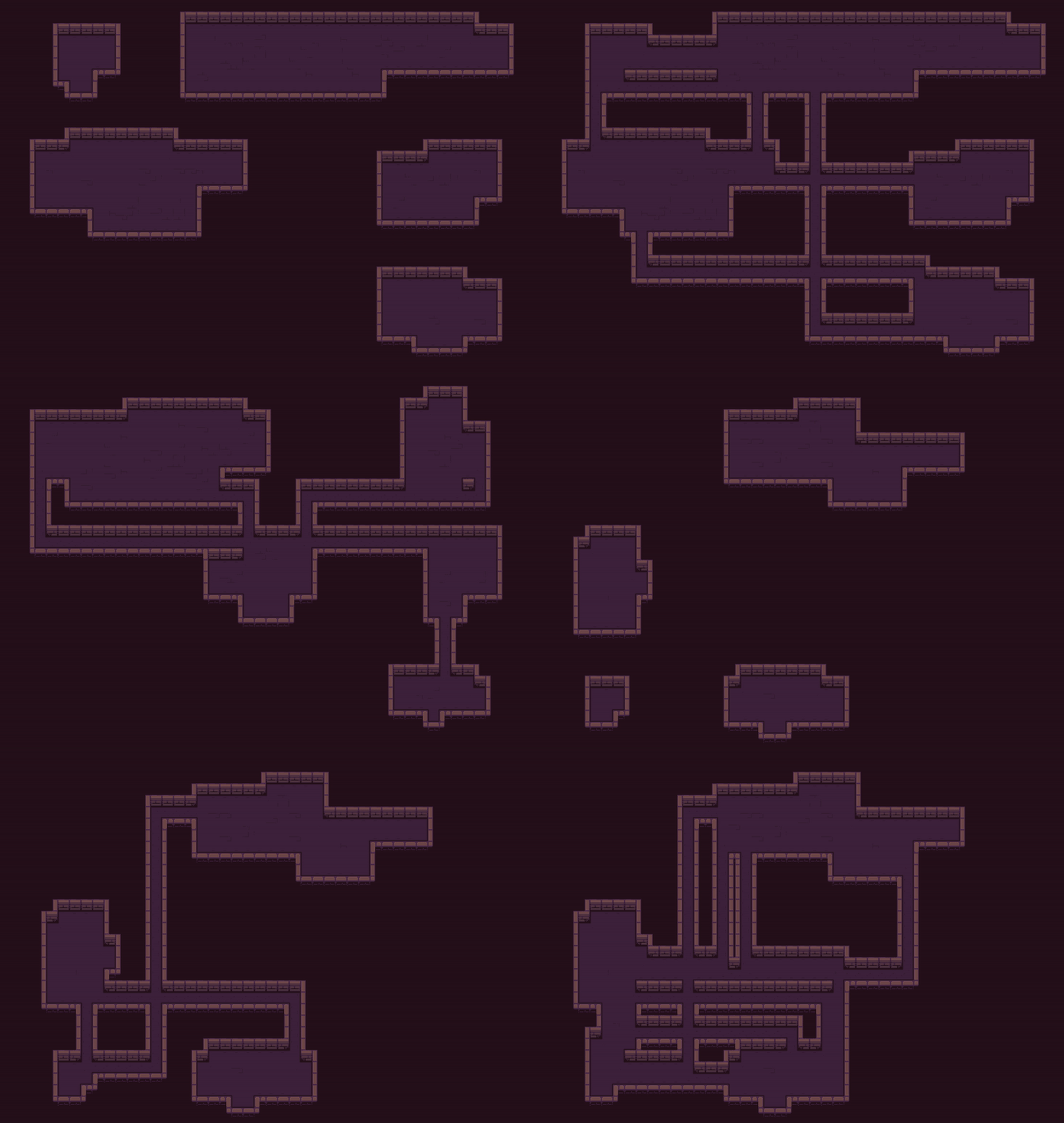
Great tileset, gorgeous work.
Used it for a personal project while exploring Godot's tilesets and random map generation. Cheers!

Great tileset, gorgeous work.
Used it for a personal project while exploring Godot's tilesets and random map generation. Cheers!

You have a lot of good comments on your plate already, so I'll quickly chime in with most of the topics. (:
Great use of the black & white gb vibe, great way to animate stuff, soundtrack was fine and gameplay feedback was on truly point. Unfortunately, as you said it yourself, not much more to go with.
Hope to see more of it in the future!
I find it quite hard to find games that deal respectfully with the topic in hand, so I was happy to see the message in the end. There were many spelling mistakes, however, which derailed a bit of the vibe of the game. Aside the spellcheck, a more somber font would have also helped a bit.
Overall it was an unsettling experience,, which I believe it was what you were aiming for.
Charming! Was happy to see a PICO-8 entry into the jam.
Visual wise the game ended up very well - although some of the arrow inputs can get hard to understand with the floating effects, it isn't that hard to guess what they are once it get's going.
The story was fine, considering how much you added into it, but either I believe I ran into a few bugs were some of my choices didn't matter or were switched around (Like buying the Silver Sword and getting the Stake prompt at the end).
Anyhow, they are probably simple things to fix. Really happy for the choice of the engine. :D
Happy to know you enjoyed it. :)
We had a lot of going back and forth about the monochrome colors, and we ended up erring on the side of spooky this time. If the game turns out to be too dark for more people we might tone it down a little but we want it to be as dark as possible. As for the instructions, the intention was to make it so you could pick it up on the go, so, once again, happy to know you managed to. :D
Thanks for checking us out! :D
Hey! (:
Sorry the colors and overall feeling weren't to your taste, we believe we struck the chord we wanted to - both spooky and charm wise. The intent in making a monochromatic game was both to hit the black and white vibe of the Bite Size Horror website and the game boy era of pixelated games.
To each is own, however, so thank you very much for the kind words and checking us out! :D
Hey! Happy to hear we hit the right accord with you! :D
Changing the mechanics up, mixing and matching nostalgia along the way, was definitely what we wanted. I'm really glad we managed to do the idea some level of justice - and yeah, trust me, even after coding it and spending time to balance it, Reversed-Breakout-Pong still messed me up as well.
Thank you so much for the kind words, we appreciate it!
Glad you liked it! We had thought about inputting more alternatives - such as repulsion effect you mentioned it but also things like slow motion bonuses, teleport-like worm-holes and stuff like that - but we had to account for the time we had (Which we got really close, like, 10 minutes before the mark if I'm not mistaken!). About the bullet predictability - yeah, we got that comment from others and although it seems to be precise mathematically maybe it's one of those things were it starts to hurt the game. We had not thought about forcing a distance from the center, which I think it's what you mean, so props - we may give it a shot in changing that afterwards.
Thanks for taking the time to give us input, by the way, we really appreciate it!
Hey SN, thanks for checking us out!
So yeah, as Pace already stated, we -believe- it is precise as it could be. We used the gravitational equation to affect the bullets around those fields in the game, so the way they behave and interact should be realistic! However, you're completely welcome in saying that it may still feel a little too sensitive. I won't burden you with the math, but for some physical/mathematical reasons we already had to limit the maximum velocity of objects leaving it, otherwise they would scale to infinity, but with more testing and inputs we might have to reduce it even more. Time - not space, this time! - will tell. P:
Now, a more detailed tutorial though, is a good idea. A challenge mode even, would be super cool to have, so thanks for the input. I hope you had fun playing! :D