:(
TheUltimateAbsol
Creator of
Recent community posts
The art style really really works well. I really love the extra polish that goes into the effects and environment like the parallax background.
However, the gameplay is confusing (as expected of a metroidvania), but a little frustratingly so. I don't really have a clear indication of what's up, what's down, when I can jump higher, and if I am making progress. There's a segment with several branches I just can't get across and I don't know if that's because I suck at jumping or I'm missing something?
Also, some of the gates between rooms are a little obscure -- like a brown block that looks like a lot of other environment pieces. It might be best to use something consistent like a black gradient shadow to indicate to the player how to go forward?
The controls also were weird. X or click to slash? Y to force field? I don't have that many fingers. I hooked up a gamepad controller and I couldn't move at all.
Anyways, I feel like this has a lot of potential with a little bit of UX testing.
The environment and ability to immerse the player are really good. Gameplay is simple, and it could be definitely extended fully into a complete experience.
I think more attention should be put into some of the smaller artistic details to make it more consistent. The Purple box UI does not mesh well with the character art -- it would be probably better if there was some paper texture/fuzzy borders etc. to fit the art style
The pixels are unaligned periodically. Is there a way to fix this?
And most of all, the cutscene art is a little cringey and needs a lot of polish. It probably would be OK to use one fleshed out image and just a lot of text rather than needing to animate individual frames (sort of like Danganronpa cutscenes)
I Like the smooth gameplay and animations, but the movement and reach of your charcter don't feel right. They're extremely small and the enemy hitboxes always expand as they turn around, so you constantly have to readjust your spacing to not get hit -- and that's not easy, especially since you can't move backwards while swinging. I keep accidentally touching enemies -- Does the character not have a constant velocity?
The dashing also doesn't provide any combat benefit (no dashing slash, invincibility, etc.) which feels a bit weird.
Also, the character art seems very out of place in the dialogue sections. It just doesn't match up...
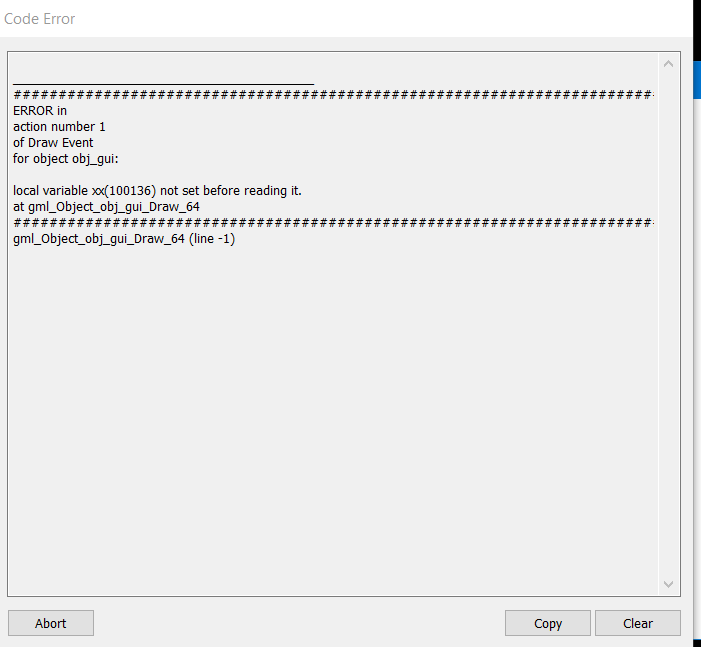
Also if you kill the final boss while he throws a spear and die during the cutscene, you get a beautiful error and the game crashes

I like the idea of "maintaining momentum" in the game, but it didn't seem like it was implemented as well as it could have been.
It was easier to just jump through enemies and abuse i-frames rather than bother with the idea of shooting them. There only was a very small subset of enemies that were necessary to shoot.
There were also several places where it looked like it was possible to jump but it wasn't. The majority of the gameplay revolves around shooting 6 bats.
It took me about 5 minutes to realize that you could use the mouse -- some sort of cursor or visual feeback might be good. Simply having the character hold the gun from the beginning might have also helped.
While it's simple, I really appreciate the sound design just being a simple beat that gets more intense. Pixel art was also very well-rounded.


