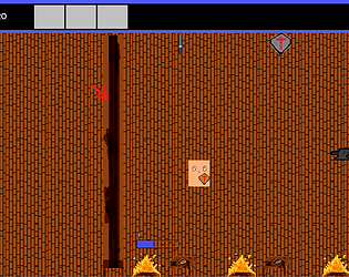
The presentation is lovely and so is the idea, but I feel like none of the puzzles are actually puzzles: I either already knew what to do from the get go, or it was kind of trial and error figuring out which switch controlled which doors. It's also a bit tedious always needing to fetch a weapon to hit the buttons.
videogreg93
Creator of
Recent community posts
You can find the save files here, depending on your OS
| Windows | %UserProfile%/.prefs/Calamity Sanctuary |
| Linux and OS X | ~/.prefs/Calamity Sanctuary |
You can probably delete that whole folder to "start from scratch", but this makes me realize that there should be a "reset tutorials" option. Interesting about the music slider, will look into it. Thanks for playing!
Very good aesthetics, amazing polish overall. However the gameplay is pretty lackluster. Weapon choices don't mean much, and there's little to no difficulty at all. Very quickly I was able to simply take my hands off the keyboard and the game basically played itself, I only had to move a tiny bit whenever guns would appear.
Thanks for playing!
I agree that one of the major things I need to work on is balancing, which is why I'm trying to get more and more people playing the game. Since I know the game like the palm of my hand it's very easy to breeze through it but I know that isn't the case for others, so your feedback is really valuable. And yeah I think the boss is too easy/the enemies before it are too hard.
For the final version of the game before you start you'll pick your character, and at that moment it'll very briefly explain that characters mechanic, so hopefully that should help remove some of the confusion around scrap.
As for the controls, I admit I have in mind that players will play with a controller, where you can swap between cards with the shoulder buttons much more easily than on keyboard. I hadn't thought to use the mouse at all, but that is an interesting idea for sure.
Thanks for trying it out!
Concerning keyboard layouts, I've haven't done the work yet to automatically detect keyboard layouts but you can rebind the controls in the option menu, which I think is a good "catch all" for the moment. The game is supposed to be played with a controller anyways, so I don't think this should be too much of an issue down the line. Honestly keyboard controls are based on common gba emulator controls, since this game is based off of a gba game originally.
I'll have to look into that tab in and out issue, never seen it before.
Automatic card draw is an interesting idea. You need manual card draw though because sometimes you'll have too many cards in your hand and not enough energy to play them all, so unless you refresh your hand and energy you'd be stuck. But something to keep in mind I guess. Manual card draw also affects things that trigger each time you refresh your hand, so you do want control over that as well.
You can't rotate daemons, I thought I removed that from the tutorial. Unless it still says it in the readme? and the left arrow thing should work, another thing to look into as well.
Best tactic in the end appeared to be to just spam card usage, redrawing when the Hand is empty. and use scrap gun whenever I couldn't do anything else.
That' part of it, at least in the early game. Ideally down the line once you get better cards you'll need to understand them a bit more, and there's the whole deckbuilding part of it as well.
Once again thanks for playing!
Hey thanks for playing! You can rebind keys from the options menu, either from the main menu or from the pause menu when you're on the map screen.
As for the cards, I agree I think it's one of the biggest pain points UI wise. I don't mind if players die a couple of times early on before learning what the cards actually do, but that being said I still think they're both in the way and at the same time hard to see
Thanks for playing the game!
1. Yeah I have to agree, I've reworked the UI a bunch of times, and while I personally have no trouble following along, I can understand it being really hectic. There's a reason why I asked if I could borrow whoever made your UI once they're available. For the record you can hold 'C' to slow down time and see your cards completely.
2. There is rebinding, it's in the options menu. It's a bit wonky but it should work.
3. The scrap gun ('X' key) damage is tied to the scrap amount, i.e. the amount of gears. You get gears by dealing damage and certain cards give them, like the basic Cannon spells for example. This should've been explained in the tutorial, but if this isn't the first time you've played the game it might've not proposed the tutorial for you. I think for future DD I'll just reset player's local preferences so it shows the tutorial regardless.
4. Bottom left is cards in deck, bottom right is cards in graveyard, small bar is just the progress until you get another gear.
5. There are a couple of cards that you can use once to heal, but maybe I could make them appear more often, or have a rest site like Slay the Spire or what not. There are also daemons that give some, but not many.
6. For DD I hard coded it to 1/3 change per battle, precisely so that players can play around with them, but seems like you got unlucky. Regardless 7th (or 9th I forget) room is always a room that gives a daemon at the very least.
One again thanks for playing, looking forward to playing your game soon enough.
Gameplay is really fun, reminds me a lot of Trials Fusion and those kinds of games. Motorcycle sfxs are really good, the rest however are a bit underwhelming, and are also pretty loud compared to the music. The air physics were a bit unintuitive as well. I would assume that when popping off a ledge, once my front wheel if off the ground a front flip should make me go further, while a backflip should make me go less far.
Otherwise, great game, keep up the good work.
Visually amazing, very intriguing like Cultist Simulator where you desperately want to understand what the hell is going on. Personally my next steps would be
1. Give me a motivation. Doesn't need to be too big, but right now I start the game and have no idea what my end goal is (if there even is one currently).
2. Sounds and Music. Amazingly the visuals and animations are so well done that I can almost here the sounds in my head already. Sfx and a backing track will elevate this game so much.
All in all, while I didn't play much this time I'm really intrigued by where this will go.
Thanks for playing! Character selection is already planned, and you suggesting it just confirms it's a good idea, but I'm waiting until the gameplay loop is tighter before working on another character, though I already have 2 character ideas.
I agree things start out a bit too fast, but I'm hoping new players don't give up after dieing once or twice while learning. I'm still trying to find the right balance between hectic fast paced action and being able to strategize. Thanks for the feedback!
Thanks man appreciate the feedback! I think healing cards are pretty overpowered, will probably try a combination of making them rarer, making them cost more or have a drawback like 1 use per fight (or maybe per game even).
I thought I had fixed the frogs but doesn't seem like it will look more into it.
What's your screen resolution? Also did you try holding down 'c' to better read the cards? I'm still trying to find the sweet spot of between totally real-time yet letting players read their cards and make decisions.
Once again thanks for playing!
Hey man, thanks for the feedback! One thing I need to figure out is how to display card information more clearly to players. Right now you can hold 'c' and it'll slow down time and you can actually read the cards, but this isn't said in the tutorial so no one tries it, plus I'm not even sure if it's a good mechanic.
Nonetheless thanks for trying my game!
Yeah game is still pretty rough, thanks for playing anyways!
its a bit unclear which cards you can play and u cant play most of the time
Mana is in the top left of the screen, and mana cost is in the top left of cards. Also certain cards cost scrap though it isn't always clear. For the moment you can press and hold c which shows you all of your cards during battle, but I haven't added that to the tutorial so no one ever does it.
i got to the end of the first stage and nothing happened, unsure if thats a bug or just where the demo ends
That depends, there are 3 floors and a boss, if you finished the boss yeah it ends there otherwise nah that's a bug.
the shop hitbox is way too big and clunky, it was hard to move around it
A lot of the isometric hitboxes are wonky, will fix eventually.
some battles would randomly start already finished, giving me rewards for free
Yeah still haven't been able to reproduce reliably and fix this.
also if you open a menu while walking the last direction the character keeps moving on its own to the last direction u were walking before opening it
hadn't noticed, will look into this, thanks for mentioning it!
Only played one game so far, died at the crazy wizard. I feel like there's a lot of good things going for this game, I really liked it. Like a mix of Fire emblem and Slay the Spire. There are a lot of minor things that I would change, but I'm betting a lot of them you're already aware of.
- It's hard to tell the range of spells, the black overlay is very hard to see. Something like bright red would be a lot better.
- Moving characters around is kinda clunky. Also I would add a movement range when clicking on characters.
- Since moving characters is kinda clunky, sometimes I would misclick and move my units to the wrong place. An undo movement button would be a godsend.
- It's sometimes hard to click on the correct units. For example, at one point I wanted to direct my healing spell to my main character who was one hex away from an enemy, and I ended up healing my enemy.
- A warning popup "Are you sure" before doing something which would seem only to benefit the enemy could be useful (like in MTG Arena)
However, all in all it's a great game, and I can't wait to play the final version. I really liked the pickpocket ability, I was really surprised when I used it on the beehive and it let me summon bees. Makes me want to add a similar ability in my game.


