Indie game storeFree gamesFun gamesHorror games
Game developmentAssetsComics
SalesBundles
Jobs
TagsGame Engines

parchii

69
Posts
2
Topics
7
Followers
9
Following
A member registered Aug 28, 2020 · View creator page →

Creator of

Recent community posts

(1 edit)

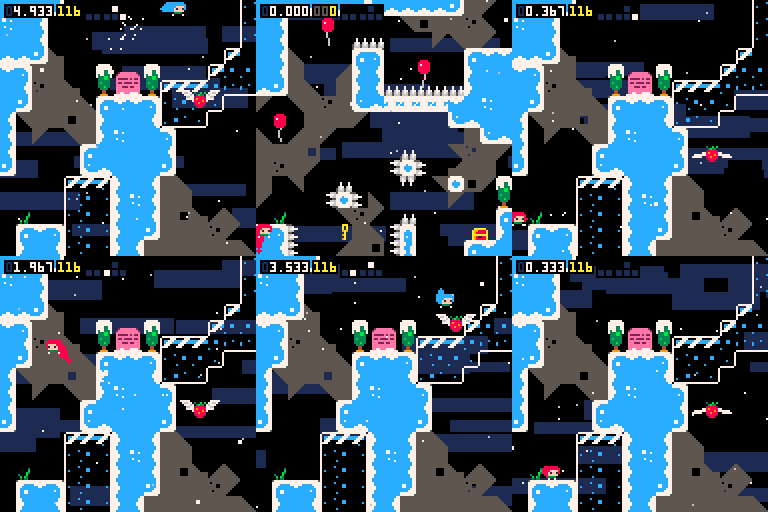
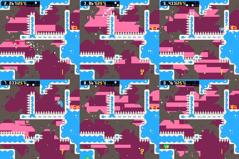
A little bit of an update post. The game is actually possible to beat with no jumps under these rules. (2 if spike jumps are illegal)

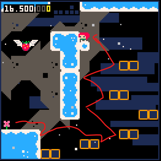
I explain this in a different comment, but basically wait until the strawberry in 1700 is at its lowest, fall into it, timing it such that you can dash up and collect it in the same frame. You will get another dash, so dash up again, spike jump, then its a success.

Edit: You can dash-jump instead of spike jumping

(3 edits)

So actually this was impossible, I couldn’t do it. Was impossible. I literally just figured out a way to do it.

The problem with 1700 was that everything is just high enough where dash-grace jumps don’t gain enough height to finish the level, and ofc the speedrun strategy jumps by necessity.

What I noticed was that there’s a strawberry here, and a strawberry hitboxes move. Because of the position of the strawberry, you are able to pop open the box, wait for the strawberry to move to its lowest point, then intercept it. You need to fall into the strawberry, but time it so that you collect the strawberry and dash up in almost the same frame, which will give you a free extra dash. Dash up again, spike clip, and then etc

Surprisingly consistent. Uses a spike jump, but this is a victory nonetheless

Edit: You can skip the spike jump by dash-jumping instead

This one jump will haunt me, I think.

Brilliant 1900M method, much easier than mine. Very nice!

The menu elements slid off screen before I could click them lol.

When making a bullet hell, always consider visibility. I can barely see the player against the background, and I didn't realize there were collectibles until one hit me by complete accident.

Nice try otherwise! 

That's really cool, good find!

Oh, figured it out

Uh. How do you play?

That's the first thing I tried, but the only times I could get to that layer was from accidently grace jumping, not wall jumping. Maybe you mistook a grace jump for a wall jump? 

(1 edit)

Yea this challenge is fun

It's  a bit tight, but in 400m you can also get here without jumping, but I couldn't get to the strawberry without an extra jump, so that was a bust, but it does open up some new options

Edit: also a slightly easier way to do old site

(6 edits)

Very nice!

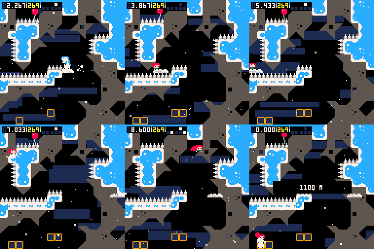
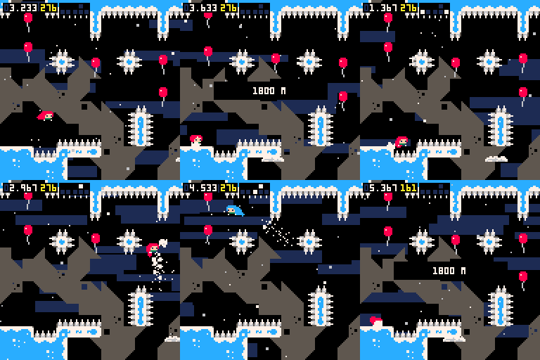
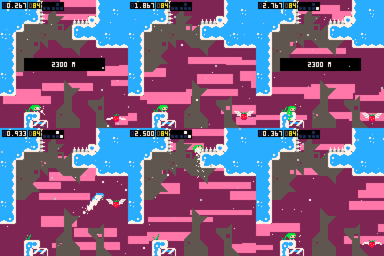
I decided to try it without dash grace jumps and managed to lower it to 2, 1 in 1300, 1 in 1700, and 1 in 2600...

In 1100 it's possible to do a spike jump on that leftmost side and then continue as normal

In 1800, it's very tight, but you can just barely reach that first balloon by getting to it at it's lowest pixel

And in 2300 you are able to do the same trick as before

Also it might be possible to get one off of 2600, but I'm not sure, I keep dying at the brown X in the image
EDIT: Wait... you could do the gemskip strategy to beat it... give me a bit to do that
EDIT 2: did it

It's kinda hilarious to me that I missed those simpler solutions and chose much more annoying solutions like in 2400 and 1900 lol, thanks for those

I managed to lower it down to 0, I suspect your jump was on 1500m? You can do a spike walljump there and just barely reach the end. Nice job otherwise!

im a better gamer than the dev, no shield needed lol

Cool!

Literally unplayable without the shotgun... The hammer has no grip, so you can't move anywhere!

Also LAG

3/5

Cool! I wish the death tiles weren't so unfair, I would barely be touching it, and I would die anyway. One way to fix it would be to give priority to normal ground blocks, and only die to the blocks when it is the only thing you are standing on. 

(1 edit)

The mechanic is unique, and the puzzles use it very well. 
The player is so smooth, you didn't have to put input buffers and coyote time, but you did anyway, and I always appreciate that
The graphics were clear and easy to read and looked great
The sounds effects were simple and didn't get in the way of the focus, and the ambiance of the music pairs perfectly with the tone and genre

Honestly, my only complaint would be that it is short and easy, but that is to be expected from a jam game, and it doesn't take away anything.

5/5, not even kidding, this was amazing. 

Definitely deserved the win

1/5... I'm tired, so reply if you want to hear my full thoughts...

... I can not believe you made me play this level over 10 times lol

Other than the visibility issues, very nice

3/5, would be 4/5 if I could see the game

Enjoyable, until the game went red, and it became impossible to see. The red and the black need to contrast more, and the player needs to be a different color. Perhaps white?

The low visibility combined with the terrible platforming physics makes for a super frustrating game to play. 
I kept trying to beat one section over and over, because I wanted to see how it ended! Alas...

2/5, cool until it very quickly sucked

I thought the last one was kinda funny, but the way it just forces you to die without a chance for you to react was kinda unfair. I would have a wall push you instead of a spike killing you.
Something that could help would be a small freezeframe after you die, after you die, you can't control the player for a few frames to give the player a chance to fix themselves. 

Cute!

I appreciate implementing coyote time, not many people do that, and that is especially important in a game like this.

I have a few tips for making your platformers feel better:
Your buffer-jumping isn't buffered, it held. If I hold the jump, I keep jump, and that is not buffer-jumping. Not super important, but it can annoying.
Controlled jumps can really help, especially in this game. It allows for more precision, which super important to have in this game.
Now for a super important one...

NEVER MAKE YOUR PLAYER'S HITBOX A CAPSULE.

In Getting Over It, you fall because the player sucks. In this game, you fall because the game is unfair with its hitbox. The capsule causes you to slip off, which is more frustrating than anything. In the Crash Bandicoot remaster(whatever it was called), the hitbox was a capsule, which caused players to slip off. Despite the game has a reputation for being a difficult game, it frustrated players because they slipped off a platform. Never use a capsule for a hitbox. 
If a tutorial ever tells you to use a capsule for the player's hitbox, don't listen to them, it is not a good idea.


The level design is pretty nice, I always knew where to go, but I felt like you were being benevolent with the punishments.

That is basically it... 3/5 for me. It is a game and has some interesting ideas, but it is not very punishing for a game where its entire point is to be punishing.

The hitboxes are a bit too large, and the last level was just unfair... 

I couldn't get past level 3, it was just too annoying.

I like the graphics, and it is a cool concept...

It's so boring and tedious though! Why would I play a game where the main thing you can do is wait. Most of this game is waiting, and it is so boring. I would just ditch the refilling altogether. 

Oh, it fixed itself

I don't want to imagine how that bug happened lol

I'm browsing

... None of the arrows are appearing for me

I have never laughed at a game so hard... I am in tears lol, thank you

haha nice try

(1 edit)

My best time is 39.39

Make that 34.36

(1 edit)

Alright review time
----

I sometimes go to the itch.io "latest games", and I just play whatever free game I happen to see. I normally find some pretty bad games, some are slightly better than bad, but I have not found a good game.
This is great!

First things first, my complaints
I don't like the way the attacks look when they overlap while they are not dealing damage(i call that anticipating). You are changing the alpha, which by itself is fine, but when the attacks overlap, it doesn't look very good imo. My solution would be to change its color instead or maybe apply some dithering.
There aren't many indicators. When an attack is about to spin, please have an indicator of which direction it is going. 
The attacks still hit, even when they aren't there. When the attacks fade away, even though they are nearly invisible I would still get hit. I get that there is an outline, but that is not what I'm paying attention to when I'm trying to survive. As soon as something starts fading away, it shouldn't do damage anymore. Also, sometimes an anticipating block would stop on me, and immediately start attacking. I had no time to react to it... 
Finally, the instant kill attack is cheap.

Now for things I like!
I love the way the enemy colors contrast the player's colors, that is a nice touch.
These particles look so great! The way the background particles move away from the boss emphasizes the circle.
I'm really happy with how forgiving the player's hitbox is. Most people just make it as large as possible lol
I like the way the game slows down when you change direction, and speeds up the less you turn. It helps new players trying to stay in one place, and for more experienced players, they will try to hold a direction as long as possible to beat the boss faster! 
I love the way the music is timed with the first attack. It teaches you how attacks and damage work, in just a second.

4/5, very well done, I can't wait to see what comes out of this.

Edit
New complaint: I beat the game and unlocked dashing, but I can't go back to normal. :/

Cute, the music a bit repetitive, and the logs feel cheap but other than that, it is nice!

4/5