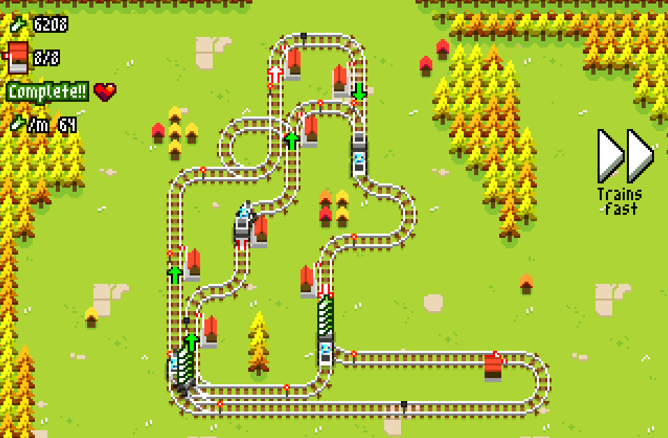
Yeah! This was like the third or fourth major iteration of this map. With like Minimetro is just keeps throwing things at you so you can never actually improve things, whereas here you can really experiment with different routes and the leeks per minute gauge tells you how well you’re doing
xeitek
Creator of
Recent community posts
I posted this after a huge crunch session but at this point there shouldn’t be any typos! Yay!
I’m not too worried about smaller issues with the layout, since I am still waiting for more art. Colors aren’t final, so if anything is hard to read let me know! It was mainly important that the different game features be distinct and easy to spot to speed up referencing mid-session, so there are distinguishing colors for important game aspects that pop up often.
If you notice anything else drop a comment here! <3
Thanks! I agree! It was a challenge to leave out details, while still giving a sense that there is some kind of place and theme, as part of the jam rules, and it was a really good mental exercise.
I’ve been working on a full game with a lot more fluff which should be released in a couple of months, it has great art and will have proper formatting, and I’m excited to release it!
I can force quit a game, menu shenanigans don’t slow me down. I’ve played plenty of scary or tension building games and I don’t remember it killing the vibe. On the other hand, a game soft locking partially because saving is disabled, that does kill the vibe. I understand that it seems to give some people a sense of accomplishment, but is self control not an accomplishment itself? :D
Yeah same just happened to me. I spent multiple in-game days. I watched the structure events unfold of the days of the late teens and wandered all over the map. I even managed to fully steal the “chest” in my garage, temporarily, there in the middle. Can sleep in my bed or other locations. Can’t save. Eventually had to kill the game.
The whole disabling the in-game menu thing is not a good “feature” for so many reasons, but combined with bugs like this it is a game breaker.


