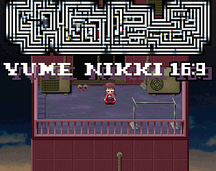
two little added secrets are really small and almost impossible to find without help, and the 3rd bigger one is totally optional and relatively unobtrusive too. I've made very few changes to the basic game, and the most important ones can be modified in the options. I hope it suits you!!!!
Youli
Creator of
Recent community posts
I heard about this game thanks to your neocities, I've been following you on twitter for a long time, I really like your style and I was very curious to discover this game!
It was a pretty good game. Not extraordinary, but pretty good, especially for a first game made almost single-handedly! The pixel art is sometimes not very nice, some rooms have tile errors, but the cinematics, the 3D models, the worlds in the mirrors and the character portraits are all incredible! The puzzles have a few problems: the 3 objects to give to the patients the game gives them directly without you having to choose, it's a shame it would have made a nice puzzle. The door code puzzle was a bit hard, and the monster in the art gallery I didn't know can killed me and since I'd never saved I had to start all over again ;~; And the boards to retrieve from the water it's a shame to have to take them one by one. The fights are a bit long, and some enemies have a too many HP, especially the manor guards. The game isn't particularly scary, but all the passages with the mad doctor were really creepy and I jumped out of my skin more than once!
Another point: the game's neocities page is MUCH TOO LARGE, it can't load properly! I have a very powerful computer and internet connection, and yet I had trouble loading the page (on firefox and chrome). After a very long wait, I was able to load the page, I looked at your code and your images are in 4000*4000, in png moreover, which is much too big whereas on the site it is displayed in 500px approximately. Other problems, the css file code: when I opened it, I almost crashed my computer. inside there are exactly 206844539 lines of random letters. I have no idea what it is, but one thing's for sure, it kills the page! and it's a real shame, pretty as your site is!
Maybe this review sounds harsh, I know what it's like to have a few games released, but I had a good time! It's very promising if one day you plan to make other games! I wish I had such a cool game as my first game!
yume nikki is made on rpg maker 2003 which is an old software. the version of rpg maker 2003 that I use is moded via an unofficial patch recognized and appreciated for a long time by the community. I guess windows antivirus doesn't recognize this version of rpg maker 2003, and there's nothing i can do about it. most of my games use this same patch and after 1000~ downloads, no one has ever complained to me. If need be, there are even a few let's plays on youtube using my version. and what do you mean by “make it open source”? My English is pretty bad I'm sorry. If you simply want me to make the source code accessible, you should know that an rpg maker 2003 game isn't compiled. There's an .exe but it's just used to read the rest of the data, and I can't make this one open source because I have neither the means nor the legal right to do so. If you still want to play yume nikki in 18:9 without using my version, you can also do it via easy rpg, but there will be many visual problems.
it's really very promising, the game has huge potential. However, the demo is really hard, but I imagine that the final game will have more simple levels. The side blocks are particularly complicated I think. I'm having a bit of trouble with the pixel art font used, it's sometimes a bit hard to read, especially in the tutorial, which goes pretty fast. Otherwise, I'm quite impressed that there's already a level editor that seems to be quite powerful! Can't wait to see the full game!
c'était rigolo, pour un projet en 1 jour c'est très propre ! visuellement j'aime bien la DA (mention spécial aux arbres ils sont trop cools), suffit de rendre le pixel art cohérent en terme de résolution et elle est nickel. Le gameplay fais le taf, jvois bien comment il pourrait etre améliorer avec des futurs updates. Beau boulot !
sinon j'ai réussi a faire 1015 !
je me balade sur itchio et boom un petit bitsy en francais sauce pang pang club ! Je trouve pas la question du "vrai jeu vidéo" très pertinent en soi. J'ai l'impression que vous avez parfaitement retranscris la stérilité du débat et la bétise des discours qui gravitent autour ! Et puis le creeper bitsy est trop cute franchement
thanks a lot, but the credit goes also (mostly) to the creator of the patch I use for the 16:9 : https://bingshan1024.github.io/steam2003_maniacs/ and yes I like to do complex things on rpg maker 2003, fighting with the limitations (and the many bugs) is very cool !!
(btw yume nikki widescreen is finish you can check it on my profil)
in fact I use rpg maker 2003 which is absolutely not designed for random level generation. I use the maniac patch for that. During the loading time I tripled the fps (the speed of the game is linked to the number of fps) and even with this it's still slow. I could have done it faster but with only three days I couldn't do better. If you are interested I can put a version of the game without the black screen to better understand what is going on behind!
thank you so much for this review, I'm glad to see that you liked my game on certain points! I quite agree with your criticisms. the 3rd zone was very poorly managed, and it is the one that requires the most work in terms of gameplay. I hope if I make a more advanced version one day I can develop a more concrete story!
(sorry if my english is bad, I'm not bilingual at all ;~;
thank you very much for this comment. actually I may have focused too much on the graphic and technical aspect, to the detriment of gameplay and fun. My game lacks interest, maybe also explanation, believe me that all this I will not forget for the next time!
I'm thinking of eventually making a more complete game of it one day, and I assure you that this comment, I'll think about it to correct the problems. Thanks you again !!!
TY !!!! I see your fangame, honestly the job done on it is really good. Your fangame was more traditional, and it's super cool. Thank you for this comment, yes the lamps are a bad area ;~; I struggled with the tileset, and the gameplay was not improved. I think that if I continue the project to make it more ambitious, I would work much better on my gameplay.