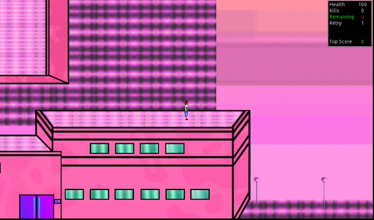
Available here: https://valntainthedeveloper.itch.io/lagarderie-soorvaivol-lvl1
This is a small scene made with Godot Engine
The only goal: Soorvaïve
Its my very first software that i upload on the internet, everything has been entirely made by me (coding, sprites animation, sfx and music), so im open for feedback and suggestions concerning every aspect of this little demo ( please keep in mind im just a hobbyist that didnt go to a specific school to learn anything, my knowledge is limited to free tutorials that you can find online, so if you have any methods or programs to propose, i would be glad to hear about it ;)
Hi Val N’Taïn,
Congratulation on your first ever publication! The first step is always the hardest. I hope this experience helps you become an even better creator.
You seem to have posted this on “Ideas & Feedback”, which is a category about ideas and feedback regarding the Itch.io site itself. There is a separate “Get Feedback” category for individual games. Once a mod/admin sees this they will be able to transfer the thread to the right place, this comment is more for future reference.
Having said that, I played your game for a bit. Considering it’s a demo, I might mention things that are already in your roadmap. I’ll include this anyway for completeness.
The very first thing I noticed, is the back/front sprites. They both look almost the same, but are mirrored, and have slightly different colors. If it wasn’t me pressing the buttons, but someone else and I was looking at the game, I would have no idea if they are looking up or down.
The game looks fun and colorful, and gives a nice vibe of exploring!
The platforming and moving up and down is a little tricky. I like the idea, and I think it has a lot of potential, but currently I find it a bit difficult to know where I can navigate to just by looking.
Sometimes the perspective of the buildings show only their front side, sometimes it also shows the back as well. I kinda love the idea, although the execution might need some more polish. Maybe make a smooth transition from one perspective to another?
The map seems to be quite big, exploring is fun, but there’s a lack of “Points of interest”, which makes me get lost easily. There are a few areas that are different color, but it’s hard to tell where on the map I am based on just the buildings.
Visually, the background and the foreground kinda blend together. They don’t contrast each other well enough. One easy way to make something “pop” is to give it a different brightness than everything else. For example if the background (sky?) was a few shades darker, it would make the ground and the buildings pop out more, and would make them far easier to see.
The enemies are quite difficult! They follow me on the same speed as I run away, and if I attack them, they attack me back from 5ft away, which makes it very difficult to avoid. There are a few tricks with running on top of a building, but currently it feels very difficult and punishing.
The enemies will only spawn in the platform area, but will chase you everywhere, even when walking up or down :(
The biggest thing the game is missing, is a reason to do all these things. An example could be, killing enemies, to get stronger, to defeat that one enemy blocking my path to a new area.
This is pretty much all the feedback I could get. I think the only thing missing on the game is it’s core gameplay, which would help to tie everything together. However for a first project is quite impressive!
Most of the feedback I’ve mentioned is more geared towards “What I think would make this game better”. So it’s up to you to pick which idea you liked, and if it’s up to your skills to implement it complete or in part.
Hi Dark Dimension,
Thank you so much for your post (especially for my first one),
Im really glad you shared that much feedback on the demo, it really gives me strength to keep improving it!
I still try to figure out how certain things work on itch io, i may be a little clumsy
About the sprites (and everything visually speaking) , i'll definitely polish them a little bit more (and maybe add a map)
I can see that difficulty has been maybe to high, do you think a difficulty menu would be a nice thing to implement ?
(and just keep the actual settings to be more challenging)
I was also wondering, did you experience any bugs/glitchy things or it run nicely ?
And im happy you liked the concept and vibe from it, you jsut made my day ;)
I can see that difficulty has been maybe to high, do you think a difficulty menu would be a nice thing to implement ?
I guess it would, but with the current difficulty I can’t imagine any user thinking it’s fair. Although currently enemies are being spawned at will, I assume once the game is in a more stable state, enemies will spawn in another way, not controlled by the player? That might affect the difficulty.
I was also wondering, did you experience any bugs/glitchy things or it run nicely ?
I don’t think I experienced any bugs. The enemies had a little bit “glitchy” behavior when moving around, but for the most part they worked, nothing game breaking.
Hey!
Just tried your game! love the personal art style :D i always used asset-store things because i suck at art stuff ;) love the music, its very basic but fits the game really well for some reason. For the controls and since there is not a lot of text or introduction in the game it could help to at leased in the start show the control’s or how they work sol i know what i can do. Also the idea that i have to spawn enemies and the spawn next to me feels a bit odd like its a easy work around why not have them come out of all the doors so the doors have a function instead of being just being a background?
its very good you put this out there, as you might seen yourself many tutorials talk about it thats its smart to put stuff out there early to learn how to cope with it! Overall for a fist its nice! Maybe adding some sort of story or hook to keep playing would help too.
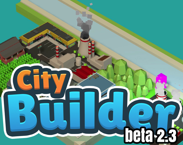
Just like you i’m also looking for all the feedback I can get, i’m making a city builder puzzle game its nothing extraordinary or anything just wanted a simple project that i will see trough till the end and set it online in the android app store to learn how this works from start to finish :) would love to hear what you think of the beta i have online :D

Hi !
Thank you for playing!
Glad to see you liked the visual/sound aspect (that was the most difficult part to do xd)
I'll probably make it more user friendly next time i work on it ( map , spawn points, maybe even a tutorial)
And yeah, in the middle of developing, i kinda lost myself and started to have doubts,
so i put what i already had to see if it was worth it to keep going further
Also, i wrote feedback in the comment section of your game ;p
(and again thanks for writing down your thoughts)