Indie game storeFree gamesFun gamesHorror games
Game developmentAssetsComics
SalesBundles
Jobs
TagsGame Engines

Try my prototype, please? (Picture Cross Towns)

A topic by imwolfgang created Mar 13, 2022 Views: 291 Replies: 4
Viewing posts 1 to 3

I started working on this a little while ago. Personally, I think the concept did not turn out as well as I hoped it would and I fell out of love with it but forced myself to finish and release it anyways as I thought it would be good experience (it's my biggest Unity project so far). I would really love to hear what you think about it, both good & bad.

Is there something you think could have been done better? Did you understand how to play? Should I just have stuck to standard picross? Did you encounter any bugs?

https://imwolfgang.itch.io/picture-cross-towns

(+1)

I really like pic-cross style games. In the How To Play, maybe mentioned something like "The numbers tell you how many consecutive squares should be filled" to be a little more specific?
I'd prefer if when there are multiple numbers that the row/column doesn't extend more than the others. I'd also prefer if the X's were a lighter shade so that they stood out less.

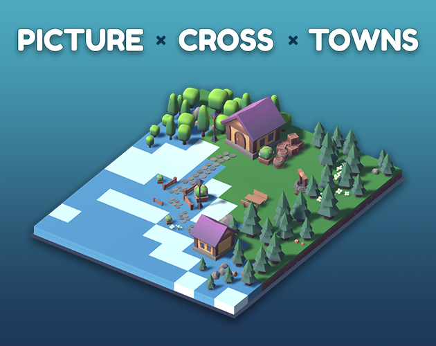
I like how it looks and I like the highlighting feature while playing. Smooth interface . The little town popup is adorbs. 
It would be really cool if we could rotate the little town ourselves after we've completed a level to appreciate the details a little more before going to the next level. Especially because I feel like it spins a little too fast for me and it starts spinning before all the town details finishes loading. Or even after playing a level being able to select the area we completed to take a look at it again.

The light blue line that's supposed to help with counting out 5 blocks is a bit distracting. Using the same color line but thicker would work but that might be my preference because of other pic-cross games I've played.

The graying out of the numbers doesn't always match what it should be (see pictures)


Overall though I really like it! It's a cute spin on the typical pic-cross play. 

(+1)

Thank you SOOO much for the really thoughtful and detailed feedback. I really appreciate it. ❤️ It's funny, I tried easily a dozen variations on the 5-block separator and just couldn't find anything that felt right to me either and settled on what you saw. I'll take another crack at it with your suggestion. I also really like your other suggestions for the tutorial text, x-shade, row/column sizing, and being able to rotate the result, and see if I can track down that greying out bug (my code for that is a bit messy, not too surprised a bug managed to sneak in..). 

Again, thank you for all the great ideas (☞゚∀゚)☞ you're awesome.

(+1)

Neat little game.  It has a ton of polish and definitely feels like there was a lot of care put into it.  The little animations for screen transitions and the way the buildings pop up at the end of a puzzle really add charm.  As for the gameplay, it feels like a solid game of picross.  

The one issue with the concept is that without the squares forming a larger image it creates less of a payoff as the puzzle gets filled in.  In standard picross the reward for completing a level is seeing the completed picture, but here it is substituted with seeing the puzzle turn into a small diorama.  It is a solid replacement but it has a bit of a disconnect between what the puzzle was compared to the final result.  I would say that maybe as you solve puzzles the combined town has some sort of growth.  Something like completing a puzzle that turns into a forest causes trees to grow throughout the town would help here, but even something small like a population counter that goes up with each puzzle would work.  As it is now the concept definitely works but the town theme feels a bit surface level.  One last nitpick: there was a bit of a difficulty spike at the last puzzle for part 1.

However, for a prototype this is very good, and feels like a finished game.  The overall experience is enjoyable and small touches like the dividing lines every 5 squares help make the game smooth to play.  I think you almost executed the concept perfectly, just a few small tweaks here and there will really get the core of the game where it needs to be.  Finally, the graphics look very nice and clean.  The whole game has a cohesive art style and a strong identity.  

You did a great job for a first major project, and it definitely seems like you are close to being done.  If you need more feedback as you continue completing the game let me know and I'd be glad to help.

Aww thank you so much for the kind words. Honestly just totally made my day you would take the time to play and then write such thoughtful feedback!! 😊

I think you're spot on about the problems with the payoff, and gameplay<->theme disconnect. Puts it into words better than I could. I'm still interested in exploring ways to use the output of piccross puzzles to build something bigger, but don't want it to feel forced. Time to take a step back to the drawing board I think and apply these learnings. I may take you up on that offer to test again if I get anywhere with it!!