On Sale: GamesAssetsToolsTabletopComics
Indie game storeFree gamesFun gamesHorror games
Game developmentAssetsComics
SalesBundles
Jobs
TagsGame Engines

Which cover do you like the best?[HeroSquare]

A topic by anothercastle created Nov 05, 2022 Views: 245 Replies: 3
Viewing posts 1 to 4
(+4)

Having reached a checkpoint with the release of a playable demo, I've now had some experience with how my promotional assets perform on itch.io. Personally I feel like there's a lot to improve, so I've started by introducing a new cover image for the image.

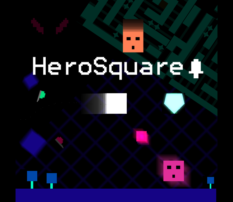
Which cover do you like better? Which one do you think works best when scrolling through itch.io games?

1 (old cover)
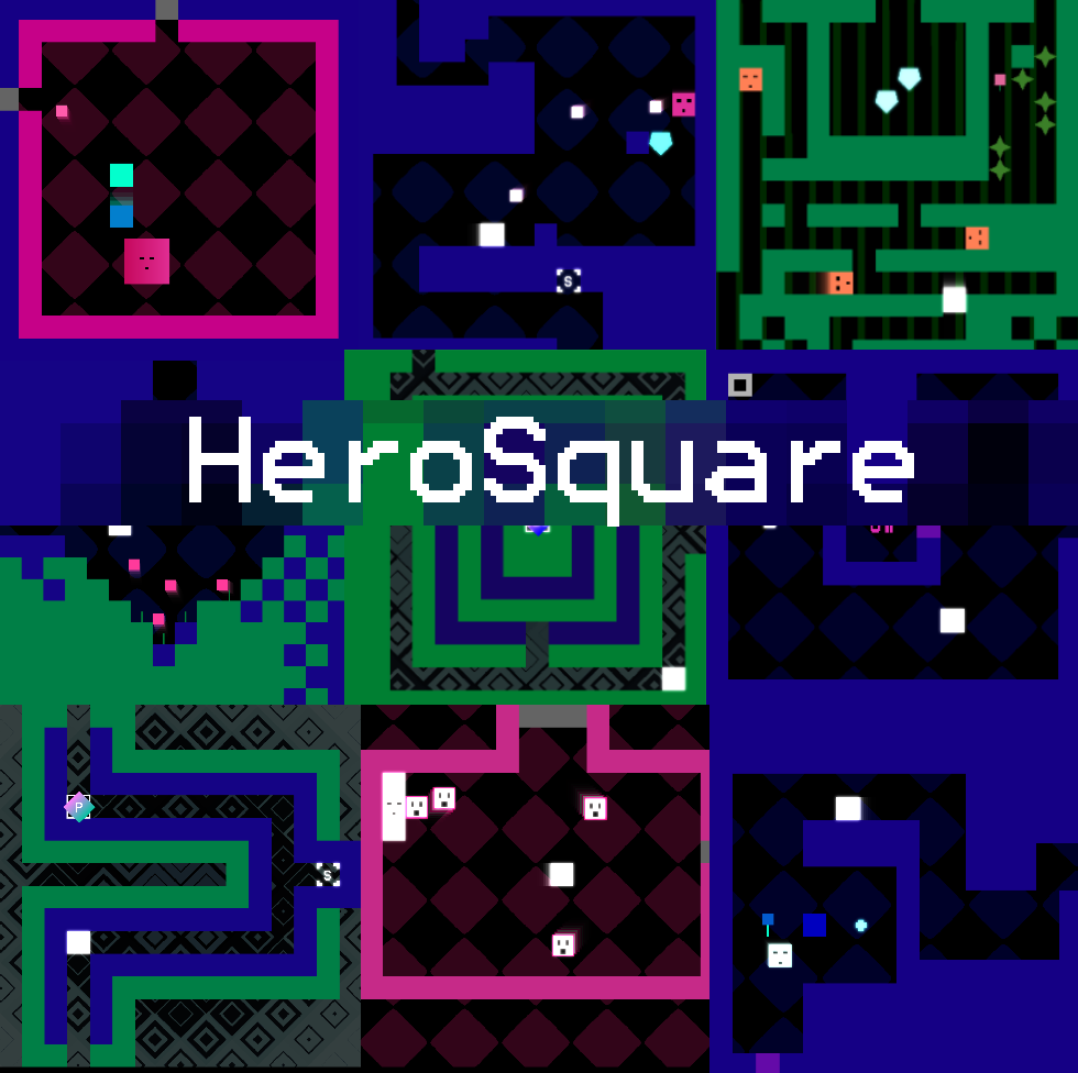
2 (new cover)
(+1)

I like cover #2 better

(+1)

#2 is more clear. #1 is chaotic

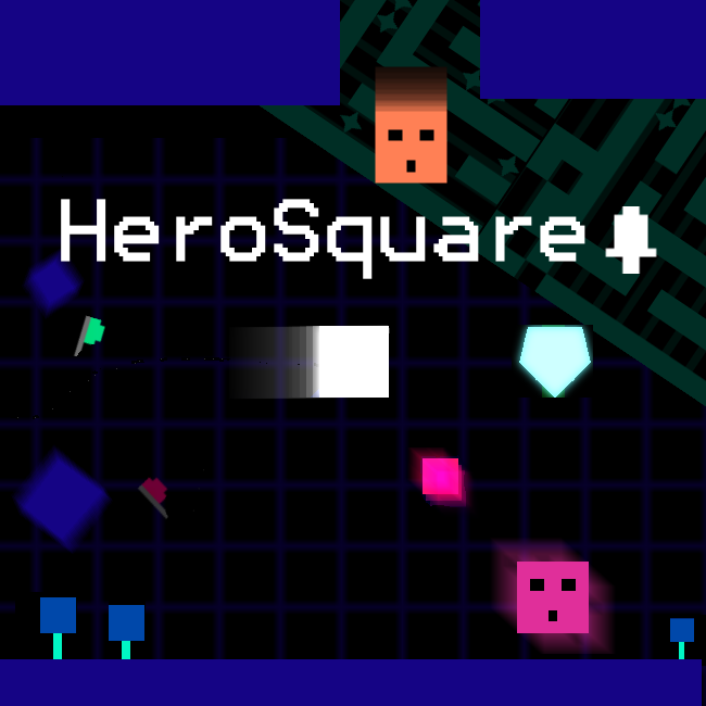
This is the final image I ended up with. I decided to take out the roof to balance it a bit and also added the ominous eyes that are related to the story :)