Thanks a lot for the feedback :)
anothercastle
Creator of
Recent community posts
Hi all,
I just remixed the main theme for my game HeroSquare. My intention is to use this theme in trailers etc. promotional contexts.
Just one question: what kind of vibe do you get from this?
https://soundcloud.com/akseliv/herosquare-main-theme
Thank you!
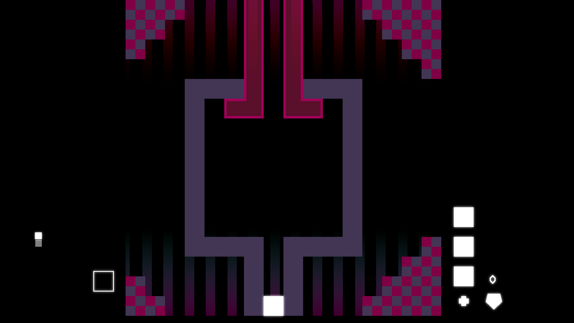
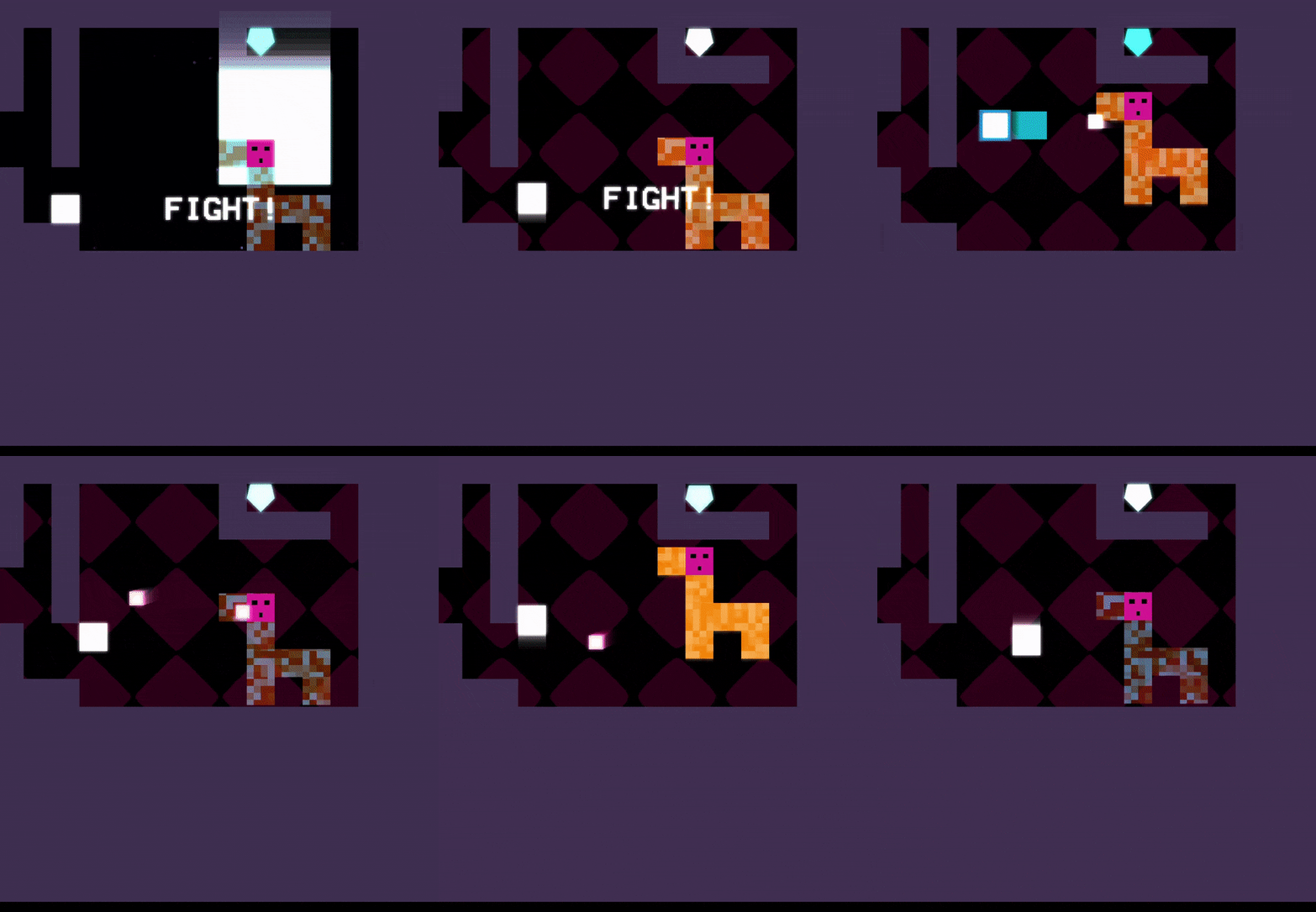
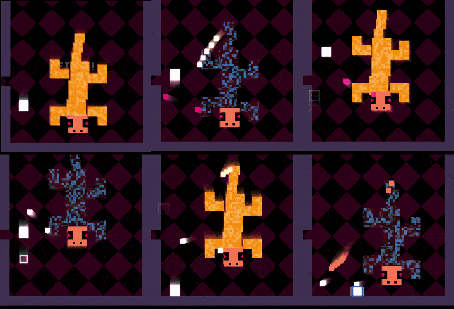
With the previous enemies I ended up creating a small system where I can make arbitrary shapes out of squares. To push it further, I wanted to see if I could some up with a more complex enemy for a boss fight.
Here's the Salamander, I'm still tinkering with the gameplay, but I'm quite happy with the visuals :)

Hi all,
I have just released HeroSquare demo for Mac.
HeroSquare is an adventure game of square proportions. In the demo you will delve into the 1st zone of the game that includes action-packed gameplay, puzzles, several boss fights and powerful abilities for you to find!
⬜ Experience metroidvania like it was 1982
⬜ Master the art of combat with tight parries and blazing bullets.
⬜ Enjoy the simple controls and classic "hit start and play" gameplay
⬜ Immerse yourself in the game with an original soundtrack, featuring haunting FM growls and melodic singing chips.

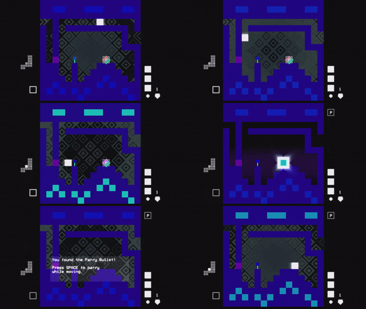
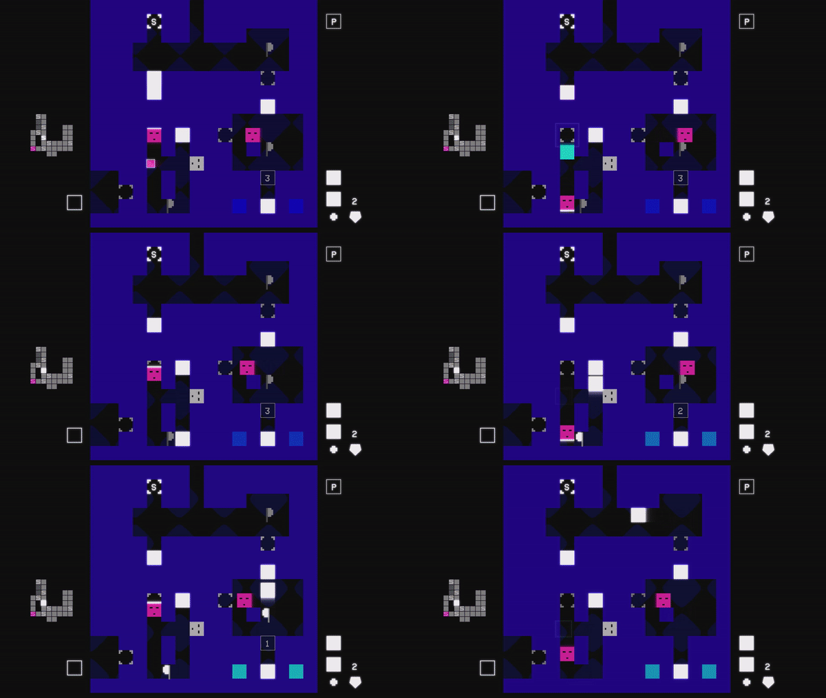
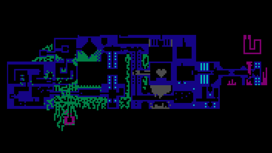
I hope you enjoy it, now on multiple platforms! https://anothercastle.itch.io/herosquare
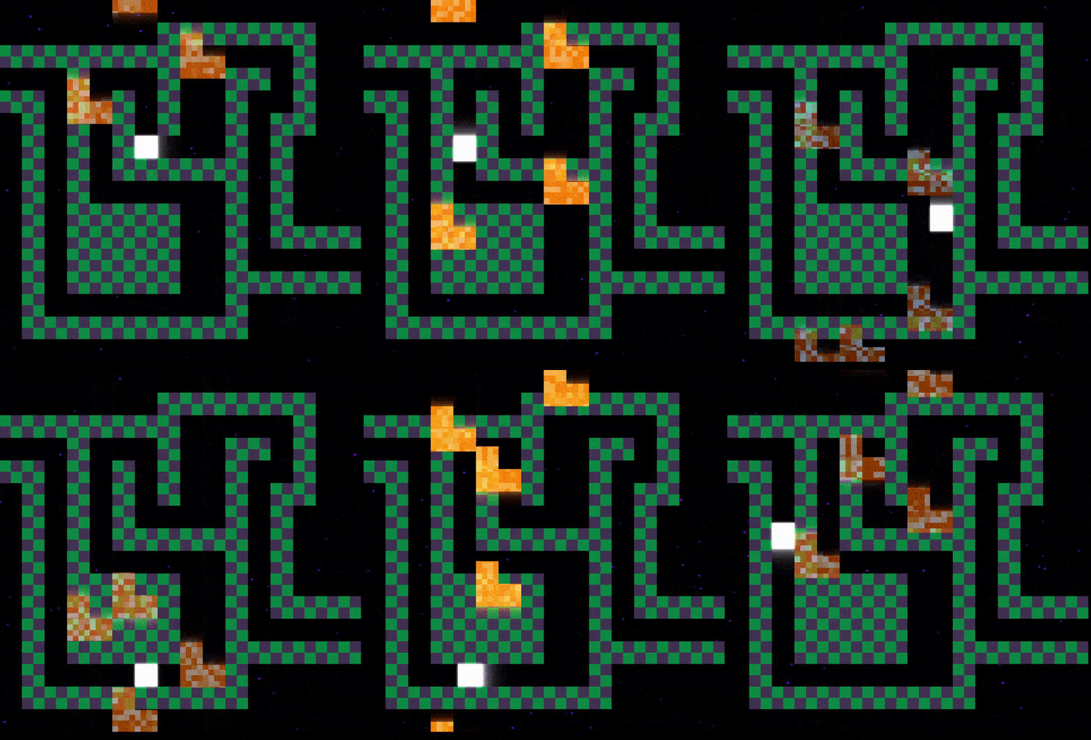
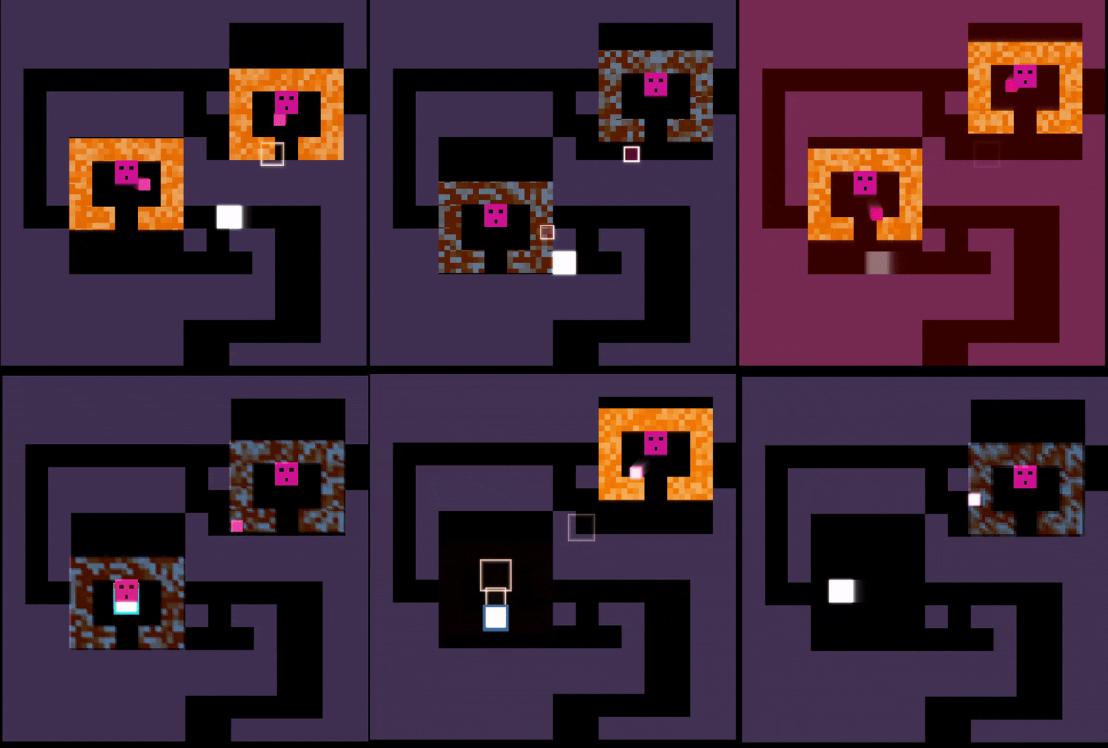
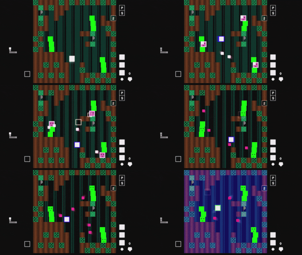
I added these traps which require you to move carefully to avoid them. I rather like how they look. Pretty simple, but required some planning so that I can get arbitrary shapes laid out with them. The system I came up with uses arrays like [1,0,1,1,] to describe the patterns, which I find pretty easy to type in a config file.
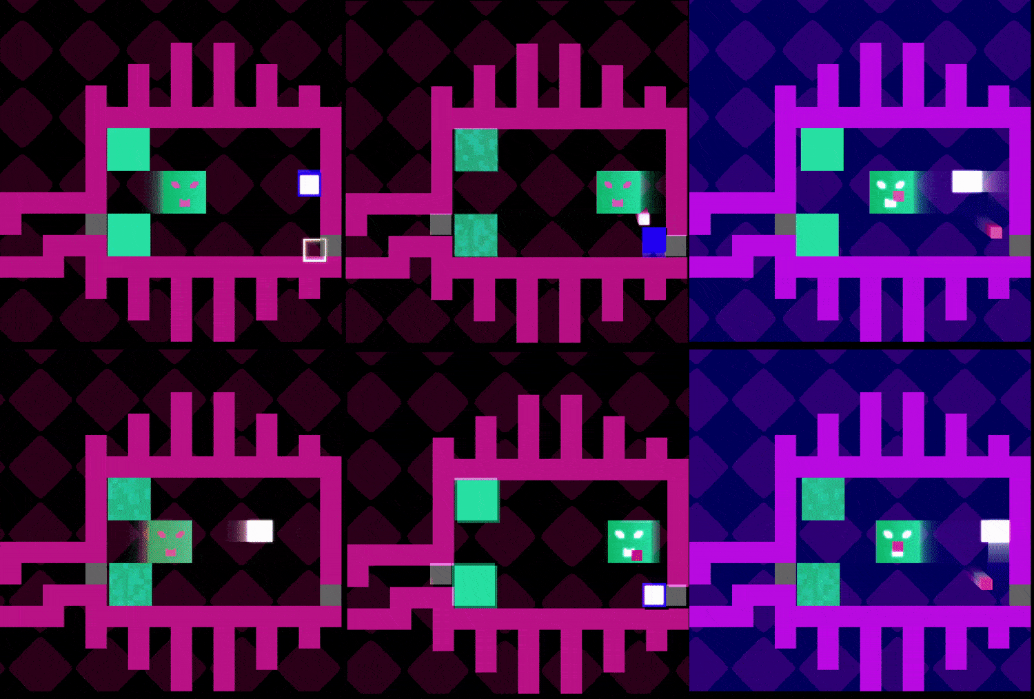
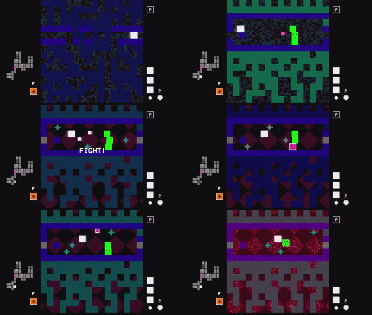
Today I'm sharing a couple of essential features of my game:
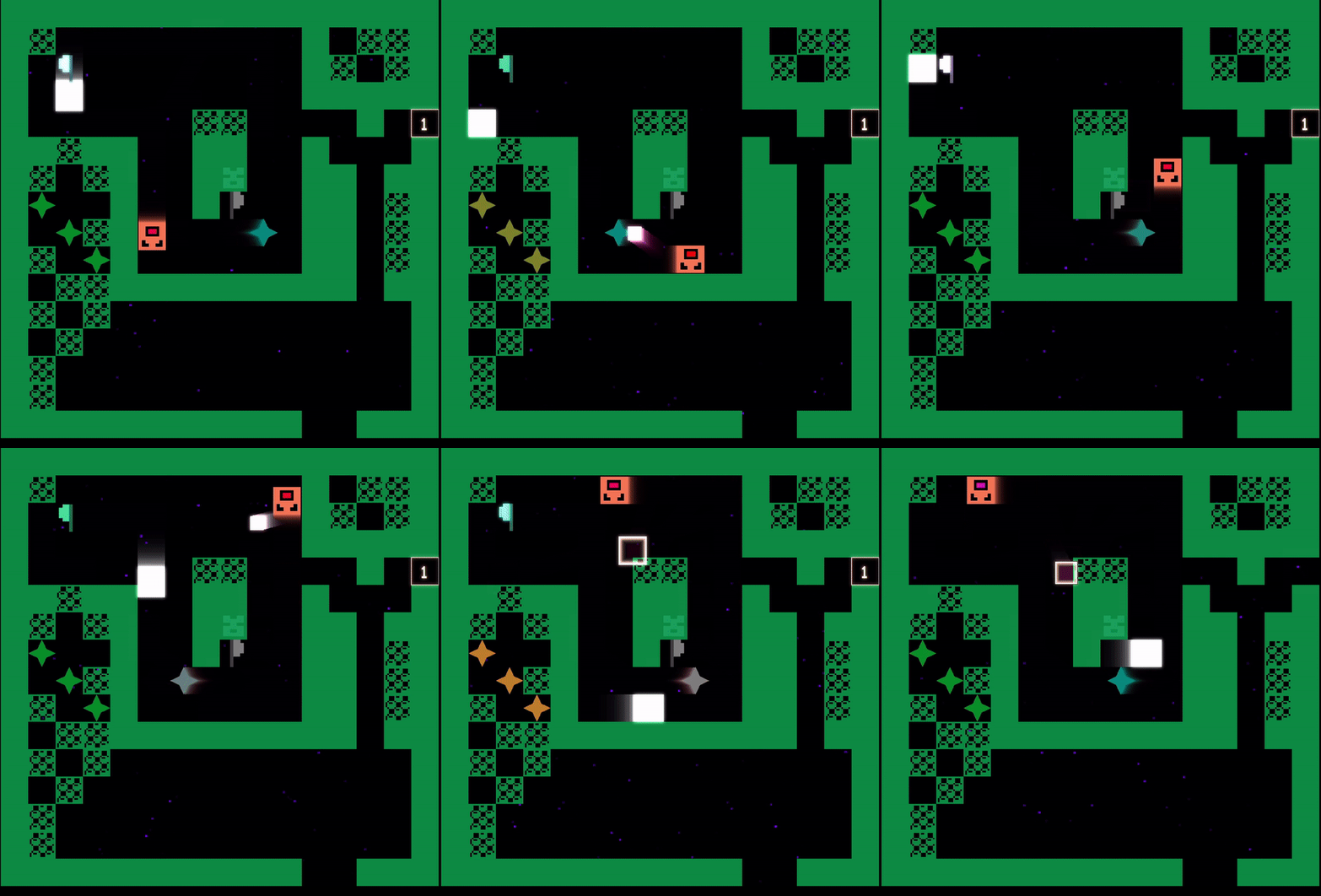
The first is bullets flying everywhere!
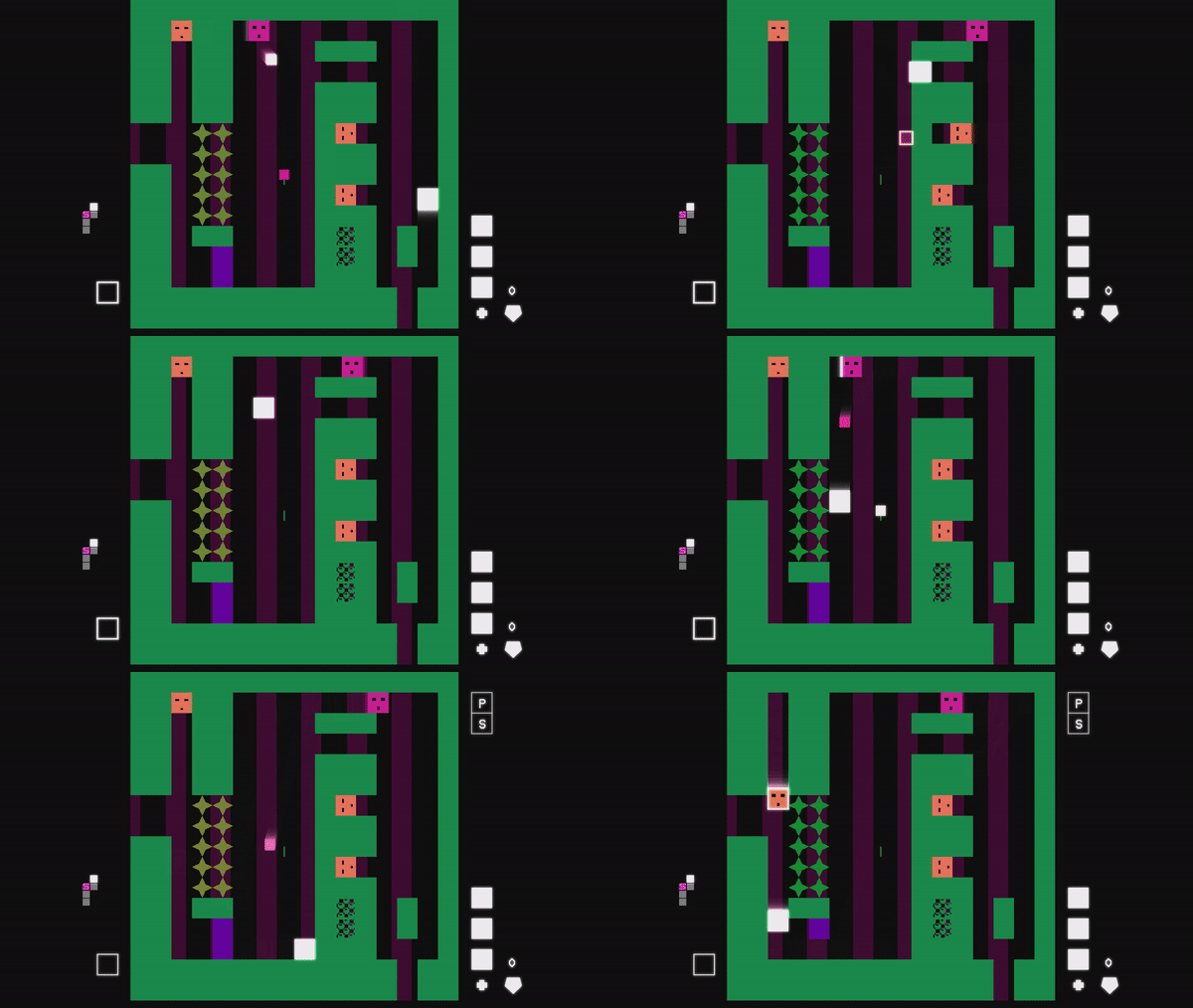
In this room the objective is to touch the two flags to remove the gate on the right.
This is made difficult by the three enemies shooting bullets constantly. Here you could choose to engage them all, but it's probably smarter to evade and try to get to the flags as fast as possible.
Using bullets + parries to advance
In this room you first have to evade / battle a set of enemies, until you come up to the wall at the bottom. This wall can be broken with a parried enemy bullet. After which you encounter the final trap of the room.
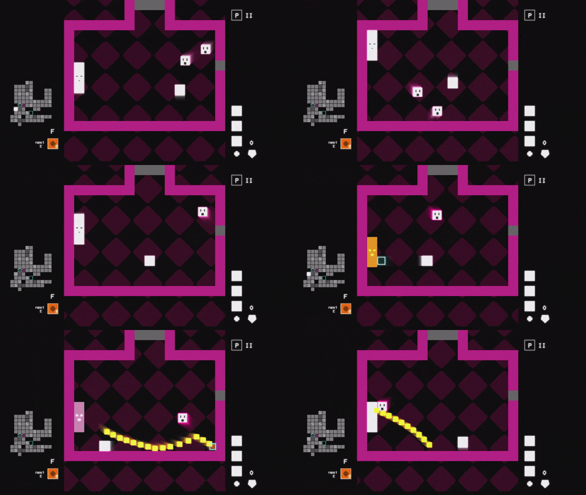
I'm working on a game called HeroSquare. It's a metroidvania type of game about exploration, fights and finding secrets and upgrades to your character. The battles feature a lot of bullets, and that's where the main battle mechanic comes in, as you'll be parrying plenty of bullets to send them back towards the enemies.



You can read a lot more about it and play the latest demo at https://anothercastle.itch.io/herosquare
Here I plan to post kind of random updates and little bits of what I'm working on, also to chronicle it for myself :)
Hi, this looks pretty cool!
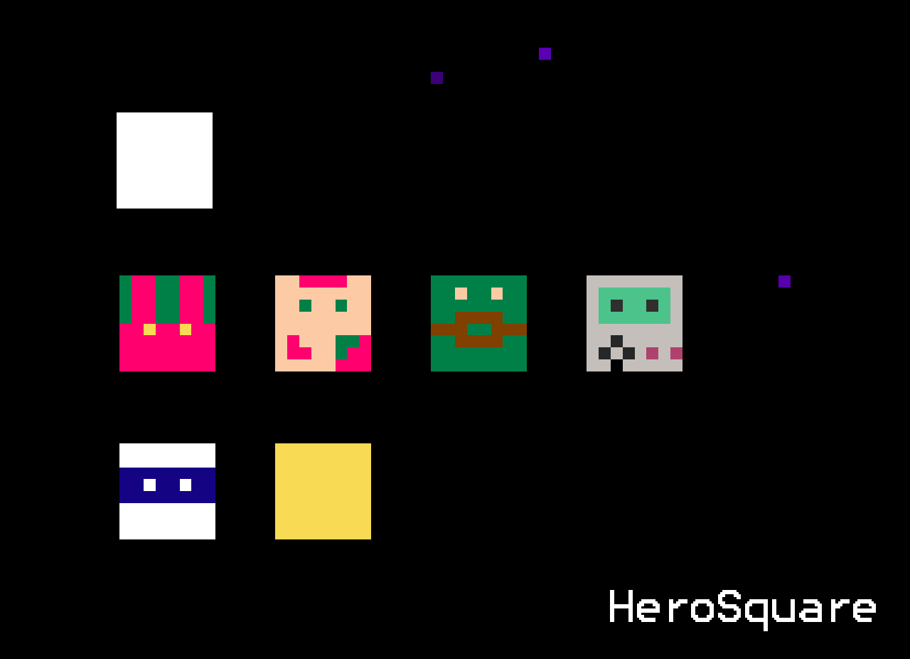
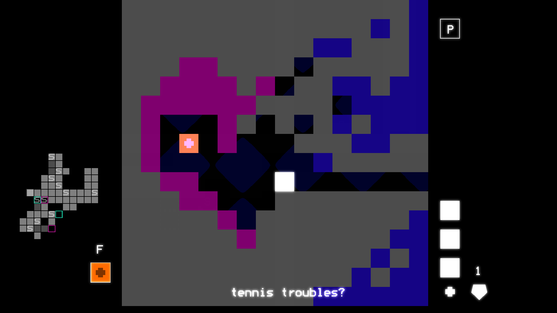
Couple of observations about the UI:
- the numbers are a bit small and the font is making them hard to read. In this kind of game I'm probably going to be looking at a lot of stats, so maybe making them larger and easier to read would be a good idea :)
- you have a lot of empty space around portraits and different sections of the UI. The graphics for characters and items look pretty nice, so why not blow them up a bit and reduce some of that empty space?
You have nice pixel art, make it larger!
I have a cool story about how I encountered video games. It's not probably quite what happened and I may have embellished it in my mind, but I like it!
When I was about 5 years old, I encountered the 8-bit Nintendo Entertainment System at a friend's house. What I remember most about it, is how the the underground level looked in Super Mario Bros 1. The way the coins glow in the dark on a CRT screen.
The video game was a mystery, an unknown, intriguing one. Back then nobody knew what was in a videogame, what there could be in a videogame.
Nowadays we of course have less of the mystery in certain terms, but as speedrunning or games like Elden Ring (and many others) show us, some of the mystery remains. I think that's why I keep playing video games, and it's also why I want to make them. The mystery endures.
I think what helps is to see it as many different activities (which it is). Coming up with ideas is important, coding is important, making assets is important, marketing is important, building networks is important. You get the idea.
I think something that easily happens is that you try to guilt yourself into building some huge project, which starts feeling bad after a while.
In reality you don't have a deadline, and there's lots of different activities that are all building towards making games, and only you can determine what your goals and ambitions are. I myself only did game jams for almost 10 years, because I found it the best way for me to interact with game development.
I know it's easy to forget, but it really is about the journey and not the end result.
If you're brand new, then most likely trying to do a highly interactive 3d game is trying to do too many things at once.
Now I know it is the game you have the idea for, and you probably feel reluctant to give it up, but maybe you can take a few intermediary steps:
Here's what I'd suggest:
- Find a tutorial that does something similar to what your vision is
- Try a couple of hours of that similar tutorial, try even completing it. Usually it's necessary to do something guided for starters and then you'll also understand the tool you use better.
- Try making a game on your own. Something very simple, like a character moving and interacting with 1-2 objects. Making a game without the tutorial is a completely different experience.
- After making a simple game return to the vision. Try to understand everything you need to do to make your vision work. Some things would be:
- how do I divide my code and entities etc. in this game?
- how do I create assets and get them into the game?
- how do I create levels and content? (making level is completely different challenge to getting character dialogue or story triggers in your game)
- After working on your vision return to make another simple game, again something very small, but interactive. Try to do a single thing from your vision.
Perhaps you see now that the pattern I suggest is roughly: vision project -> small game -> vision project -> small game etc.
Game development is had and it requires learning quite a few things. This becomes easier if you can create a ladder of smaller projects towards your ultimate goal, and will probably keep you motivated for much longer than just working on the big project, because inevitably it won't be fun all the time.
Also going with this logic, one of the small games could be a visual novel treatment of your idea. Basically all professional games are also started with a prototype, that often won't have much to do with the final game, but is used to explore the setting and ideas related to the project.
I hope you got something out of this, and I hope you make a great game :)
Depends a lot on the related mechanics.
- Health bar is important if health doesn't regenerate, as you definitely want to see how much health you have (because if you don't then you kind of just randomly die which isn't very satisfying).
- if health regenerates, then we can do much more vague health indicators (such as increasing red color many games with automatic health regen do)
- I wouldn't add just a visual gimmick for health, unless it somehow changes how the game operates
In general with UI I'd say, it's not an aesthetic choice, it's more thinking about what supports your core mechanics.
You can hear the title tune in the game trailer
The tune is actually something like 7-8 years old, I never had any intended use for it, but I've always thought it's a nice melody and now I found a perfect place for it.
For this version I tried to build the instrumentation around retro sounding FM sounds (such as the Yamaha chips in old arcade games and some consoles). This is quite obvious in the bassline :D
The hardest part to nail was that brass sounding thing that comes in the chorus, really happy with that particular sound. The drums I kept pretty basic, since the tune is already kind of full of movement and lots of things going on.
How do you like it, does it evoke some adventuring from days yonder?
HeroSquare is an adventure game made up of (mostly) squares. The gameplay features action, exploration and puzzles with branching paths and upgrades familiar from the metroidvania genre.
HeroSquare's main ability is to reflect enemy bullets by parrying them, which is used for combat and puzzles alike.
The just released demo features:
- approximately 1h of exploration and action gameplay
- several boss encounters
- items and upgrades for you to find (or not)

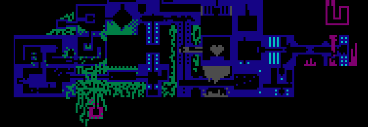
I hope you have as much fun playing it, as I did making it :)
Really appreciate any feedback you may have!
Hi all,
I would like to get some feedback on my gamepage (and if you want on the game itself).
1. What do you think of the game page at https://anothercastle.itch.io/herosquare? Do you get a good impression of what the game is and how it plays? Is there something you think would put you or others off from trying out the game?
2. If you try the game, how did you find the first 5 minutes? Is there something putting you off from playing more? What is your impression on the overall quality of the game?
Thank you so much!
(If you're busy, just tell me your first impression on the gif below :) )
My first association is that this plays when some exposition is happening, and maybe we're having a bit of a scripted boss fight etc. because the slower tempo would support something like that. I think it would be cool to introduce a new element for the 2nd half, like a guitar solo or something that would be in contrast to the very measured and harmonic base you have here.
Hi,
My game https://anothercastle.itch.io/herosquare hasn't shown up in search for 24 hours (there's another game with a similar name that does show up). This seems to have occurred after editing the cover image. Otherwise I have not changed much, there's a downloadable file and the project is set to public.
If I just need to wait a bit more, that's fine
Thank you!
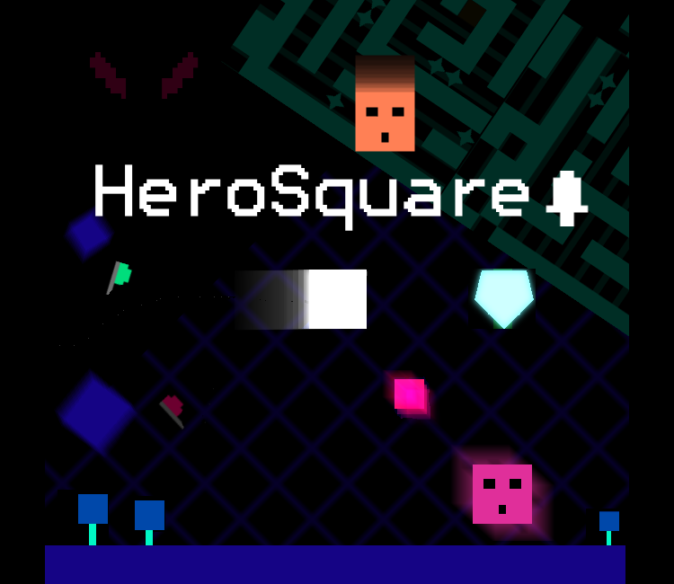
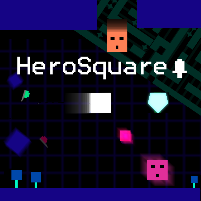
Having reached a checkpoint with the release of a playable demo, I've now had some experience with how my promotional assets perform on itch.io. Personally I feel like there's a lot to improve, so I've started by introducing a new cover image for the image.
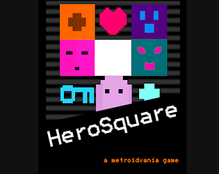
Which cover do you like better? Which one do you think works best when scrolling through itch.io games?
1 (old cover)
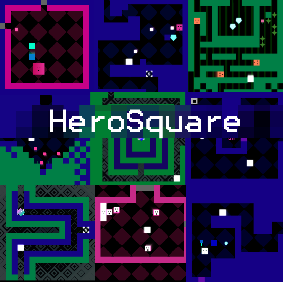
2 (new cover)
Hi everyone!
I'm so pleased to officially announce my upcoming metroidvania-adventure game HeroSquare.
In the game, you're a small square with great ambitions:
- You will venture through various strange zones, fight enemies, solve puzzles and find treasure!
- You will also find new abilities and powers, that you must put to good use to make it to the end
- Throughout exploration will see you finding some very obscure locations and items
Try your luck at finding the Demo Trophy in the playable demo 🏆!
You can find the demo at https://anothercastle.itch.io/herosquare


