If there is anything you would like added to Animation Buddy, let me know here and I may add it.

Flip through a video frame-by-frame, and practice your animation skills through observation · By
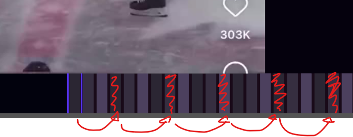
Could there be a feature that can change the highlighted frames to a specified amount of frames? Like every 2nd, 4th, or 8th frame? And potentially some customizable colors for the frames too? A scroll bar for the frames would also be a nice addition because the swiping motion does get a little tedious.
I worry that making user customization for highlighting every amount of frames would complicate the user experience for little gain.
The high-customizability option would be allowing the user to configure an offset and pattern-length (probably by intuitively dragging the cursor on the timeline while holding a key down).
The low-customizability option would be making the default highlight pattern mark every 2nd/4th/8th frames. This may work because most animation is done on twos.
I fear the high-customizability option may be seldom used, confuse people, and distract from the study by adding a new thing to think about.
I want to try the low-customizability option, but let me know if that does not fit your use case or if it would be weird.
I'm generally not a fan of user-customizable UIs; I believe that if a user desires customizing their UI, then the UI may just be poorly designed and should be made better for everyone. But then again, maybe it's just a fun form of expression for the user. Why do you desire to customize the colors? I'm curious if this is for expression, to solve a design problem, or another reason.
I do see the value of a scrollbar. So Animation Buddy can keep its minimalism, I could probably have it off by default and toggled by a hotkey.
Just to double check: are you aware you can zoom out with a configurable hotkey (Or I think Ctrl+Scroll wheel)? This eases the amount of work accomplished by the swiping motion.
Your post made me unrelatedly think I could easily make clicking on a frame toggle highlighting that frame in particular, so it would be easy to mark frames. That would be useful for quickly visually distinguishing a starting frame for a study (previously I was solely using the frame number).
Thank you for the suggestions.
Let me know your thoughts on my responses.
Hello! The low-customizability option would be great! I wanted to follow along Toniko's suggestion of referencing every fourth frame when studying a scene. It would make it easier to visualize and keep track of every 2nd/4th/8th frames, so I think this would be a really useful feature.
For the UI, I desired customized colors just as a fun form of expression. I do also think it would be nice to have slightly brighter color options instead of just purple but it isn't necessary to have.
I'm aware that I can also zoom out when viewing the timeline but I didn't consider it for making the swiping motion easier. Although, I still believe the scroll bar function would be a valuable feature to have to move around freely and also visually keep track of an area of frames (besides the timestamp and frame numbers). I'm not sure if either a scroll bar for the frames or a seeking bar for the video (like on a YouTube video) would be a better implementation of this idea. I also don't mind having the scroll bar off by default for the minimalistic feel.
I really like your idea of frame highlighting. That would be amazing to be able to keep track of specific frames for studying. Maybe it could also work well with a seeking bar that could also mark the highlighted area on it.
Thank you for your response!
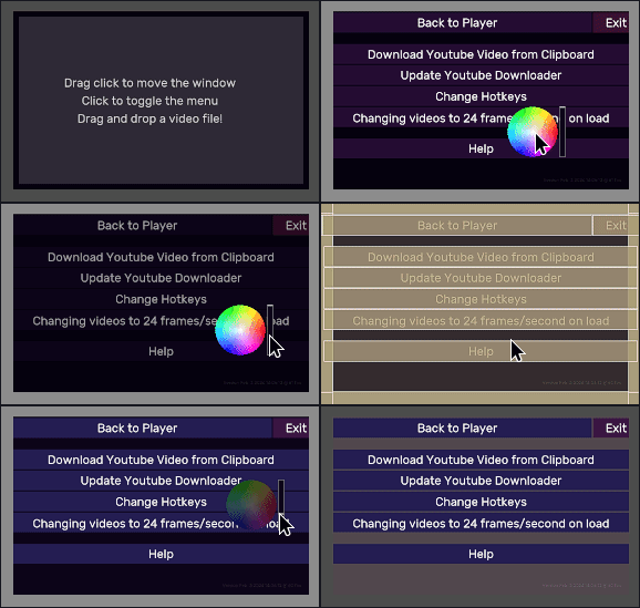
Awesome :) The update is now released, with user themes included. Holding "Ctrl" and "Shift" and holding click on a visual element should allow you to change its color, and this will save changes to a file automatically.
You should be able to access the download page from your Itch.io library or from the "You already own this; go to the download page" banner on the store page.
