Game screenshots
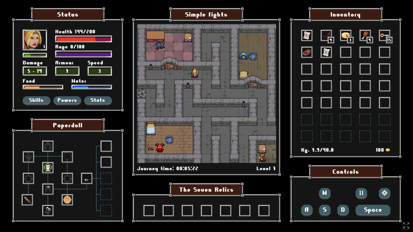
The adventure screen
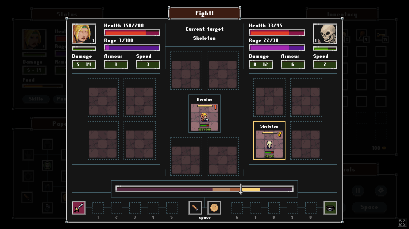
The combat screen
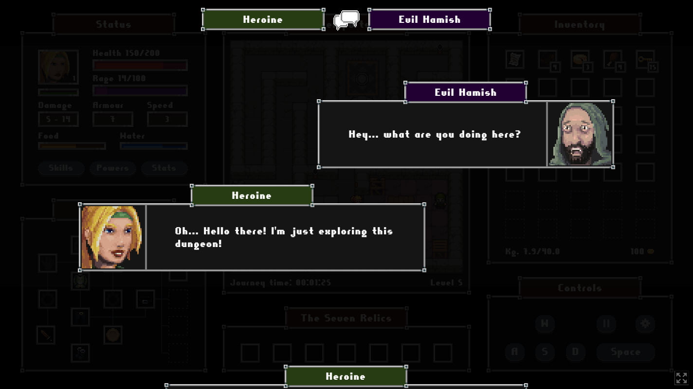
The dialogue screen
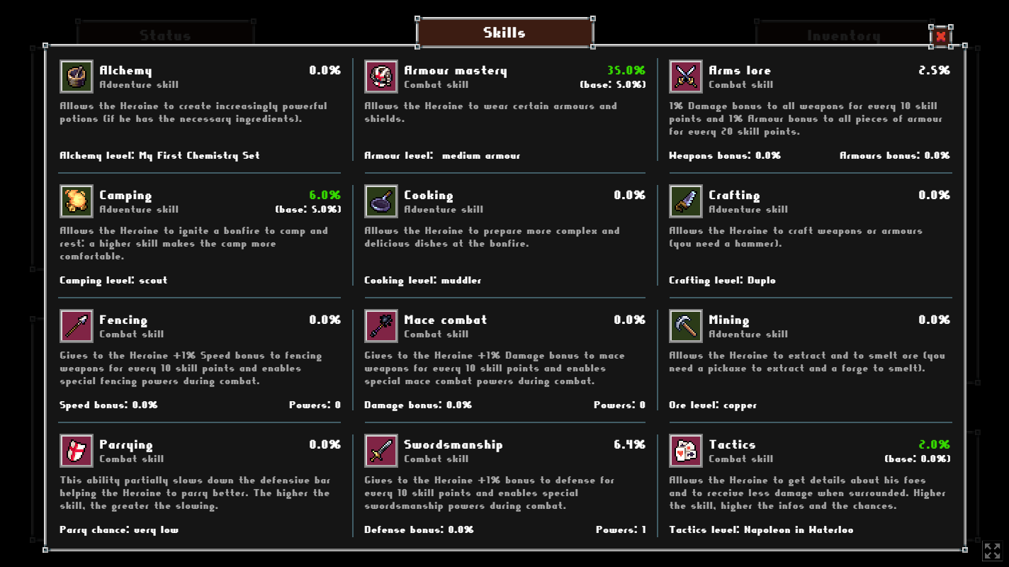
The skills panel
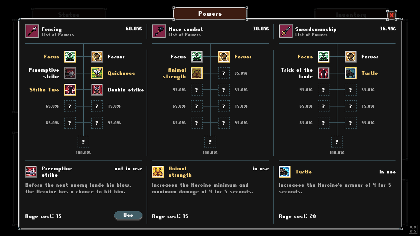
The powers panel
Link to the demo
https://iltimido.itch.io/the-great-unnamed-roguelite-game-demo
In a nutshell
This is a demo of an upcoming roguelite game (still unnamed). The game will feature up to 50 different levels, combats, a crafting system and (we hope) a nice story.
What to expect
Players will embark on a journey through this treacherous dungeon, fighting their way through hordes of monsters and bosses, collecting loot and crafting powerful weapons and armor to aid them in their great quest.
As players journeyed through each level, they will face new challenges, each more difficult than the last. The combat system is fast-paced and intense, with players needing to use all their skills and wits to overcome each obstacle.
Despite the challenges, players will be eager to dive into this new world, will be eager to explore its many levels, discover new secrets, and become the ultimate champion.
This demo
This demo consists of two parts: the first shows the basic gameplay of the game, in fact in the first simple levels you will find labyrinths, traps, buttons, teleporters etc etc..
The second is focused on fights and a detailed tutorial has also been provided to explain the basics: you'll find lots of monsters with different characteristics precisely because... it's a demo!
The final game won't just be about that, but that's how it is right now.
Thanks for your time and nny constructive feedback is greatly appreciated!

