Indie game storeFree gamesFun gamesHorror games
Game developmentAssetsComics
SalesBundles
Jobs
TagsGame Engines

Could I ask You for little help Mr. Eccma?

A topic by ̒̈́̕𝕮̖̪̼𝖍̒̈́̕𝖆𝖔̒̈́̕𝖘 created Dec 23, 2023 Views: 1,153 Replies: 12
Viewing posts 1 to 6
(+1)

Hello, so as You probably know I'm working on Wikia for Your game!

I would need to have texture for border "paper image" You use in game but made in way so I can use it for Wikia. Sadly I'm too potato at making PixelArt so without Your help I'm not gonna be able to make it perfect :(

If You wish to see how it currently looks: -> https://lonarpg.fandom.com/wiki/User:TobiChaos

If You could edit that texture to what I need for Wikia it would be great.

Corners should be seamless same with borders, also they should end at color as central tile, don't go beyond "red lines" Wikia is using 30pixels from each direction to use as border for element on the page, all that need to be done is just soft gradient towards center like You have on all "picture - papers" :x...

Ofc. if You don't want to do it or You don't have time for that... it's also fine and dont worry :x...

GPT Translation:

你好,正如您可能知道的那样,我正在為您的遊戲在Wikia上工作!

我需要有遊戲中您使用的“紙張圖像”邊框的材質,但要以我可以在Wikia上使用的方式製作,可是我在製作像素藝術方面太差了,如果沒有您的幫助,我就無法做得完美 :(

如果您想看看它的當前外觀:-> https://lonarpg.fandom.com/wiki/User:TobiChaos
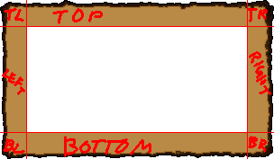
如果您能將該材質編輯成我在Wikia上需要的樣子,那將是非常好的。

角落應該是無縫的,與邊框相同,它們應該在中心磚塊的顏色處結束,不要超出Wikia使用的“紅線” 30像素,以用作頁面元素的邊框,所有這些都只需要輕柔的漸變朝向中心,就像您在所有“圖片 - 紙張”上一樣 :x... 當然,如果您不想這樣做或者您沒有時間,也沒問題,別擔心

he can fully understand english he just struggles if you talk english to him,  also why not use the red background boarder like the one used in equip menu?

Because idea is to have paper background for some content like we have for Encounters and some other events.

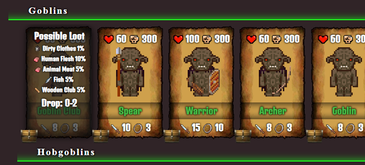
I'm gonna create Animated CSS like when You select item and little table to look like items in game, these things can thankfuly be made just with CSS. Paper background will be used for stuff like for example Goblins Cards You can see in Enemy page I created ( and used like 200 hours of my life in it already xD )

On top of that these paper pages can be easily animated so for example if You hover Your mouse over it paper can tilt or move like normal "paper page"

That's why I translated message using ChatGPT so he don't have to struggle and waste stamina on attempts :P

Also... Im not sure what You mean by red background border like one in equip menu...

I can't remember about any red background in Lona... :/

Developer

what u mean ?   tempCG texture?

Developer (1 edit)

asdasdasd

I did used that texture at first but It was looking very bad when stretching it as background, so i decided to make it as repeating border and then fill with either random semaless tiles background or just with solid color.

only thing i need is to have texture that have only 30 pixels of "dirt" on edges and goes into solid color in center.

if center of the picture is too detailed then You can see many edges at page borders with center :/

Ohh I have an idea,


If You could edit that texture on edges so there is no so much visible  "border" between then.

Browser to create container on Wikia will sample texture on edges and create any resolution page as needed so we can have containers of 300x200 pixels or 500x500 pixels etc. I know I could use picture as background BUT... it's only good when You work with high resolution pixtures because streatching not gonna be visible, in case where we have PixelArt we don't want to stretch pixels around so seamless to center texture is required :(...

(+1)

I got a friend to make little edits to that texture for me, but his works is kinda far from perfect.

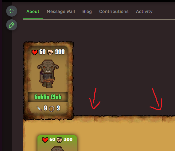
I hope It could give You general idea and here is how it currently looks like:

Here is version created by him, problem with that texture is that as You can see it's not seamless, in order for it to be "connections" between corners and borders should be seamless... well it do look much better now but if You could make that little one fix I would be really happy ^_^

Here is texture that Wikia currently uses:

OH!! That looks good! Glad the wikipage design looks very cool!

Regarding to the seam issue, do you know how to use Kirita to solve this issue?

I have no idea what is Kirita, I'm not Artist I'm programmer xD 

Just Googled it, it's some soft for drawing i see... well never used it :x... I use Paint and Gimp sometimes xD

(+1)

I already make made some edit and reduced the seam issue for your wikipage, hope this helps.

(1 edit) (+1)

Sorry that It took so long but I have a lot of stuff to do ( I have basicly 3 jobs ) but I tested Your texture now and well...

It have some issues, 

  • 1) it is blurred and 
  • 2) it is not really seamless :/... 

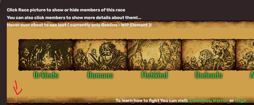
Thank You for at least trying to help ^_^ as You can see Enemies page looks way better now :P doing some more upgrades with more CSS, having Admin permission on Fandom is awesome :D

I managed to make it almost 99% seamless already so it pretty much works perfect now ^_^ there are some issues still ( bottom left corner ) but well... almost nobody gonna notice stuff like that i believe :D

So I can say that I'm step closed in makin LonaRPG Wiki better visual xD

Btw. I have over 800 edits on LonaRPG Fandom and ~90% of them are just Enemies page :D lol...


(+1)

don't forget about goblin focused and hobgoblin focused the only difference is they are passive at 60.1+ weak