A place to share any constructive criticism for the game! Still early in development as this is a student project but should be updated frequently. Releasing late-May 2024.

Fight your way out of the scrapyard! · By
The game graphic is classic, it's like old-school horror game (More interesting than realistic graphics) maybe keep it that way.
The longer you play the more you get bored because of the game being repetitive each rounds.
I do not know why some rounds there would be 5 robots spawned in.
It would be funny if you could fall INTO the lava and try to jump out.
Make the map more wider.
Expand the map so the players could run further into the map without having to easily get cornered by the robots.
Give wave break each round.
Character skins?
Overall this game was fun in the beginning and it just get bored overtime with the game being repetitive. I'll give it 8/10
Thanks! Glad you enjoyed the game.
We plan on updating the UI soon to make things a bit more clear for the player. A lot of your points here are already being targeted for future updates, fortunately!
The graphics were also a feature we loved - the old PS1-esque pixelation.
Passing your compliments and feedback along to the rest of the team!
Glad to hear your feedback!
Health UIs for the player and the bosses are in active development!
As for the instant spawning, we are working on having the "loop" feel more like a loop - a proper death screen, some minor downtime between bosses and a few other details.
Thanks for taking the time to play!
Hello Devs,
Cracking bit of work you guys have here and am excited to play the final release. A lot of my feedback has already been notified by other people but thought I'd mention it anyways. The main menu is awesome- love the diegetic feel of it being the scrapyard and the moving parts such as cogs and such keep it feeling super dynamic. Perhaps once you click play the character's face lights up on the "play" screen as if it was being awoken to fight. The weapon choices are nice and am liking the different playstyles that each of them give to me.
Id suggest either dialling back the fire rate on the pistol or change it to something a little more fitting such as an SMG of some sort.
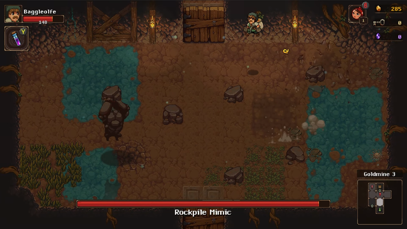
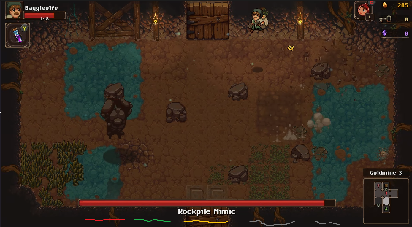
I can see that the UI is in active development - I think that your game would benefit a UI that looks something similar to this. The health bar being at the bottom would fit much better *imo* as the boss starts from the top of the screen allowing the player to see the boss and its attacks straight away. It frees up real estate allowing for better clarity of the game space.

-Also try changing the text size of the modifiers to be smaller than that of the bosses name. The modifiers are Additional effects to the boss fight so they shouldn't be the same size as it ruins the readability of the boss. In my example above you could fit modifiers below the name in a similar fashion to this (Excuse the MSPaint) where each of them is colour coded to display what type of effect it does (yellow = status effects, blue = statistical modifications) or even by rarity/difficulty (yellow = legendary modifier, blue = elite modifier) and allowing for better rewards upon defeat depending on what modifiers it has when its killed.

Lastly, i would love to see more stage hazards. This would promote some really nice emergent gameplay segments and lean into the roguelike genre even more! For Example, I can see you have poison implemented to some degree so having a damage over time that keeps ticking even if i step off of it; would mean that I am substantially more careful about where I tread. Water could glitch the screen and electricity could even power you up for a little movement speed buff (but also the boss as they're both robots). Additionally Lava doesn't feel that much of an issue at the moment - Id flash a vignette or pick a clearer font as I cant really see how much damage I have taken when I'm in the heat of battle.
Keep it going, Lads. You've got something good here and am loving the current progress!
*keep connor in check, heard he's got a bad case of the scopecreep-itus*
- tcarterdev
Wow, thanks for taking the time to leave such extensive feedback! The detail is fantastic and I agree with basically everything mentioned. Some great ideas that we'll be sure to take into account.
Gameplay UI is a known weakness right now and your suggestions there all make a lot of sense - cheers!
The system is there to add more stage hazards, too, so that should be a good easy(ish) way to up the variety even more.
Once again, thank you for this feedback!
- Louis