Thanks man!
Tariq Carter
Creator of
Recent community posts
Hello Devs,
Cracking bit of work you guys have here and am excited to play the final release. A lot of my feedback has already been notified by other people but thought I'd mention it anyways. The main menu is awesome- love the diegetic feel of it being the scrapyard and the moving parts such as cogs and such keep it feeling super dynamic. Perhaps once you click play the character's face lights up on the "play" screen as if it was being awoken to fight. The weapon choices are nice and am liking the different playstyles that each of them give to me.
Id suggest either dialling back the fire rate on the pistol or change it to something a little more fitting such as an SMG of some sort.
I can see that the UI is in active development - I think that your game would benefit a UI that looks something similar to this. The health bar being at the bottom would fit much better *imo* as the boss starts from the top of the screen allowing the player to see the boss and its attacks straight away. It frees up real estate allowing for better clarity of the game space.
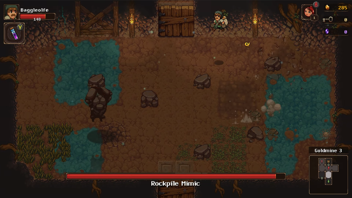
-Also try changing the text size of the modifiers to be smaller than that of the bosses name. The modifiers are Additional effects to the boss fight so they shouldn't be the same size as it ruins the readability of the boss. In my example above you could fit modifiers below the name in a similar fashion to this (Excuse the MSPaint) where each of them is colour coded to display what type of effect it does (yellow = status effects, blue = statistical modifications) or even by rarity/difficulty (yellow = legendary modifier, blue = elite modifier) and allowing for better rewards upon defeat depending on what modifiers it has when its killed.
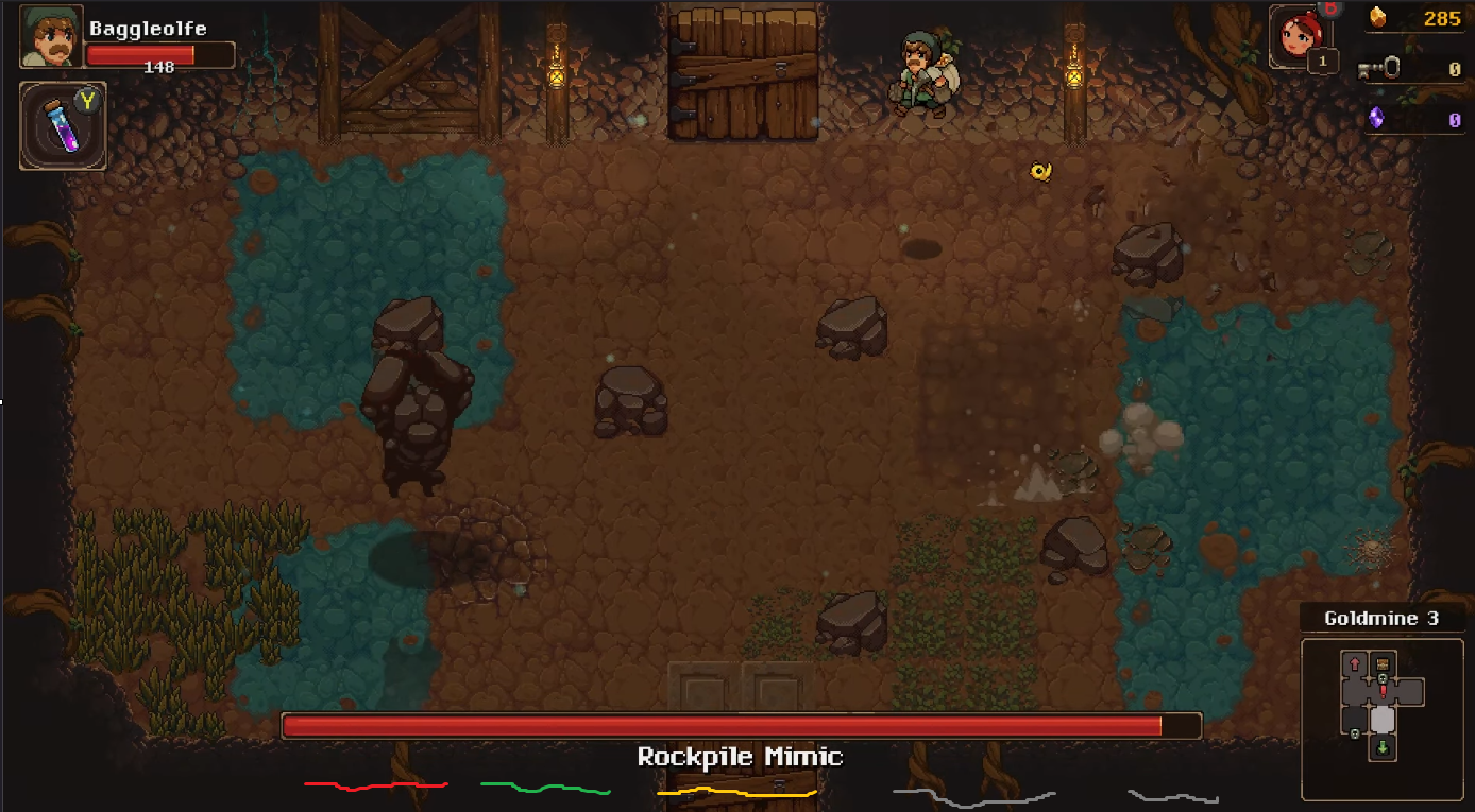
Lastly, i would love to see more stage hazards. This would promote some really nice emergent gameplay segments and lean into the roguelike genre even more! For Example, I can see you have poison implemented to some degree so having a damage over time that keeps ticking even if i step off of it; would mean that I am substantially more careful about where I tread. Water could glitch the screen and electricity could even power you up for a little movement speed buff (but also the boss as they're both robots). Additionally Lava doesn't feel that much of an issue at the moment - Id flash a vignette or pick a clearer font as I cant really see how much damage I have taken when I'm in the heat of battle.
Keep it going, Lads. You've got something good here and am loving the current progress!
*keep connor in check, heard he's got a bad case of the scopecreep-itus*
- tcarterdev
Super interesting mechanic- love it! Let us know what you thought on our submission https://tcarter.itch.io/cl34n-up
Nice submission man- Love the art and with more features to the gameplay loop such as randomly spawning the burgers for example would improve such a great foundation. Check ours out and see what you think https://tcarter.itch.io/cl34n-up
Thanks,
tcarter
Your game is super fun, I like the art assets a lot and the animations on the pumpkin lord at the bottom are really cool. The hazards on the stage are a really nice addition too and had me mashing my arrow keys. I would suggest using Text Mesh Pro for the fonts next time or at least turning the font files to "hinted Raster" to prevent the blurry look to them.


