On Sale: GamesAssetsToolsTabletopComics
Indie game storeFree gamesFun gamesHorror games
Game developmentAssetsComics
SalesBundles
Jobs
TagsGame Engines

What do you guys think about our first Pico 8 Concept Art?

A topic by Metellus created Dec 11, 2018 Views: 874 Replies: 7
Viewing posts 1 to 5
(1 edit)

Hi Guys,

we are currently developing a small game for a Pico 8 Game Jam at our Game Design school in Cologne. While we're just at the beginning of the development i can already share the first Image from our game.
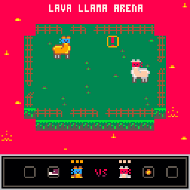
Like many of you can already guess, LAVA LLAMA ARENA is a short game were you have to push your Llama friend into the Lava. (More Details of the Gameplay are still in development)


So what do you think of that first pick? Feel free to share your opinion!

The LAVA LLAMA ARENA Team

(+2)

Looks amusing. My only suggestion would be that the area surrounding the arena is way, way too bright. It's a really vibrant shade and it draws the eye way more than the actual gameplay area. I think something like a burnt orange would still communicate lava wihout being so distracting.

(1 edit) (+1)

The lava needs to look more like lava and more dangerous. I don't know it is lava until I read your post.

(+1)

This is a bit confusing: no "concept art" here, rather a mockup screenshot.

Concept looks cool -- whats not to like, throwing your fellas to lava.

A gif may do better here (i'd like to see them bubbles swell and pop).

(+1)

Thank you all for the feedback! 
Today we're starting play testing.


(+1)

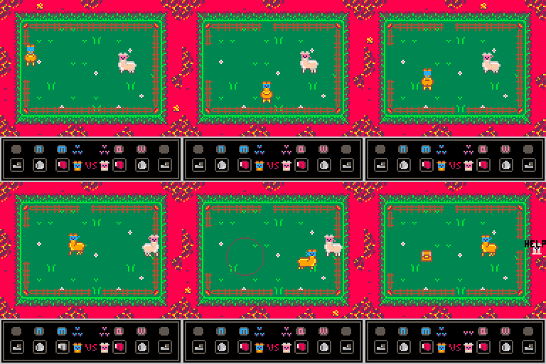
gifs look really nice tbh, agree with another poster about lava colour being a a bit too bright. 

But wit the new animations and the corners etc it looks a lot better for sure.

aside from that think it looks pretty cool, like the look of the mechanics :)

(+1)

I'm totally with you. Pico 8 only have that "Magenta" Color type. We did our best to defuse the Lava :-)