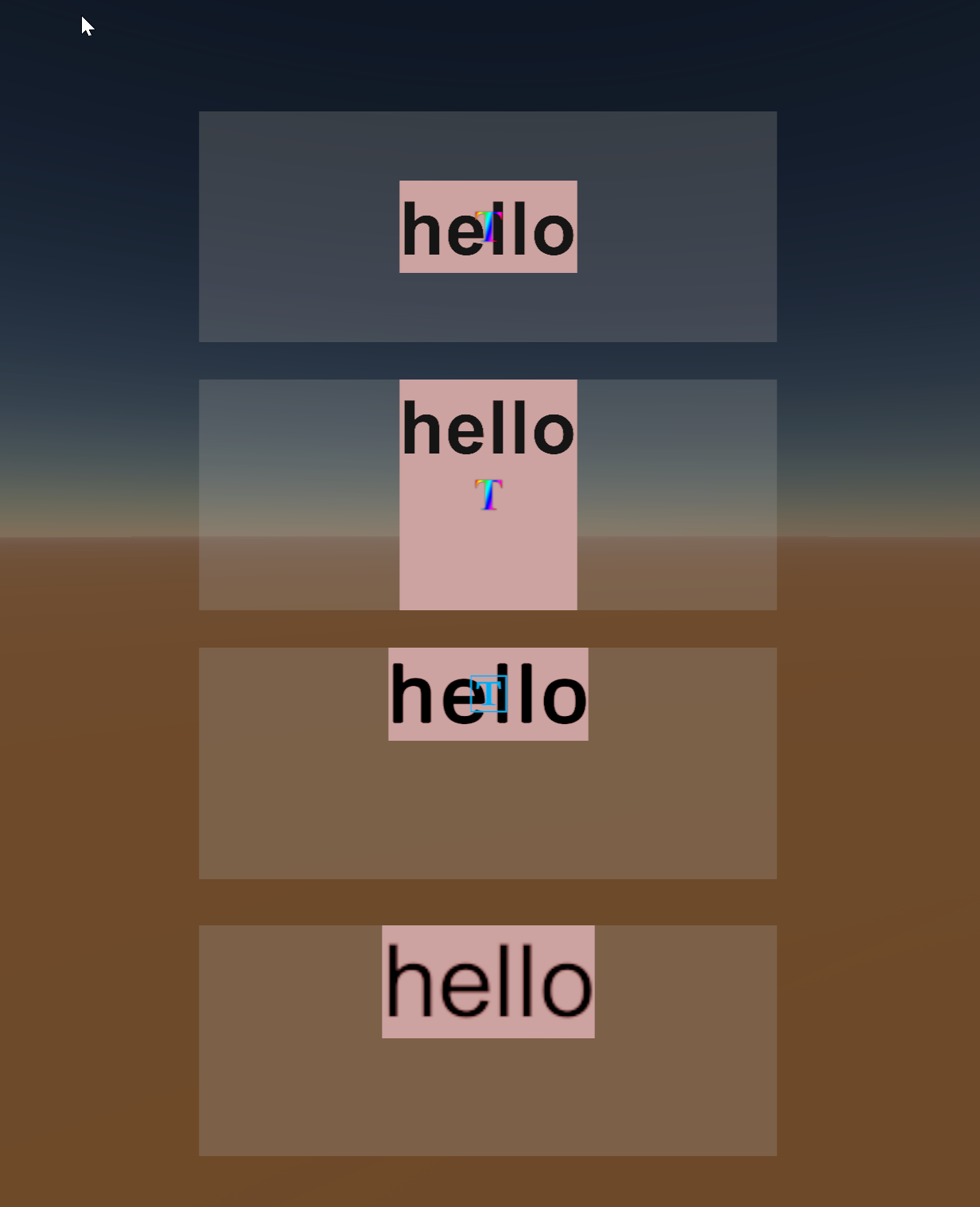
Here’s an example of a very simple scene with SuperTextMesh, TextMeshPro and Legacy Text

The bottom three are identical, the top one has an extra ContentSizeFitter as the docs suggest, which does kinda help, but still causes the layout to be wrong.
The exact setup is created following this short video https://www.youtube.com/watch?v=W4tUQr9Tv3g, in short it’s simply a text item with two nested VerticalLayoutGroups set to Control Child Size.


