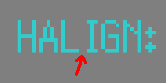
I've noticed some odd kerning for a few of the characters, the most obvious one being the capital "I" which has an extra pixel on its left side causing awkward gaps in some words. Image provided to show what I'm talking about. There's also a similar issue with the exclamation mark and some other characters, but the "I" is the one that really stands out.


