Indie game storeFree gamesFun gamesHorror games
Game developmentAssetsComics
SalesBundles
Jobs
TagsGame Engines

I made this NES mockup and I could use some feedback

A topic by Mr_Kha created 52 days ago Views: 109 Replies: 1
Viewing posts 1 to 2

So, long story a short: a friend of mine is working on a manga and next week will be its first year anniversary (November 2nd). I decided to make an NES mockup based on the latest chapter as fanart for the occasion and I'm in need of honest critique in terms of originality- how close it looks to an NES videogame, or what needs to be improved to look like one.
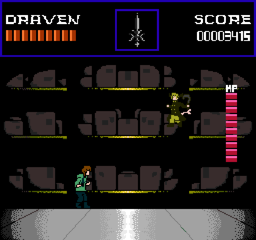


I think your HUD looks too big, comparing to Castlevania NES. In the latter, you can see many info in the HUD without sacrificing readability. IOW reduce the text, icon and HP size to allow more info in the HUD. That includes boss's HP bar.

That being said, it looks good. I can imagine on what's happening here.

Oh if you're going to post updated mockup next time, please show the weapon from both characters to see how much screen is filled with their weapons.