Indie game storeFree gamesFun gamesHorror games
Game developmentAssetsComics
SalesBundles
Jobs
TagsGame Engines

The Tome: Pixels

A topic by jeffreyjene created Mar 27, 2020 Views: 696 Replies: 5
Viewing posts 1 to 6
(2 edits) (+2)

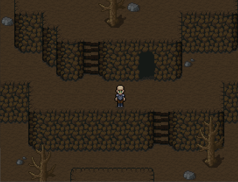
Usually I hate the way my RPG "mountains" or "hills" turn out, but this isn't too bad. I want to fix the square corners on the tops though, and give the steps more character, less uniform.

Edit: improved the stairs a bit. Now at least they look like stairs and not a ladder. I'll work on it a bit more.

(1 edit) (+1)

Looks great! I actually see a real staircase :) I also saw a similar work - when a character crawls on a rope inside a large vertical pipe (curved wall) - here IGMC MANSION TILES. This is a really great idea with lots of options for quality mapping. Thank you.

doesnt look too bad!

hey do you want to make a game together?

Yeah if the tiles for the stairs could match it'll be better. 

It looks pretty good =]

(+1)

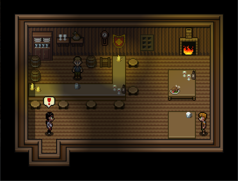
Another screen shot using my Darkwyck tileset I'm developing. The lighting effects are done with an RPG Maker plugin: