Indie game storeFree gamesFun gamesHorror games
Game developmentAssetsComics
SalesBundles
Jobs
Tags

Mempathy : A conversation in the Stars Gameplay feedback

A topic by SoyGema created Jun 22, 2020 Views: 277 Replies: 2
Viewing posts 1 to 3
(1 edit)

Hey there fellow Gamers and Testers!

Im building Mempathy... a narrative clicking experience :  a transformative relationship with constellations and  words, in order to discover something about yourself. Navigate making click  over the stars to discover how the conversation should be developed. Depending on the path you take, you might be conducted to  a different conversation.


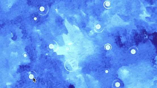
Im searching for feedback regarding the gameplay : Im not sure if this might be a clicking experience , or introduce swipe and drawing the paths through the game. I would the video game to have the conversation as the core, but Im not sure if the 'just clicking' mades it too simplistic to the game experience... would also be nice to include somehow the art in all this , but not sure how to advance in this area.

Also Im searching for some general feedback gathered in this form https://forms.gle/qwmtb4SfAjPdqMui9

Also in the search of other examples or games that might be useful regarding the gameplay and / or art progression. 

Thanks for the time dedicated to give me some feedback :) ... looking forward to help you as well in what you might find convenient 

https://soygema.itch.io/mempathy

Looking forward to hear from the community!

Moderator(+1)

Hi SoyGema,

Congratulations on the release of the game! Here is my feedback:

  • Currently the gameplay seems to be minimal. For the first few screens, the user has to click some bubbles in order, to move to the next screen. This is less of a game, and more of a visual novel, where you tell a story with minimal input from the user. If that’s what you were aiming for, that’s good! If you were aiming for something more of a game, I’d suggest emphasizing the game parts. The rest of this feedback assumes you were going for the game approach.

  • The concept of diverging the conversation should be introduced earlier. On the first or second screen the user is still learning how it all works, so just having one path is fine. But from the third screen onwards I’d suggest adding more branches, to give the user options, and make them understand that this is what the game is about.

  • I understand that you don’t want to reveal the whole conversation, but I think it’s very important to show to the user something different for each path. Let the user know what each branch would result in. You don’t have to be specific. It can be something as subtle as “Path 1 is aggressive, Path 1 is timid”, or it can be something more specific to the conversation. This will engage the user, and make them start thinking, and pick their option.

  • Clicking on the last bubble immediately moves to the next screen, even if I haven’t clicked any other bubble. I assume that’s a bug?

  • Upon loading a new path of the conversation, it’s difficult for the user to tell where the conversation starts, and where it ends (which bubble they should click first). Maybe mark the first bubble with a different colour?

  • The text can be difficult to read at times. This is both because of the font and because of the colour. I’d suggest for a different font that is easier to read, and maybe adding some outline, to stop it from blending in with the background.

  • While playing the game I ended up in a screen with the eyes looking at me. I assume that’s the last screen since I couldn’t do anything else in the game. It would be nice if there was something telling me that’s the end, something like a button with the text “Restart”, or simply some text saying “The end”.

  • Ability to restart the game without refreshing the page would be much better.

  • I like the artistic style of the game, that it’s a little abstract and lets the user make their own ideas of what’s happening.

This is some feedback for the page:

  • The page for the most part looks good. Colours are nicely balanced, everything is clearly visible. I see the same font is used for the titles of each section of the text, which is good in this case, as it’s bigger in size, and it’s only a title, so it’s not as difficult to read.

  • Maybe the background could be tiled both ways? Currently I can see a nice star-y gif playing on the top part of the background, with a solid blue on the bottom.

  • For the trailer, I’d suggest to add some music.

That’s all I could see for now. Hope they sound helpful on what to do next (assuming the project is still under development).

Worth noting that everything is my opinion, based on my experience, so feel free to pick only the parts that you like :)

Hey!

Thank you so much for your feedback, it definetly has activable  a deep empathetic understanding towards the intention of the game : Im definetly taking all into consideration. This was extremely motivating... please, dont hesitate in provide this kind of feedback across the platform.

thank you again