Indie game storeFree gamesFun gamesHorror games
Game developmentAssetsComics
SalesBundles
Jobs
Tags

I need feedback!

A topic by VarietySoft Productions created Jun 22, 2020 Views: 361 Replies: 6
Viewing posts 1 to 4
(1 edit)

Hello everyone 

I created my own board game named Word Royal.

https://varietysoft-productions.itch.io/wordroyal


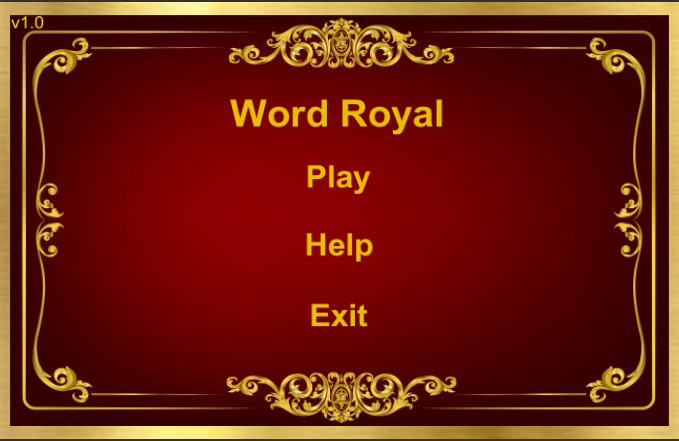
In game you must creating words and fill all fields.

If you make 7 mistakes you lose.

I need your rating of my game!

(+1)

Hey! can you post the itch.io link to the game in order to give you feedback?

 thanks

Moderator(+1)

I found the page based on OP’s profile: https://varietysoft-productions.itch.io/wordroyal


Sorry for not attaching a link, already done.

Moderator(+1)

Hi VarietySoft Productions,

Well done for finishing a game! I didn’t get a chance to play it, but here is my feedback based on the game’s page and the trailer:

  • Your trailer doesn’t do a good job explaining how the game is played. While watching it I put effort to try to understand the rules, and I still don’t know how to play it.

  • I’d suggest adding more sound effects while the game is being played. Preferably a different sound effect every time the game’s “state” changes. For example if the user clicks on a tile, and now they are expected to type a letter, it would be very smooth to have a sound effect hinting that this is indeed the case.

  • Background music would definitely improve the experience.

  • It would be so much better if you add some more visuals or effects on what element is currently “active”. As in, when clicking a tile, it should be obvious which tile is currently selected. When putting a new letter on a tile, it should have a small animation/effect to show what tile was just updated. These little touches can make a LOT of difference.

Here’s the feedback for the game’s page:

  • Your background seems to contain part of the gameplay. This can be quite confusing while looking at it. I’d advice to try to use something else, maybe something simpler and with less contrast. Remember, the background is meant to be discreet, it’s not there to attract attention.

  • The middle part of your page (the yellow panel) is way too transparent. This isn’t really a problem by itself, but because the background is so complicated, it makes it difficult to read the text. I’d suggest to change the background (as described above) or make the panel less transparent, or both.

  • Based on my experience, screenshots are best to show gameplay. Nobody is looking at them to see what the main menu of the game looks like. I’d suggest removing the main menu screenshot.

  • There is some blue text on top, and some black text below that. This seems inconsistent. I’d suggest to make a more “organised” style of when to use each colour and stick to it.

That’s all I could see, keep in mind they are all my opinion, so feel free to pick only the ones you like :)

Thank you for your feedback!

We listened to your opinion about the game and working on everything  what you tell here.

Soon we will post a new update in which the playing fields will be highlighted when pressed!

https://varietysoft-productions.itch.io/wordroyal/devlog/157396/we-announce-the-new-update