I'll keep this short because the subject isn't that complex either.
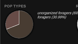
At the moment, we're using pie charts for data visualization, like so:

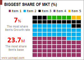
However, we could instead use waffles, like this chart:

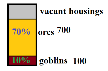
or this one:

They have less dead space but they may be more difficult to read and only show percentages rounded to the nearest integer. They also have a bit different aesthetic.
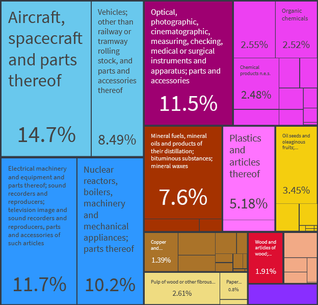
Which one would you prefer? Or perhaps there is some yet different graph you'd suggest for the main data visualization tool (with exception of treemapping, it's a bit too slow to use all over the place)?


