Play game
Punch Kick's itch.io pageResults
| Criteria | Rank | Score* | Raw Score |
| Audio | #48 | 2.008 | 2.200 |
| Gameplay | #57 | 2.100 | 2.300 |
| Theme | #58 | 2.465 | 2.700 |
| Arts | #62 | 2.008 | 2.200 |
| Mood | #66 | 1.734 | 1.900 |
| 2 Colors | #66 | 3.560 | 3.900 |
Ranked from 10 ratings. Score is adjusted from raw score by the median number of ratings per game in the jam.
Team1
jklassen
Leave a comment
Log in with itch.io to leave a comment.


Comments
Some concepts that I liked from greatest importance to least importance:
* The game tells the default values of the controls in the game.
* The main menu has moving text and text that enlarges when hovered on. These texts look eye-appealing to me as my eyes like seeing texts that are not stationary. I think these types of texts look charming.
Some concepts that I do not like from greatest importance to least importance:
* The gameplay is frankly uninteresting. These days, I do not really like endless runner like games in where the player can not actually win and finish the game. This is because the gameplay can get boring real fast as the gameplay can be pretty repetitive. In this game, there barely is a variety of enemies. Therefore, the gameplay can become easily become really repetitive. There is also not a very strong incentive in this game that motivates me to try my best. I do not really feel happy when I reach a good score because my work in this game is never finished. I never feel a final sense of accomplishment. In addition, I do not like that the player can kill an enemy while punching or kicking in the opposite direction of the enemy. This is because this does not make sense in real life. Fixing this issue can make the game much more fun and enjoyable.
* The configuration window shown at the beginning of the game needs to be removed. First of all, if the player changes the screen resolution to make the window smaller than the default screen resolution, some of the UI of the game can be cropped out. Though it is possible to make changes to the UI to adapt to changes to screen resolution, there is also another reason why the configuration window should be removed. In the configuration window, there is an input section in the window, and the information presented here can confuse some players. This is because the information in this section is not exactly explained too well. There are many useless controls in the input window that do not get used and these controls can overwhelm and put a burden on some players. Modifying controls that are used in the game though can be risky as the game still tells the default values of the controls despite the modifications. This can confuse some players, especially players who forgot what values they assigned to the controls. Also, assigning two controls the same value can lead to glitched gameplay. Therefore, the configuration window should be removed.
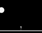
* The graphics of the game are not that interesting to look at. The graphics look way too simplistic and they do not really fit a certain style. They look unappealing. The moon in the game looks kind of blurry. Also, texts in the Game Over screen overlap. These texts look messy and almost unreadable. These texts and the graphics in the game make the game look unpolished and unprofessional. This ruins my experience of the game for me.
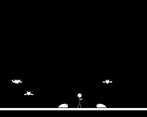
* The game is not that great in explaining how to play. It took me some time to realize that I could only kill bats by punching them and I could only kill bugs by kicking them. The instructions that said to not touch enemies was kind of confusing. This is because in order to kill enemies, the player had to touch enemies, but the instructions told the player to not touch enemies. Though I later on comprehended what you were trying to say, the instructions should be clarified so it does not confuse the player.
Whew that was a long wall of text. Thanks for the feedback. Sorry that the game seemed a little rushed and not polished. My time to create this game was cut short do to other commitments. I would have loved to make the game look better and have a little more interesting gameplay but I didn't have much time to do so. I usually am able to fulfill most of the bad aspects that you mentioned with the exception of the endless runner style. I enjoy them as long as they have an interesting element and I am not being bombarded with them. Also just so you know, even though you can't kill bugs with a punch considering they are too low on the ground, you can kick the bats if you jump. Hope you enjoyed the game nonetheless.
This is the best punch animation I've ever seen!
Those hitboxes sure are large :D
Thanks. I am not much of an animator so they took a really long time to make. I'm glad you liked them.
Pretty fun little game, even though I think the very unforgiving combination of small hitboxes for the attacks and a single life make it too hard. But maybe I'm just bad :D
Haha. Ya. It's hard to find the sweet spot for difficulty. It was a little rushed. Thanks for the feedback.
The initial idea is simple and fun, but it could be expanded. If you keep spamming punchs and kicks you will survive a long time without thinking too much. You can also work on audio and visual feedback of your attacks, that way the game will feel much better.
Thanks for the feedback. I was away for a large chunk of the jam so I had to rush over a few aspects of the game. Sorry about that. I was also taking some time trying out some 2d art software which took a small chunk of time out. Do you have any suggestions for some good art software?
I really suck at art but pixilart is good if you want something simple and quick, it's the one I usually use.
Okay, I'll try it out. Thanks.