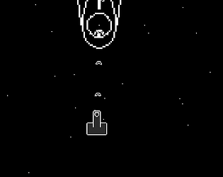
Beaten the whole game, good job! It was a bit difficult, but nothing crazy. Most of my deaths were caused by performance issues, most likely due to playing in browser. I like how there were risk vs reward choices in routing, that's level design 101 but still good. The one thing I'd add to make this game better (in my opinion) is a dotted line projected from the player character's tip, so that you can instantly tell where is your front pointing at any given moment, because the game can get a bit disorienting if you have to focus your eyes specifically on the triangle and nothing else. Also, it took me an embarassingly long time to figure out that holding forward is required to move, and I assumed I'm homehow supposed to do it all with boost thrusts, which is plain impossible.
Lunatic Dancer
Creator of
Recent community posts
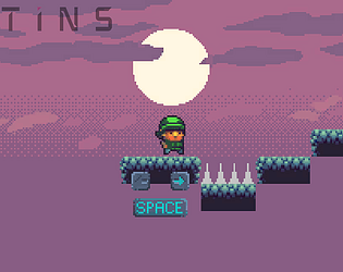
This is cool. Though it makes perfect sense in the setting, I'm not a fan of the jump - very floaty, sometimes frustrating to land. Also, the spikes have a bit too wide of a hitbox, you can die before you observably touch them. Even if they're pixel perfect, it just doesn't feel fair, and feel is important.
But in general, I liked it.
This was SO great. The aesthetic is exactly what I wanted to be doing for about 2 years, this is an incredible inspiration. I like how this is basically a very small metroidvania, I liked the thick atmosphere, all around great!
There were some visual glitches when I moved the camera sideways, in which various objects scrolled at different speeds, but it looked uncanny enough to add to the mood :D
First things first - great job! The aesthetic was mostly consistent, and the game works quite well.
Now, both as a fellow developer and a Dark Souls veteran, I'm gonna pick this thing apart :D
The animations are too stiff and weightless, the particles of the chests look like placeholders, the combat system doesn't feel good enough - too little interactivity and impact on hits (like swords bouncing off of shields), enemies deal pitiful damage, your attacks hold close to no risk with their swiftness, having both jumps and rolls is more than enough avoidance, you have to be really bad at games to struggle at that point. The control scheme has some absurdities, mainly roll on Q, like who the hecc does that :D Also, no lock on on Scroll, that's a bummer. Music controller isn't the best, especially with this easily breakable AI, I've had constant music resets. What you copied too faithfully from Dark Souls games is the camera behavior, the hardest thing about the fights was seeing anything at all :D
For the problems, the most memorable one is the rotating of health bar on the first enemy, and the lack of health bars on further enemies.
In summary, it's not there in a lot of areas, but I can say you're certainly on the right track, and you seem to have enough skill to eventually get there. Best of luck to you :)
Nice! The shield dudes were quite tedious and I didn't fully figure out how to deal with them. I liked the art a lot and how there are the little worldbuilding details like the kingdom's banners depicting a perpendicular angle. I ended up running past half of the game though, when all the enemies were the shield dudes :D
You'd get damage, unless you:
a) are facing the bullet you collide with
b) don't have a bullet ready
Both conditions must be met.
The systems for this are there, only the display broke in the last moment. When you get hit, you don't die, it's only added to the hit count, which is basically this game's scoring system - the less hits you take, the better.
Thanks a lot for playing!
Welcome to roguelikes :D
This reminds me of the times I was first learning to play NetHack - everything displayed in Matrix-like letters, the whole keyboard is the controls, to know what does what I had to either read a separate book or use the help command which was always ready to overwhelm you with information. It felt like deciphering ancient technology, and I had a blast.
If you have any prior experience with berlinian roguelikes, this game is very obvious, but I can see where does your confusion come from :D
Really enjoying seeing some roguelike representation! Quite fun in its simplicity, I've really enjoyed myself here. The unorthodox control scheme was interesting, a weird marriage of numpad controls with WASD (at least it wasn't vi-keys, ugh). I loved how the monsters can hurt each other too, how you can interact with everything, how there's no real pathfinding so encounters are VERY forgiving, this is one of my faves so far!
The only flaw is that it barely fits the theme at all :D
Exactly, that hiding guy can only be properly hit from behind. There is health, but it's not displayed, sadly.
First the design was for the player to die and restart the level, then it changed, that if you get hit, you get a point, and the more points you have, the worse is your end score, so the player could strive to do every boss no hit. The score recording is there, working, but we ran out of time to show it properly, so it looks like you taking bullets is consequence free.
Thanks for trying it out!
Design by substraction is a hard thing to do well. You've basically designed tedium - every tiny move requires a click, and exploring the map is also mostly guesswork I suppose.
Got stuck in the moment when I found the up direction, Alt didn't swap out the arrow, so I was basically stuck in the pit forever. The key bindings are quite funny, not gonna lie :D
Of course, congratulations on making it through your first jam! And the graphics were quite nice too, the camera work was decent, and the idea - maybe had some potential of which I too can't think of.


