Play game
Paloma's itch.io pageResults
| Criteria | Rank | Score* | Raw Score |
| Art | #6 | 4.130 | 4.130 |
| Overall | #11 | 3.557 | 3.557 |
| Sounds | #12 | 3.304 | 3.304 |
| Gameplay | #16 | 3.217 | 3.217 |
| Stability | #17 | 4.130 | 4.130 |
| Originality | #23 | 3.000 | 3.000 |
Ranked from 23 ratings. Score is adjusted from raw score by the median number of ratings per game in the jam.
Leave a comment
Log in with itch.io to leave a comment.



Comments
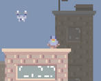
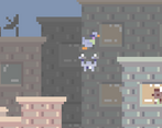
The first game in the jam to make me cry. Not due to the touching story of a mother dove recovering her eggs in a dangerous urban world like you'd expect though. I cried because of Drone #3 on Level 3. I died so many times to that thing!! Finally managed to beat it though! Thanks for making it easier, saved me from having to smash my keyboard.
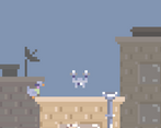
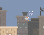
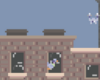
The art style was fantastic! Who could've seen such a cute game inducing so much rage?
The controls were very responsive as well! I think adding a "coyote jump" would have made it feel absolutely clean!
Your description for the game was funny as well, tell MyMom.Industries thanks for the quality content!
Great entry!
Hahaha, you made my laugh at loud! Thank you so much. I HAD to make it easier because... I'm not so sure if someone would use 2 hours of their lives into this silly game just to beat it! Also thank you about your comment about the style and I 100% agree I have to use more advance mechanics for next game.
Thank you for playing!
Oh! One more thing I wanted to add!
I see some comments about using procedural generation instead of handcrafted levels like you made. Now, I don't necessarily disagree with this. However, I do feel like handcrafting the levels like you have done helped match the flow of the game. For example, on Level 3 when the camera is moving at nearly the same speed as the character, I feel that procedural generation could cause some confusion.
Running from the screen, knowing that one mistake would spell my doom made for intense gameplay! If one platform is misplaced by an algorithm that isn't finely tuned, it could be very frustrating. I think procedural generation is great for more slow-paced/exploration based games, but in games where timing is everything and bouncing perfectly off a platform is important, I think what you did made it much more satisfying.
I don't know why I kind of just accepted it as the best option... butttt Yeah...you are right, it wouldn't make sense to be a procedural generated game in this case...
It actually took me a lot of time to design each level and trying the last one to be super hard but also possible.... so, you made me realise that even though procedural generation is super cool and I would love to learn to use it... in this case I was able to do a good thing with what I had... so thank you I guess, haha!
This was a cute game, I like birds a lot
Thanks, me too!
Cool game! I love the vibe given by the graphics and the background sounds. I agree with other comments here that a randomly generated world would fit better for this type of game, but overall its really cute!
Thank you! I agree too I'll try to improve my programming skills for next jam!
Incredibly beautiful pixel art, considering the limitations. Very solid entry.
Thank you! I couldn't play your game, but the art that you made for the cover is really nice as well!
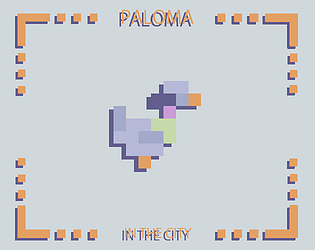
I really like the flying animation of the duck :) fly ducky
It's a dove -_- (jk hahah)
Pretty cool game, although I would've had random gen instead of set levels. Also maybe you could've added another interesting mechanic.
Ih yeah, that would've been awersome, no idea how to do it tho
Not the most original mechanics ever (not that mine was either hehe) but the art is great, I like the setting/idea and its a bunch of fun! :)
Thanks. I agree about the mechanics, I'll try to improve but I guess I'm more an artist that what I'm a programmer...
Ah well I'm the other way around :') maybe we should do a jam together sometime!
That would be nice, right now I can't but here is my discord if something comes up #Sasha4780
I like the athmosphere created by the background noise, but the cartoonish sound effects somewhat diminish that effect. I also really like the colour palette, though I feel like the drones should have been given a different palette to better portray their animosity, as now they have a very similar colour scheme to the player, making them appear more like a powerup than an enemy. I also noticed some slight tile tearing, which got exacerbated when playing in full screen mode. Another problem with full screen mode was that the aspect ratio changed, meaning that the death zone wasn't lined up with the edge of the screen anymore.
Thanks for commenting. I with all your points here, and most of them I didn't think about until now
I discovered the error when playing full screen mode but I didn't know how to fix it (what is not an excuse of course) so if someone knows how to and fix that as well as the tile tearing and would willing to explain me, I'll be super thankful!
Awesome entry! The graphics are stunning and I love how well the darkened background works! Just the overall presentation, ideas, and execution are produced really well in this project and it has turned out super polished! Great game! :)
Aww thank you! Your game as well!
I was completely astonished by the level of professionalism on your work (Check it out if you haven't seen it, random comment reader)
Hehe thankyou so much! And lol free promo :D