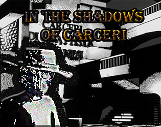
Play game
In the Shadows of Carceri's itch.io pageResults
| Criteria | Rank | Score* | Raw Score |
| Atmosphere | #197 | 2.298 | 3.250 |
| Mental Engagement | #231 | 1.591 | 2.250 |
| Lasting Impression | #234 | 1.591 | 2.250 |
| Overall | #236 | 1.591 | 2.250 |
| Overall | #236 | 1.591 | 2.250 |
| Emotional Engagement | #250 | 1.237 | 1.750 |
| Characterization | #253 | 1.237 | 1.750 |
Ranked from 4 ratings. Score is adjusted from raw score by the median number of ratings per game in the jam.
Leave a comment
Log in with itch.io to leave a comment.


Comments
Well that was a tricky and painful dungeon! The story seems to be interesting although a lot of text is thrown at once at the beginning.
Art looks nice, but I couldn't see the platforms or the exit doors very well. And my jumps were sometimes going anywhere.
I think that if you die, and reboot in the same room that would be add a lot more playability (instead of sending you to the first screen)
In the end, it is a very well working prototype I did enjoy playing. It has a lot of potential too, so congratulations on getting this submitted within the 2 weeks!
Atmosphere and art are great, I really loved the setting too. The gameplay feels a bit rough and the story is interesting but very wordy so it becomes oddly paced with the short platforming segments between long story bits. I also crashed at the 3rd note pickup for some reason. Overall cool concept though
The background art is very nice, and I think the atmosphere is very well done! A did find a couple things a bit frustrating while playing though, the tone that plays every time you jump is a bit annoying after a while, and it would be helpful if the controls could be explained at the beginning since I was struggling trying to figure out how to progress when I first started haha. I also think that if the notes were to be more like an image instead of the text being in the text box would help a bit with readability, since they are a bit wordy. Unique platformer though!