Play game
Little Red Ridding Hood's itch.io pageResults
| Criteria | Rank | Score* | Raw Score |
| Graphics | #2 | 4.100 | 4.100 |
| Audio | #2 | 2.800 | 2.800 |
| Overall | #3 | 3.400 | 3.400 |
| Theme 2 - Nature | #4 | 4.100 | 4.100 |
| Theme 1 - A way home | #4 | 3.300 | 3.300 |
| Gameplay | #5 | 2.800 | 2.800 |
Ranked from 10 ratings. Score is adjusted from raw score by the median number of ratings per game in the jam.
Judge feedback
Judge feedback is anonymous and shown in a random order.
Great submission Tyler, this is an incredibly impressive prototype. You have the makings of a great platformer game here! A couple of things I noticed.
1 - The gameplay isn't clear. As the player you have no idea that you need to interact with the lamps in the level, and the initial thought is the objective of the game is to collect roses.
2 - The UI is not scaling correctly. The rose counter always displayed "Number of Roses" but did not update with any numbers. If there was any extra text for this string then it is off-screen.
3 - Your level loading could be refined so that the camera is not enabled when the level loads in. The player spawns in a fair few times when a level loads, and this could be hidden if the camera was faded out prior to loading.
4 - Sound effects! The music was great but the game would have come so much more alive if you had sound effects implemented.
5 - The end game is unclear, on the second level I managed to somehow end up back at the main menu without activating all of the lamps or collecting barely any roses.
6 - The connection to the theme 'Nature' is not overly clear - the game just seems to be set in a natural setting without much context.
All in all this is a great game and I am incredibly impressed, especially considering the size of your team! I hope you continue to add to this game and update it, because I think you could be onto an idea that's worth turning commercial!
Solid game mechanics and gameplay. Camera was frustrating at the start when your in the house, But much better in the larger level environment. Art style, lighting and music combined well, an excellent submission.
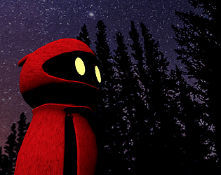
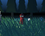
Great use of lighting, shadows, and color. Pleasing main character animation and control. Particularly liked the shoulder movement. Clever puzzles for collecting roses. Didn't realize there was an attack animation until second play-through -- but didn't need it and didn't seem to do anything?
Very polished overall.
Team Members
Tyler Addison - Main Programmer and Designer
Taylor (Criniti) - Ideas Girl
Leave a comment
Log in with itch.io to leave a comment.


Comments
I liked the visual assets a lot but the controls and movement were really frustrating. Combined with tricky moving platforms and pits/ponds it was really unenjoyable until I figured out you could bypass it around the edges.
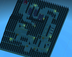
Also I couldn't progress from the first map, I assume the blue barrier is the exit? Im not sure if I needed all the flowers to progress but I explored the level a half dozen times, pretty sure I had them all but I couldnt get through it. so I gave up eventually.
You were supposed to left click on the lanterns im pretty sure I put it in the description of the game plus idk how you found the platforming tricky. They move really slow
I tried interacting with the lanterns but nothing happened. The reason it was tricky was because the combination of the camera controls and the movement, not the speed of the platforms or anything like that. It wasn't a skill based issue so much as a test in patience to fight with the controls. Sorry if I offended you.
No problem it was my very first game iv made on my own. And the lanterns I just ran out of time to make them actually change they do work just not visually.
So what was wrong with the movement since to me it feels perfectly fine.
the games art assets are really well thought out, thought the controls let you slide a bit as you jump and move.
also on the moving platform areas you can clip the sides and bypass it.
all in all a great game
yeah i only just noticed that the tree hit box must be slightly smaller then the ground hit box