Play game
carbon: CANCELLED's itch.io pageResults
| Criteria | Rank | Score* | Raw Score |
| Feasibility | #1 | 4.667 | 4.667 |
| Originality | #3 | 2.833 | 2.833 |
| Playability | #3 | 3.667 | 3.667 |
| Overall | #3 | 3.500 | 3.500 |
| Messaging | #5 | 2.833 | 2.833 |
Ranked from 6 ratings. Score is adjusted from raw score by the median number of ratings per game in the jam.
Judge feedback
Judge feedback is anonymous and shown in a random order.
- This is a simple game that with a few tweaks could be made a little more frantic and still maintain the core messaging. The more I played it the more I liked it but there needs to be some work on the user experience and some basic tweaks to the mechanics could make this more fun. For example allowing shapes to rotate or to allow 'capture' with only one full line. I know this would rift off Tetris more but for an event on the big screen this might be an additional benefit. More signalling to the player what is required would help aid playability. I liked the bold and simplistic colour scheme but the game is not necessarily novel or innovative. It is functional and in 4 weeks a lot could be done to enhance the gameplay and UX.
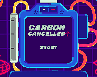
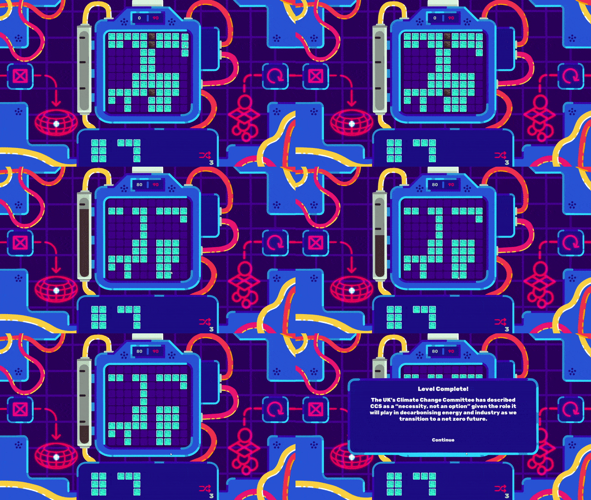
- A fun hybrid of tetris and candy crush but with CCS! Well built game with opportunities to build in complexity to make the game more difficult. Could definitely see this game being played and enjoyed by attendees at COP 26. Although the game captured the essence of removing carbon, the wider messaging was lacking.
- Very beautiful and striking art style and interesting gameplay loop! Add some "juice" to it and this will be a stand-out piece!
- Really striking and beautiful style, and very fun to play. With some simple tweaks to tie in the SSE messaging further (e.g. showing the carbon collecting in storage at the bottom, some text popups) this could be perfect. Great work.
- Love the art, looks amazing and the colour palette is ace. Gameplay feels a bit slow, it takes a while to fill it out and it's not really exciting. Messaging gets a bit lost too. Audio is great though. Well done!
- Really beautifully polished entry with appealing visual development and lots of style. The gameplay worked reasonably well although more clarity on first play and onboarding would be welcome. Tonally the game is offbeat which is really great, although in this particularly case a more obvious alignment with the brief/messaging would have been beneficial. The gameplay isn't particularly original.
Leave a comment
Log in with itch.io to leave a comment.



Comments
This was a super fun game! The music absolutely slaps too haha
Thanks so much! And yeah our sound designer is magic ✨🎊