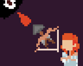
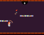
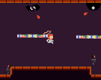
Play game
The Looping Libary's itch.io pageResults
| Criteria | Rank | Score* | Raw Score |
| Gameplay | #11 | 3.688 | 3.688 |
| Visuals | #21 | 3.500 | 3.500 |
| Overall | #34 | 3.125 | 3.125 |
| Audio | #40 | 2.938 | 2.938 |
| Theme | #65 | 2.250 | 2.250 |
Ranked from 16 ratings. Score is adjusted from raw score by the median number of ratings per game in the jam.
Leave a comment
Log in with itch.io to leave a comment.


Comments
Thank you so much for the feedback, the way I was flipping the player made aiming with the bow weird so I didn't use it!
the visuals where prety good. i liked the gameplay but audio needs improvement. also it didnt fit the theme well.
also please check out my game and rate it
Thanks! Will do!
I'm not rating this one because I might just be bad at the game, but the controls were uncomfortable for me (wasd or arrow keys to move, but space to jump, but mouse to shoot? Its manageable, but It would be better if the jump button was w) Also it doesn't fit the theme very well. The different enemies were well done and the art was good
Yo really solid job! I liked the overall but I don't really see the theme too much. I really liked the simplicity of the game and the bullet tracking factor.
Thanks so much!
Congratulations on the game.
This game was pretty fun, other than the confusing UI, I dont have a fault with this game.
Thank you so much! I still have no clue why the UI is like it is!
Can you try my game?
yes will do!
Hello.
What I like:
- This game is similar to another game called Neon Abyss, which I like.
- I like the music.
Suggestions:
- Make stuff more "permanent". Yes, this is kind of a roguelike, permadeth, I get it. However, I mean like if you play a room flawlessly you get +1 heart next room, so it rewards the player for playing well.
- On itch.io you put the resolution with a very big value. It should be the same X as in Unity and +100 of the Y ( Example of my game: on itch it is 800 ( x ) and 650 ( y ). On Unity it is 800 ( x ) and 550 ( y ) ). This make it so that player does not need to full-screen mode. I'll play WebGL games on full-screen mode whenever avaliable, but not everyone does that.
- Chage the color that displays Room 1, 2, 3 etc. Brown makes it look like it is background. Therefore, it is hard to see, so if you want to see you'll most likely take damage.
- As Vironacorus said, not having the player "Flip" looks strange. I'm not 100% sure how you calculate the angle of the mousePosition but here is some code to make the player flip ( C# ):
void Flip()
{
            Transform transform = enemy.GetComponent<transform>();
            Vector3 Scaler = transform.localScale;
            Scaler.x *= -1;
            transform.localScale = Scaler;
            // if flipped was true, it becomes false and if it was false, it becomes true</transform>
}
then you can check use this flipped bool and some variable related to the mousePosition to make the player Flip() using if statements. ( If you need help to implement that, my discord is: Galse#8611 )
Bugs/Glitches:
- It seems like I just die if I take 2 hits, even though on the UI I can see I still have a heart left. If you want to make it so that the player can only take 1 damage per room without losing, that's ok but display that you can only take 1 damage per room.
Wow. Thanks, this is some really good feedback! Most of this game was made in the third day so a lot of features were rushed. For the bugs and glitches I have no clue why the hearts displayed didn't work! I planned to have the player with three hearts that would carry on for each room, but I didn't have time to add this so I gave the player three hearts per room but the UI got a bit mucked up!
Thanks so much! I'll make sure to check it out!
Nice game tho i think the music doesnt really fit the theme
Thanks! The music was a late add!
the game is good but why dont you flip when you run?
The way I set up shooting made it so I couldn't flip the player without making the shooting really weird. So I decided to make it an "artistic " feature!
you needed to use sprite flip of player.not local scale
Oh thanks, I'll keep that in mind for the future!