One thing that i noticed is that cannons that already have the dice, need to be picked again, move away and then press R to be able to roll for the cannon (red dice)
I apologige. forgot about the Main menu, but beyond that the gameplay just moves the walls towards the center and the enemies pass throught you and you just keep waitting for the walls on "survival". That's why i evaluated the theme as "Ok for the part where the "walls" enclose on you"
However, my main issue with this is just how slow the character turns, often times I’d miss shots not because my aiming was bad, but because the character didn’t turn fast enough. This design decision feels rather contradictory: you wanted to make a fast-paced game, but the slow turning means that I often have to play slowly and patiently.
Fair point. I added a todo to make it "not smooth". It will look straight where the mouse is.
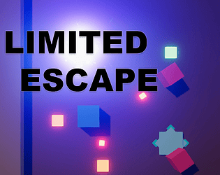
It also feels rather weird that there are 4 different portals, but only 1 of them is actually useful. Which one is useful is communicated visually, but at first glance it’s not actually obvious what that means or that only 1 of them works, and it only adds confusion when playing the game for the first couple times. I think there should only be 1 portal, at the center of the screen.
IT was planned an animation to tell which portal is the "escape one". After the Jam, i'll update and i'd love if you could re-evaluate the decision after that.
Theme: I don't know. The limited part that i noticed is the "confort" that keeps going down if you keep far away from the thing on the middle and your health goes down.
Audio: I thing there could be more. like a warning about the confort and the health going down. even the trash appearing on the field.
Visuals: The art design is fine. I think there could be more information UI about the gameplay and the items.
Gameplay: The fact that i had to click the item to highlight it, and them more from outside to touch it, was tiresome. when i was on top of the object and i clicked, it didn't grab. i had to move away and move back to collect it. IT says "Objective reached", but could have some kind of text saying "collect x amount of items to reach goal and return to the menu".
Gameplay: I gotta say, after I Browse UI, i couldn't do anything. I clicked everything even trying to "delete" the installed game, but i couldn't do it and the game ended everytime i hit play on the current installed one. Seems like the game restart and i couldn't managed to install the other ones.
I have a Wide screen monitor. The game UI on the bottom wasn't displaying because of the resolution.
I advice you to learn a bit about the Canvas UI to limit the resolution to a certain aspect ratio. Otherwise "wide screen" monitos won't be able to see what you created.
The best thing you can do is force the game to be windowed. This avoid diferent resolutions to have UI problems. Thankfully BenBonk played your game live stream, so i just rated based on his playing.
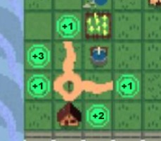
Theme: I don't think this style of game fits the genre IMPOV.
Audio: I understand that it is your first game, so for the next one add audio.
Visuals: Pretty nice. Even the UI. I think you could add an hovering number on each tile to display the amount of population and soldiers.
Gameplay: Since i played this kind of game i know how it work. It is very well done gameplay.
The enemies were is ok to spawn randomly at the red glowing squares. But i didn't have time to add a "ohhh... an enemy will spawn here" effect. Something like a second "warning", because my intention was the game to be a fast reaction game.
The same for the enemy shooting. Something to warn the player that the enemy will shoot.
There will be an update after the JAM finish and i'll be live making everything for the last update.
Gameplay: I think we could have a single boost speed or a dash everytime we grab the green square that expand the scene. would be nice and make us last longer.
Congratulations on the game. Almost got full 5 starts. ;D
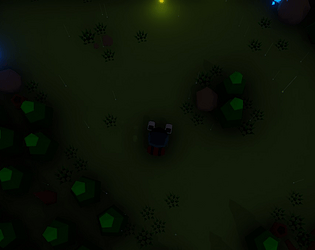
Theme: The space was limited, but i didn't feel that i had a limited space regarding the gameplay.
Audio: Very good. I didn't notice an audio for the enemy attack or when i got hit. I miss a "dungeon" style music too.
Visuals: Perfect.
Gameplay: Good, but the enemies could be faster and respawn inside the tiles when the space shifts to another shape, because they were stuck outside of the playable area, making me waste "attacks" in order to shift to a position where or they could move towards me or i could attack them.
Theme: There's plenty "space". I think this kind of levels could create walls to limit the player movement to give advantage to the enemies, therefore creating the aspect of "limit space"
Audio: No audio at all. At least it played nothing for me.
Visuals: I enjoyed the style.
Gameplay: Good. The only issue is that when the room closes to fight the enemies, there's a possibility that a enemy spawn right where you are causing damage to you or even making you lose the game instantly.
Yes. there is. after the jam is finished i'll stream fixing the issues, implementing new features and releasing the source of the project free for everyone.
Theme: When looking at the playable area as "limited space", i'd say ok.
Audio: I miss a retro music for the design concept.
Visuals: Good for the game idea.
Gameplay: Very limited and not much challenge. I played twice to confirm and if i avoid all the enemies i still win. xD. Good game though. I think it can be improved alot.
Congratulations on the game.
Btw, how do your game zip file end up with 300mb ?
Think about the MVP. You need to separate an hour or two to makes notes. Create alot of questions about the idea you want to make. Then do as many answers as you can for each question and see what do you think might fit together and what you can make.
This should help you. I have a problem with overscoping too. Usually overthinking, but this was the first Jam that i managed to fit a project together and deliver it.
Audio: Good, but need improvement. more envinroment audio and enemies sound would be nice.
Visuals: I enjoyed alot. Good contrast.
Gameplay: Good, but i think the character movement could be slower even the jump. I couldn't appreciate the entire scene because of it and the "player's light" was too little, hiding the beauty of the envinroment.
Congratulations on the game.
I saw that you tried to tell how long the player survived. Here: https://pastebin.com/jk9EEHD This will help you format the float into time. I'll make my project files public after the jam is complete too.
Visuals: I honestly didn't like it. Very confunsing as you tried to populate and make the room very alive it miss the contrast between the "objects" (images).
Gameplay: A nice puzzle after getting the hang of the game and avoiding the visual conflict.
It is a fast pace game. The more you kill more will spawn, but only when you kill them. YEah i can increase the aim rotation. i just think that is wonky a fast rotation when the mouse is too close to the center of the screen.
For the amount you can kill, try spamming the bullets. you have 5 active bullets.
Audio: Missing alot. I only hear the swing of the player sword.
Visuals: It is not in my liking taste, but i feel that it could have more visual representation, like a hitting effect so i'd know that i'm hitting them.
Gameplay: The loot could shine a glow and have a more wide area of pick-up. it is dificult to pick them up. The enemies idk if i'm hitting them or not until they collapse. hehehe