Play game
Alone's itch.io pageResults
| Criteria | Rank | Score* | Raw Score |
| MUSIC | #281 | 3.172 | 3.172 |
| VISUALS | #313 | 3.517 | 3.517 |
| DESIGN | #361 | 3.138 | 3.138 |
| OVERALL | #378 | 3.207 | 3.207 |
| THEME | #447 | 2.931 | 2.931 |
| SOUNDS | #509 | 2.517 | 2.517 |
| INNOVATION | #560 | 2.552 | 2.552 |
Ranked from 29 ratings. Score is adjusted from raw score by the median number of ratings per game in the jam.
Leave a comment
Log in with itch.io to leave a comment.



Comments
Great work!It looks like it was inspired by Thomas was alone. I really like it. The only thing is that the double jump feels like sometimes it isn't working. But I loved the game :)
Thanks heaps for the feedback! The double jump did have some issues and im working on fixing them! :)
really great platforming controls you got the weight just right! in my opinion the platforming challanges got quite repetetive. also is the theme explained through the story? because the story didnt grip me but that is just me. really enjoyed my time!
Awesome feedback! I defiantly agree that the story was maybe a little to squished into small spaces, which made it not very griping or easy to read! As for the repetitive obstacles i think i may just make each level go in a different direction (for example the last level the player goes down and the first level the player does basic platforming) Thanks again for the feedback, its all really helpful!
Amazing work, Luak! Really enjoyed this entry! It ran really smoothly and everything felt in the right place.
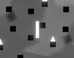
One of the standouts for me was the art style! I loved the grayscale, hand-drawn styled background accompanied by the pixelated character, and the font you chose really went with the game!
I also really loved the music, although it was a bit quiet. Again, it tied in with the concept and adventure aspects of the game! :D
I agree with the two major things RedHeadBros had mentioned in their review, but still, this was an awesome experience and I really enjoyed playing it! Thanks for making it, Luak! :D
Thanks for reviewing! I also think what redHeadBros said is correct. Thanks for playing it! :D
No worries, Luak! :D
Overall, your game was pretty bloody fantastic. Platforming felt good (though a bit floaty), and visually it looked pretty spectacular.
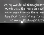
I have two gripes: one, your story didn't grab me. I read a few of the dialogue lines at the start, but when the text for me to read was larger than the screen itself, I phased out and just walked past it, it wasn't worth the effort of reading it.
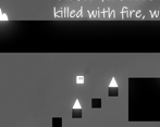
Two: in the falling section with the spikes, there were times where I couldn't see which platform beneath me I was supposed to jump to next - I was on the lowest platform that didn't have spikes on it, and I couldn't see any way downward. I'd recommend either making the screen taller for this section, or positioning the camera below the player during this part.
Overall, once again, game's flipping fantastic. Smooth as butter.
Thank you SOOOO much for the feedback! I defiantly agree with those two major things, the story issue is a problem, Im thinking about making the text shorter and more stretched out! Thanks again for the awesome feedback!
I love the neon feel to the character, and the trail. The platforming was surprisingly difficult, especially when trying to read the text on screen
Thanks so much for the feedback, some of my friends said that too... is there any specific aspects of the platformer that were very difficult?
I think the fact that the platforms you were trying to land on were relatively small made it difficult. It made it feel like you were going to overshoot. That, and having a jump that was barely strong enough (on its own, without the double jump) to get you there made it feel like each jump was life threatening.
i totally agree! Thanks again for the feedback!