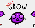
Play Don't Grow
Don't Grow's itch.io pageResults
| Criteria | Rank | Score* | Raw Score |
| THEME | #77 | 3.871 | 3.871 |
| VISUALS | #216 | 3.774 | 3.774 |
| INNOVATION | #278 | 3.194 | 3.194 |
| DESIGN | #289 | 3.258 | 3.258 |
| OVERALL | #321 | 3.323 | 3.323 |
| MUSIC | #865 | 1.387 | 1.387 |
| SOUNDS | #905 | 1.387 | 1.387 |
Ranked from 31 ratings. Score is adjusted from raw score by the median number of ratings per game in the jam.
Leave a comment
Log in with itch.io to leave a comment.


Comments
Nice and fun little game. I like that it is simple and easy to understand. Would be nice if there is music and sound effects.
Really fun little game with a cute character. I would love some music and sounds, and some kind of popping or exploding effect when you lose. But the underlying gameplay is solid and the game is addictive and fun. Good job!
Pretty simple. Some of the textures seemed to have not been working for me. Still, pretty fun. Good job!
kept me on my toes the whole time! good job!
Thanks for the feedback!
It looks really cool, and the game itself is very accessible. You know exactly what to do from the start. Really good job on the visuals! Could use some music and sound effects.
Thanks!
Yeah, agree that there should be some music and sound effects too.
i like the idea and art
Um okay, don't have sfx or music though.
sorry it was another tab lol
Ah, that's fine. Don't worry.
im sorry the mechanic of your game was changing the color to match the projectiles
it looks like i just blindly made the comment
Nice Game overall, would be a lotttt better with sfx and music and it really is that type of game. fit the theme well. With a bit of polish it could be great!
Thank you for your feedback! Yeah, sfx and music would make it a lot better.
Really simple concept! Great work making a fun game with very few pieces. It's fun and I'd love to see an expanded version with sound effects and maybe a POP if you get too big.
I'm glad you found it fun! Some sound effects would be nice and so would that POP! Didn't ever think of that! Great suggestion!
Glad to help! It was a cool game! Hope you'll try my game too!
Don't worry, I will certainly try out your game! Thanks again for giving mine a go!
Cool concept. More challenging than you'd think at first.
Thanks!
nice gameplay, art is like Noa’s, sadly there’s no sound!
Yeah I wanted to try and make my art like BlackThornProd's but he just has a way with colours and drawing that I can't replicate. However, I'm fairly pleased with the result. I wanted to add sound but ran out of time :(
a very good implementation of the theme nice work on the sprites simple yet effective, the game is constantly engaging which i liked the most
kudos :)
Thanks! I really appreciate you giving my game a go!
really nice game and nice art i just wish the was a bit of juice like screen shake maybe
Oooooh. Now that you mention it, screen shake would be nice!
great concept and art, but needs some audio, rate mine Rate cubic sword game by EM for Blackthornprod GAME JAM #3 - itch.io
Thanks for the feedback! And yeah, I agree that some audio would be nice.
Really simple but elegant game, could me a nice mobile game. I did find the same as other colour blind people that I found the blue and purple(?) hard to tell apart
Thank you for the feedback!
Yeah, I'm sorry about the colours. I forgot that blue and purple could get easily mixed up but am going to take this feedback into account for the next colour focused game I make.
This game is so simple. It's easy to learn and hard to master. As other people have said, changing the colors and adding music it would make it so much better. Great game!
Thank you!
Yeah, I will definitely take this feedback into account in my next game. I wasn't able to add sound and music due to running out of time so I'm going to try and make more time for that in the next jam I do and the colour issue is one I forgot about while making it but will keep in mind for my next colour oriented game.
The game could be better with sound/music. And because I am colour-blind (not your fault :) ) for me the blue and purple(I think ) isn't the best pick. Green,red,blue will be better. But overall I liked the games idea and simplicity :)
Yup, agree that sound and music would be better and I'm glad you brought up the colour issue as I'll definitely try to find a way around it if I make a colour oriented game again. Thanks so much for the feedback!
Simple yet effective :)
Thanks!
Nice and simple look, solid gameplay. Some music and sound would help though.
Thanks! Yeah, I also think that music and sound would make it much better. I unfortunately ran out of time during this game jam so I had to leave them out :(
Nice and simple look, solid gameplay. Some music and sound would help though.
I really appreciate the feedback!
Yeah, couldn't agree more on the music and sound front. Unfortunately I ran out of time so I couldn't add them in but I'm going to try and make time to add these in to my next game during the next jam I partake in.
Hi,
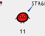
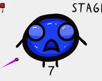
This is really well made! I love the art style and the changing faces as you grow. Great job! What program did you use to make the art out of interest?
If you have a chance any feedback on my game would be much appreciated too!
Cheers
Thanks for the feedback, I really appreciate it! I will certainly check out your game!
I used photoshop with a drawing tablet to create these characters. I hope that answers your question.