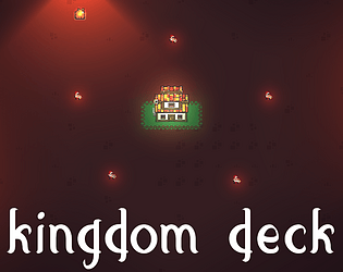
Play game
KingdomDeck's itch.io pageResults
| Criteria | Rank | Score* | Raw Score |
| Fun | #469 | 2.286 | 2.800 |
| Game Design | #479 | 2.368 | 2.900 |
| Audio | #488 | 2.123 | 2.600 |
| Graphics | #494 | 2.449 | 3.000 |
| Innovation | #500 | 2.123 | 2.600 |
| Overall | #533 | 2.109 | 2.583 |
| Theme | #746 | 1.306 | 1.600 |
Ranked from 10 ratings. Score is adjusted from raw score by the median number of ratings per game in the jam.
How does your game fit the theme?
There are many doors in many buildings. And the enemies try to open the doors of the players Town Hall.
Did you write all the code and made all the assets from scratch?
I wrote all the code and as I like the artistic skill assets were downloaded from the asset store.
Leave a comment
Log in with itch.io to leave a comment.


Comments
This game feels like it has a huge scope. I did enjoy the idea of combining a cardgame with real time elements. Maybe cards that aren't buildings could increase the fun of playing cards into your kingdom (like a band of archers or a huge boulder crushing enemies xD). Overall this feels like a very solid base to build upon. Content, ballancing and polish can make this game a hit! If you look at other digital cardgames they put so much effort in polishing the "card-interactions". here are a couple of notes:
sorry for rambling so much. Digital cardgames are my passion! I hope i didn't offend you or anything. What you did in a week is incredibly amazing and i could only dream of accomplishing something like that!
No offense taken!
Your feedback is greatly appreciated!
Most of the scale problems should be avoided if you turn on full screen. (I wrote it in the description but for the future, I'll be putting a text wall "TURN ON FULL SCREEN P L E A S E").
I also thought that the distribution of the cards was a bit off but when coming up with a solution my brain started creating smoke so I stayed with a layout group. In the next card game, I will use the grid!
I put quite a lot of effort into polishing the cards so that they would be reusable but couldn't figure out how to do the "movement into your hand" as that would require knowing the exact spot in the hand for the card. I will prep such magnificent code for my next Jam :)
Again, thanks for the input! I'm planning to test out different card games now so that I can build a card game as my game for the next year so feedback from a specialist like you is a godsend. :)
I really like the look!
This game is neat and looks cool but it does not fit the theme, and you do not have a big role in what is happening on screen.
Dope game, keep up the good work
Love the idea, not sure how it matches the theme ?
Took me a bit to understand how to make money as I did not read the description before ^^"
but will bookmark it for later inspiration ;)
Add more enemies and make it a city builder / vampire survivor / roguelike deckbuilder
Yeah, I had that Idea before the Jam and just couldn't stop myself from making it :)
A roguelike deckbuilder is the Goal!
haha , will follow you to see what you come up with ;)