Play the chaos
'Cause Chaos's itch.io pageResults
| Criteria | Rank | Score* | Raw Score |
| Fun | #103 | 3.750 | 3.750 |
| Innovation | #161 | 3.583 | 3.583 |
| Theme | #204 | 3.667 | 3.667 |
| Overall | #278 | 3.417 | 3.417 |
| Game Design | #457 | 3.250 | 3.250 |
| Audio | #475 | 3.083 | 3.083 |
| Graphics | #646 | 3.167 | 3.167 |
Ranked from 12 ratings. Score is adjusted from raw score by the median number of ratings per game in the jam.
In what way does your game fit the theme?
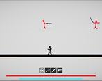
Its just absolute, physics based chaos.
Did you write all the code yourself and made all the assets from scratch?
No. I used some code and assets from elsewhere.
Leave a comment
Log in with itch.io to leave a comment.


Comments
Funny and great game!!!!!!
Awesome!
I liked the different weapons idea and the simplicity of the art style. It was a bit buggy but that is expected for a game made for a jam
Oh the joys of a deadline and Unity's physics system!!! Lol! I'm glad you liked it.
This is a cool concept and I liked the different weapons however it was really hard to defeat enemies. The gun did not seem to work if I was not in the water and the sword could not be swung around.
Were you holding Q? That could've been the issue... Anyway, with the controls update your problems should be fixed.
Loved this game! It was perfect for the theme and I loved the soundtrack!
Thanks, though I can't take all the credit - the music's actually from a free chiptune rock pack on the asset store.
Movement is fun. Nice game, good job.
:)
For sure the movements of the player and the enemies are pure chaos.
Quite difficult to play but a nice concept.
Chaos forever! I agree that it's quite clumsy and annoying, and I hope to soon update it with some of CodeGnat's control ideas.
I like the movement of characters and how they look. They look hilarious! And the constant shaking when holding fits all of this soooo well.
Weapon and tools are very creative. I was like "hmmm a sword, a gun, a double grappling hook!? A pen platform?!?". (Little bit of exaggeration, but rest is really what my mind is thinking lol)
Controls are kinda hard to use, but after a bit it is not unmanageable.
Color schemes are already nice, but I think the color of the bullet is kind of hard to see.
The screen effect is pretty neat and fits well with the game track.
Ha ha! Thank you! I think CodeGnat's ideas would help with the controls a lot.
The game looks nice, the audio is fitting. Making the sword and gun have automatically aim and attacking/shooting with right click would have made it much easier to play. Making the weapons strollable with the mouse wheel would completely remove the need to take your fingers off the wasd and space. Good game.
Really great ideas! Thanks! I was already thinking along the same lines...